I am Mari Pettersson, a multidisciplinary senior creative and graphic designer in Auckland with over 20 years of hands-on experience from concept to finished art, across agencies, in-house marketing departments and global brands.
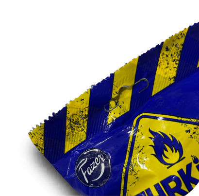
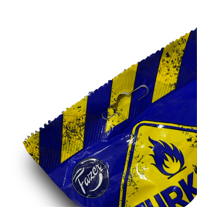
Originally from Finland, I made my way to Aotearoa via Dublin, Ireland, where I got to hear “You’re mad!” a lot, both for my out-there ideas and for the love for salty licorice. To that I always added “in a good way!”, and it stuck.
Now a New Zealand citizen, and with a lens of three cultures, I bring a unique viewpoint and comprehensive mix of design and production skills to the table.
MOI!
Palvelut myös suomeksi, rakkaalla äidinkielelläni.
Olen Mari Pettersson, luova yövuorolaisesi Uuden-Seelannin aikavyöhykkeellä. Minulla on yli 20 vuoden kokemus konseptista valmiiseen materiaaliin niin toimistoissa kuin in-house-markkinoinnissa, ja globaaleille brändeille. Olen kotoisin Keravalta, ja päädyin 3,5 vuoden Irkkumutkan kautta Aucklandiin 2004.
Tarjoan ammattitaitoni lisäksi “aikaetua”: kun sinä pistät pääsi tyynyyn, minä aloittelen työpäivääni. Briiffaa päiväsi päätteeksi – aamu tuo tuloksia.
Voimme tutustua Zoomin tai Teamsin välityksellä ja sopia projektin yksityiskohdista sekä käytännön asioista, kuten tiedostojen siirroista. Laskutus hoituu helposti euroissa – IBAN-tilisiirto käy mainiosti.
Ota yhteyttä: moi@madinagoodway.com
From a single headline to a full campaign concept, I get there by asking the right questions first – then stepping away from the screen to let the ideas find their own way.
It often starts with pencil and paper. Sometimes a long walk. Research, mood boards, a nagging feeling that there’s a better angle somewhere. An overnight test. By the time I open a file, I usually know what I’m making.
Headlines, short copy and calls-to-action are part of my thinking too – not copywriting as a discipline, but enough to know when the words and the visuals are pulling in the same direction.
Thinking
Brand identity, layout, iconography, illustration – I’ve worked across print, digital, OOH, packaging and everything in between. Enough formats to know what each demands, and what not.
I design for the audience first. That means understanding who they are, what they need to feel, and what needs to happen next. Getting the aesthetics right matters, but so does hierarchy – knowing where the eye lands first, and making sure it finds the right thing.
Designing
Finished art, pre-press, image retouching, multi-language booklets, InDesign book files, automated tables of contents, dielines & kiss cuts – the detail work that nobody notices when it’s done right, and everybody notices when it isn’t. Enough experience to know where things go wrong, and how to avoid it.
I’m careful, methodical and I don’t cut corners. If something isn’t right, I’ll say so before it becomes someone else’s problem. Eagle-eye is my middle name.
Producing
I get a quiet satisfaction from building something once that works a hundred times. Templates, data merge setups, icon sets sized and organised for every use case – the unglamorous backbone of great ongoing work.
I’ve also created how-to guides and handover documentation for peers, so the thinking doesn’t walk out the door with me. Consistent output faster, and one less thing to figure out from scratch.
Building
Scripts and automation have saved me more hours than I can count. If something feels repetitive, I’d rather spend time finding a smarter way than keep doing it the slow way.
New tools and techniques – I follow industry publications, watch a lot of tutorials, and learn best by seeing things done rather than reading about them. There’s always something worth knowing.
AI is part of the toolkit now. Claude, Copilot, Suno and more; I use them practically, not evangelically. They’re useful when they’re useful.
Exploring
Life is full of
lights and shadows
interesting details
nature in unnatural places
objects that look like faces
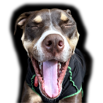
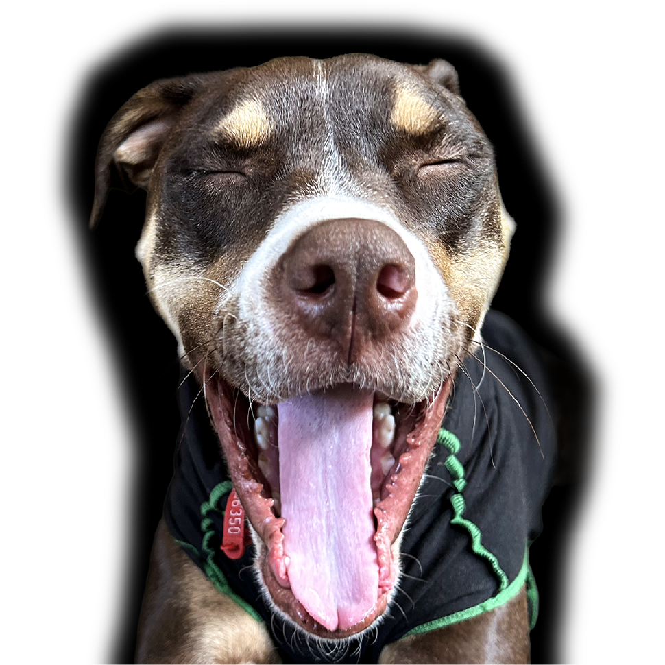
fleeting yawns
Waiting to be immortalised.
I love photography and have a good eye for composition. Useful for work too!
LIVINGLOVINGCREATINGSHARING
Portfolio
Corporate Capabilities Brochure
Kingram Communications Group
Design + Layout
1/10
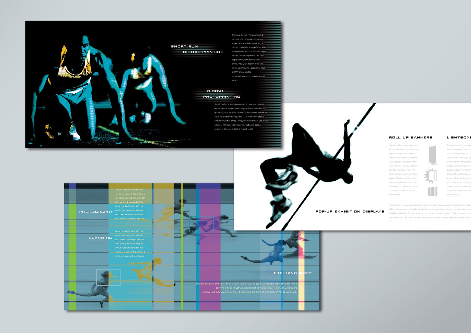
A dynamic capabilities brochure for a print and display services company. Sports photography given a bold digital treatment to dramatise the services offered – short-run printing, photoprinting, scanning, finishing, roll-up banners and exhibition displays. Strong, high-energy visual direction for what could have been a dull subject.
MY ROLE
Concept, design, illustration, finished art
AGENCY
K2 Creative, Dublin
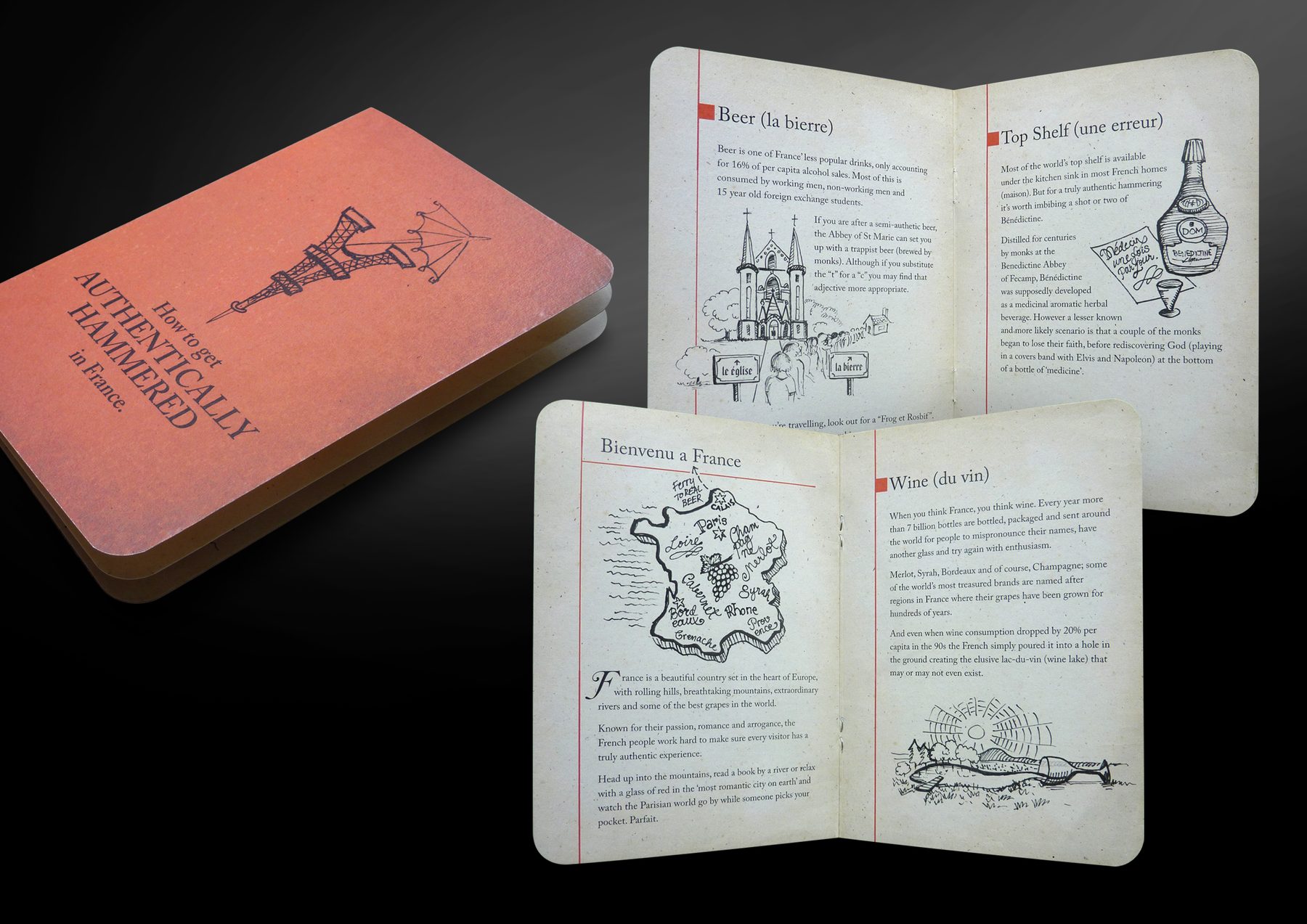
How to Get Authentically Hammered in France
Hunch
Design + Layout
2/10
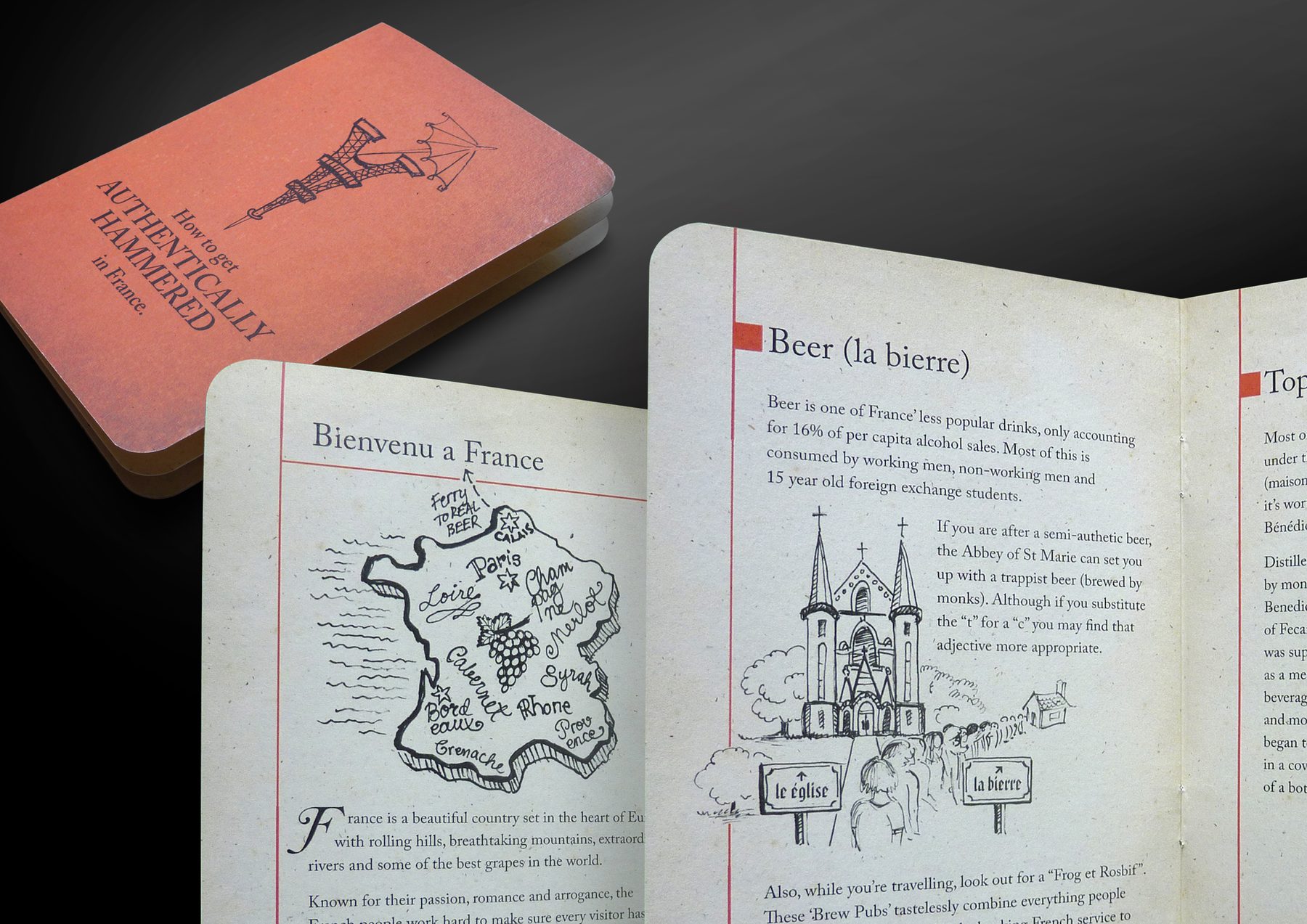
A witty client gift booklet in passport format, designed as a personalised send-off for a client heading to France on holiday. Sections on beer, wine and top-shelf spirits, with hand-drawn illustrations throughout. Copy and passport format from the client.
MY ROLE
Design, illustration, layout, finished art
AGENCY
Madinagoodway
Post Modern
An Post (Ireland)
Design + Layout
3/10
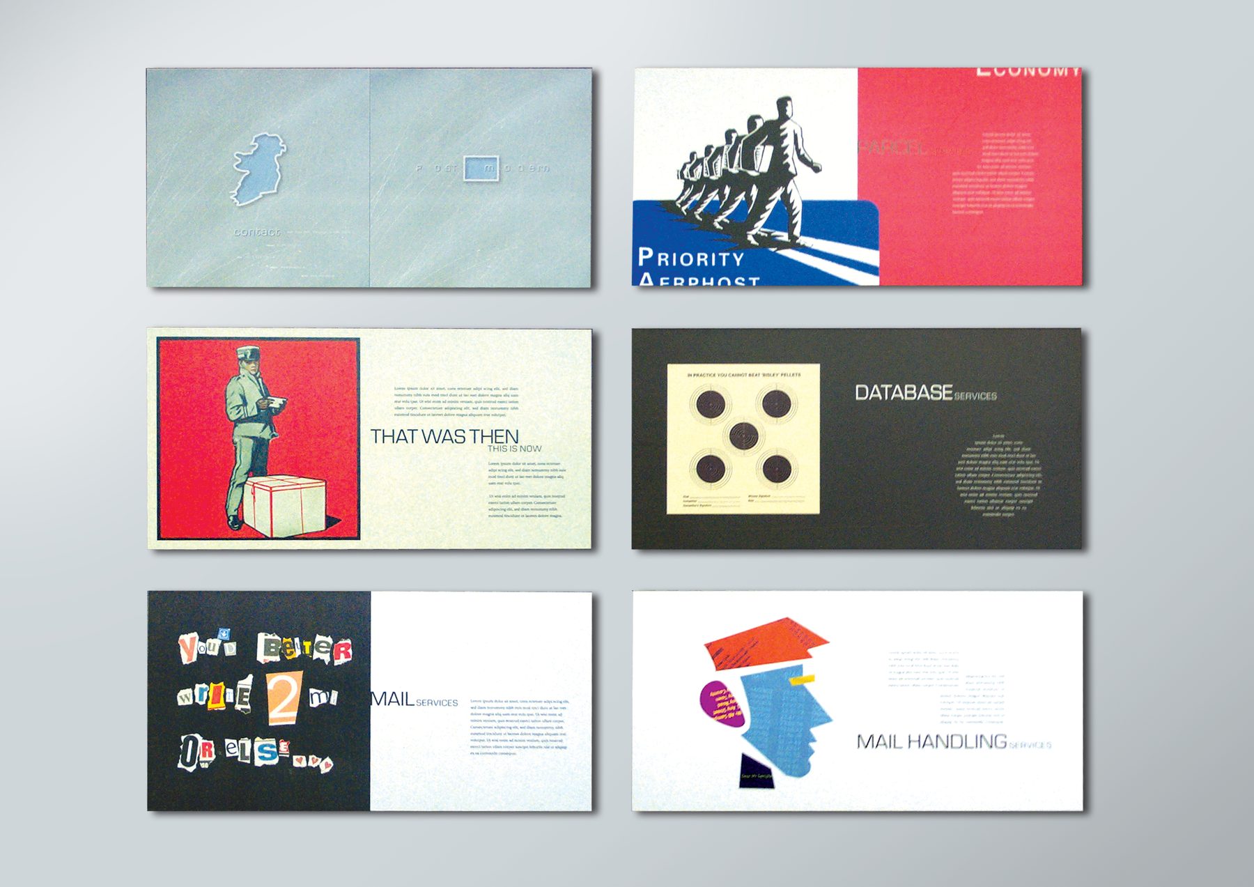
A pitch brochure presenting An Post’s full range of services through six visually distinct spreads. Each section has its own tone and treatment, from bold retro collage to dark minimal typography. A conceptually ambitious piece that treats postal services as anything but ordinary.
MY ROLE
Concept (inc. name), design, illustration, layout, finished art
AGENCY
Dialogue Marketing Communications, Dublin
Banan-A-Gram
Chiquita
Design + Layout
4/10
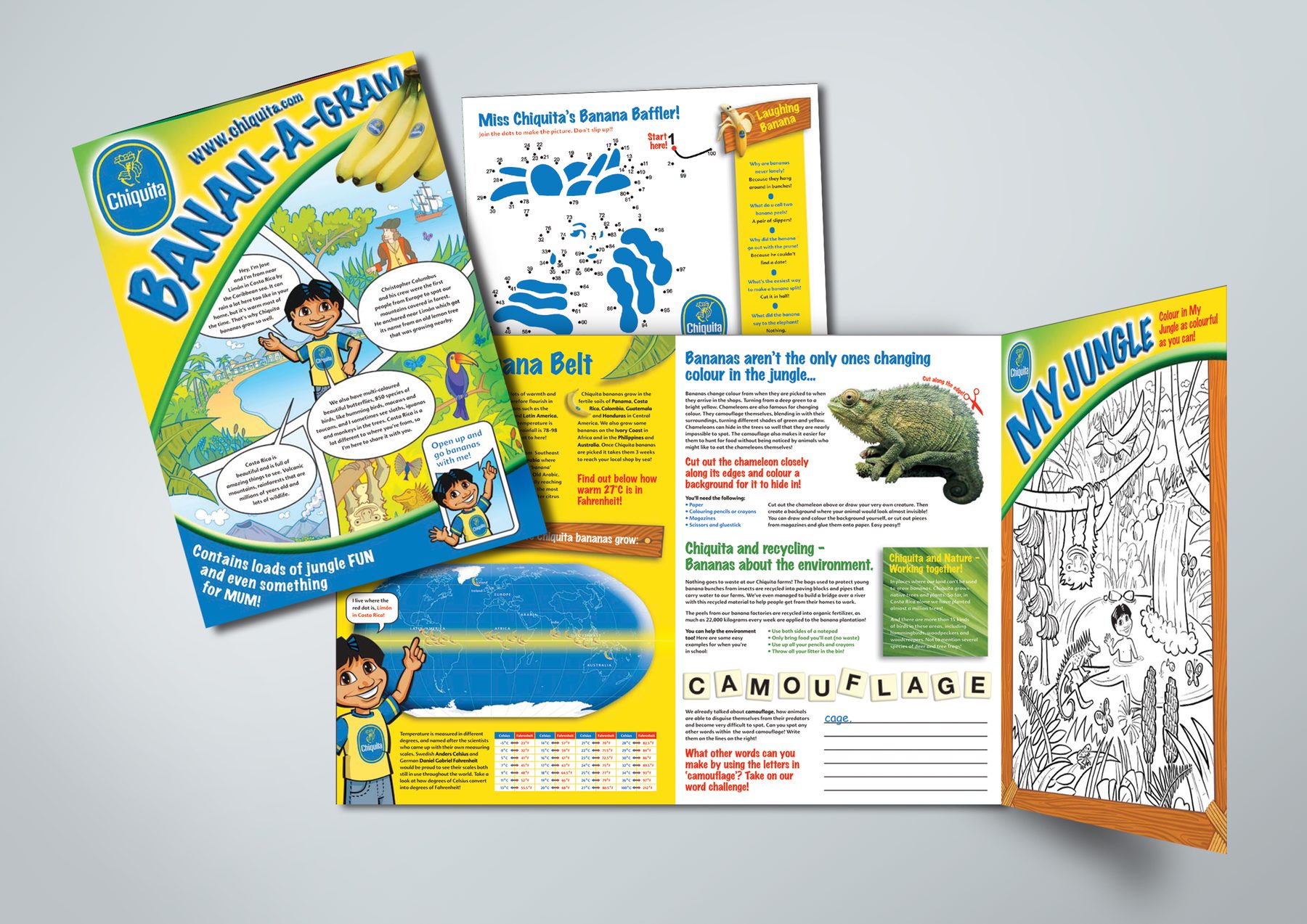
A richly illustrated children’s activity booklet built around the Chiquita banana brand and Miss Chiquita character. Includes original puzzles, a dot-to-dot, jungle facts, environmental messaging and a colouring page. A technically complex layout managing high-energy branded content across multiple formats – and a genuinely fun piece of work. Concepted with a copywriter, then I originated the games and puzzles, researched and wrote some of the content, commissioned and art directed the illustrations and colouring activity.
MY ROLE
Design, activities, illustration procurement & direction, layout, finished art
AGENCY
Target Interactive Marketing, Dublin
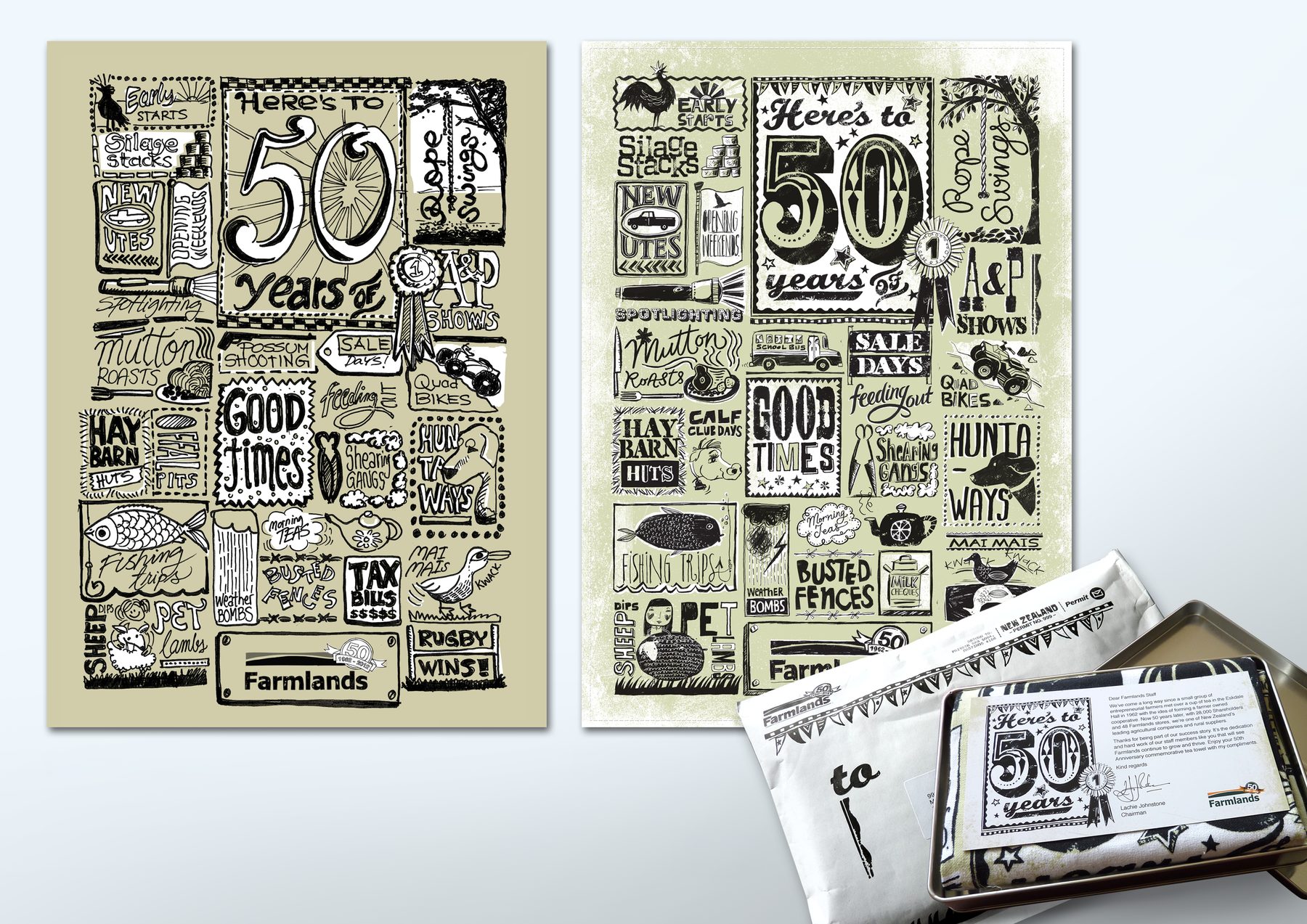
50 Years of Farmlands
Farmlands
Design + Layout
5/10
A celebration of Farmlands’ 50-year history presented as a hand-illustrated teatowel, mailed to customers in a tin. A genuinely memorable direct mail piece with strong standout as a lasting keepsake. I produced a detailed scamp for the teatowel and art directed the illustrator through to final artwork. I also produced the DM package with all its components.
MY ROLE
Art direction, layout, finished art
AGENCY
justONE, Auckland (Freelance)
A Love Story
Ziera
Design + Layout
6/10
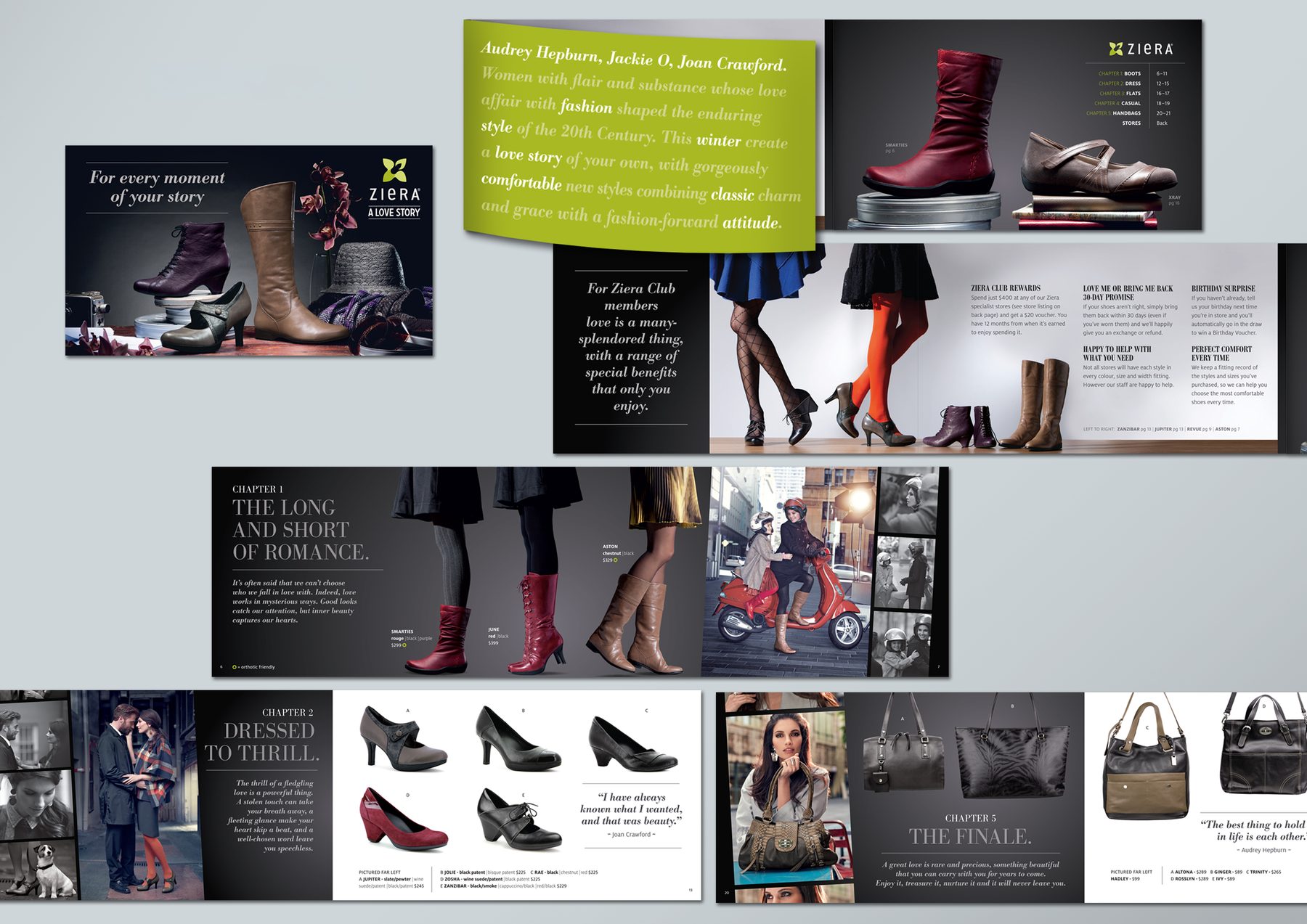
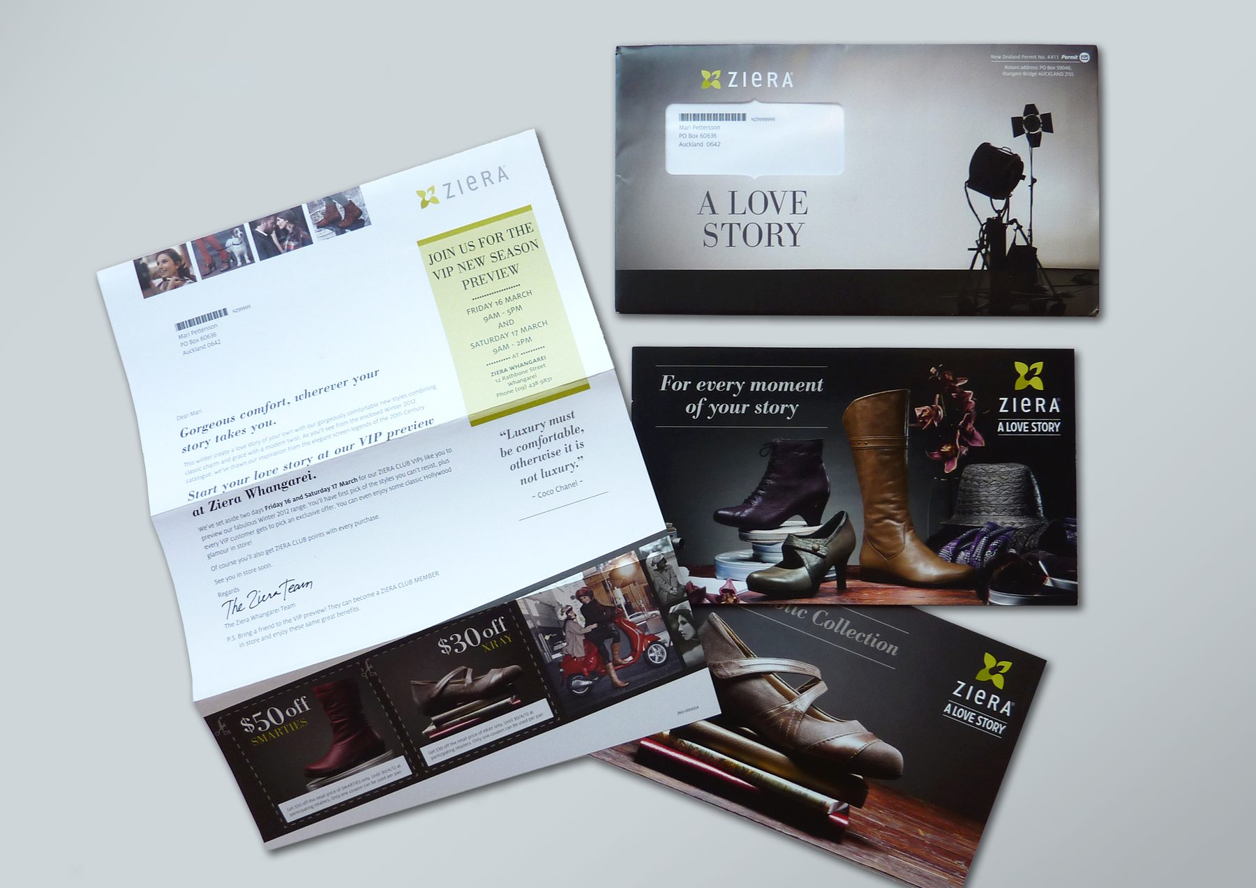
A sophisticated seasonal fashion brochure structured as a love story. The creative challenge lay in adapting a high-end campaign for direct mail without losing its premium feel. One of several Ziera pieces produced across the DM programme. I curated/adapted a large supply of above-the-line assets for DM use, extended the concept across all touchpoints from envelopes to web, and executed all layouts through to finished art.
MY ROLE
Production design, layout, finished art
AGENCY
TEQUILA, Auckland
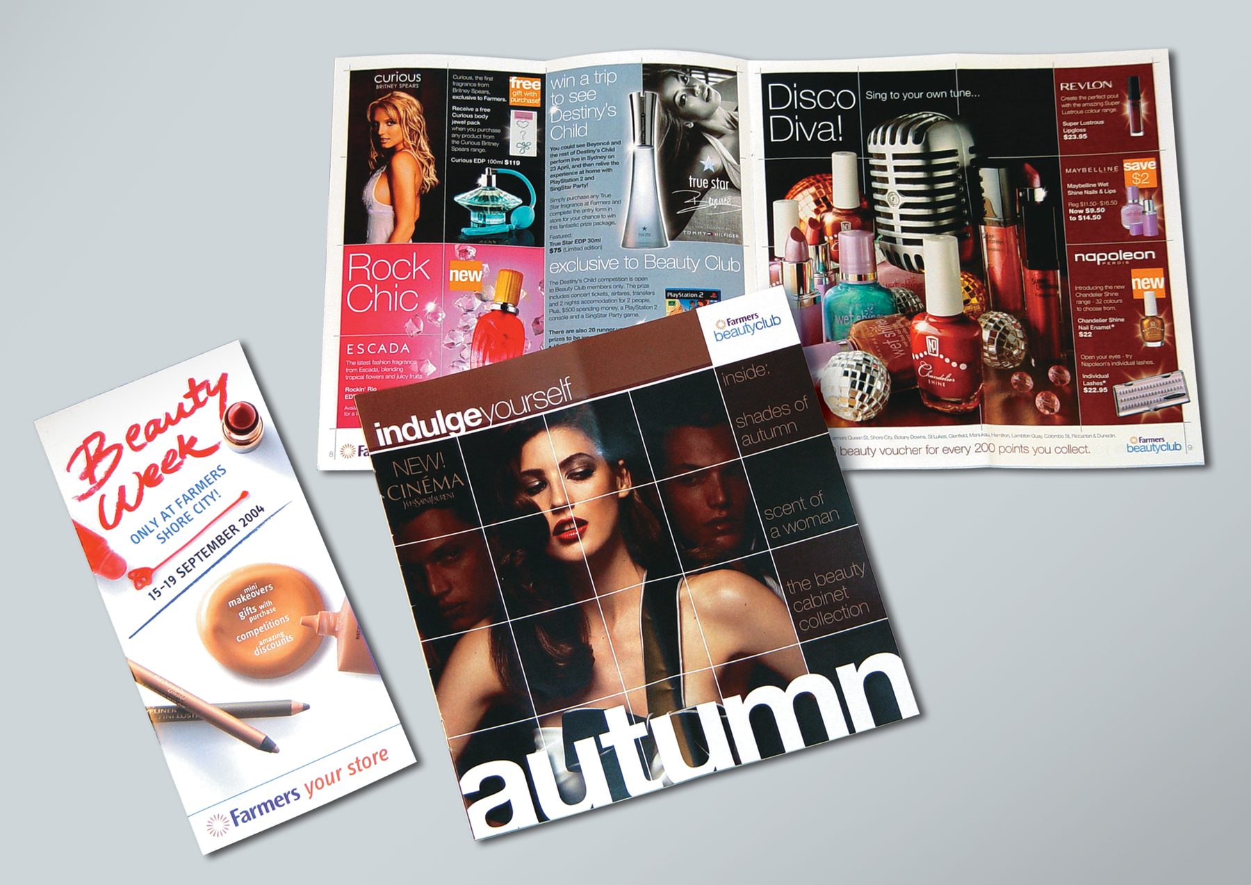
Beauty Club Autumn Brochure Revamp
Farmers ‘Indulge Yourself’
Design + Layout
7/10
Beauty Club autumn brochure (‘Indulge Yourself’) and Beauty Week in-store leaflet. Imagery for brochure supplied by the ATL agency, and for Beauty Week leaflet I concepted the cover, commissioned & supervised photography, and brought all to final artwork.
MY ROLE
Art direction, design, layout, finished art
AGENCY
TEQUILA, Auckland
Grand Prix, RSVP Awards, 2005
Gold, Best Loyalty/Relationship Programme, RSVP Awards, 2005
Silver, Best Sales Generation, RSVP Awards, 2005
Bronze, Best Mail, RSVP Awards, 2005
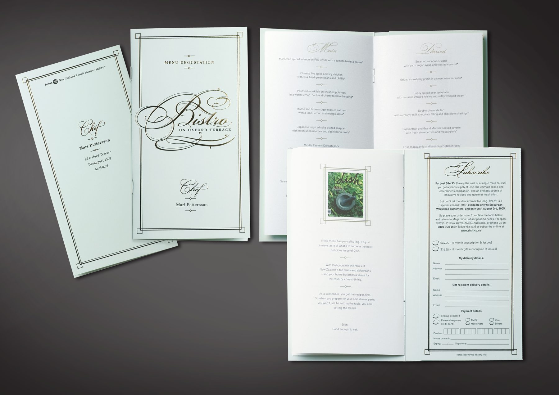
Dish Menu
Jones Publishing | Dish magazine
Design + Layout
8/10
A subscription DM disguised as a beautiful restaurant degustation menu, personally addressed to the recipient as ‘Chef’. The outer carrier, menu card and reply form all sustain the restaurant conceit. I received copy written in a menu format, then originated the design, chose typography, did layout and finalised artwork.
MY ROLE
Art direction, design/layout, finished art
AGENCY
TEQUILA, Auckland
Gold, Publishing, DMA Echos, 2006
Silver, Customer Retention, John Caples Awards, 2005
Bronze, Best Flat Mail, DM Asia Awards, 2005
Finalist, RSVP Awards, 2005
Finalist, Axis Awards, 2005
Finalist, Best Circulation Promotion of the Year, MPA Magazine of the Year, 2006
Wedding Invitation
For a friend
Design + Layout
9/10
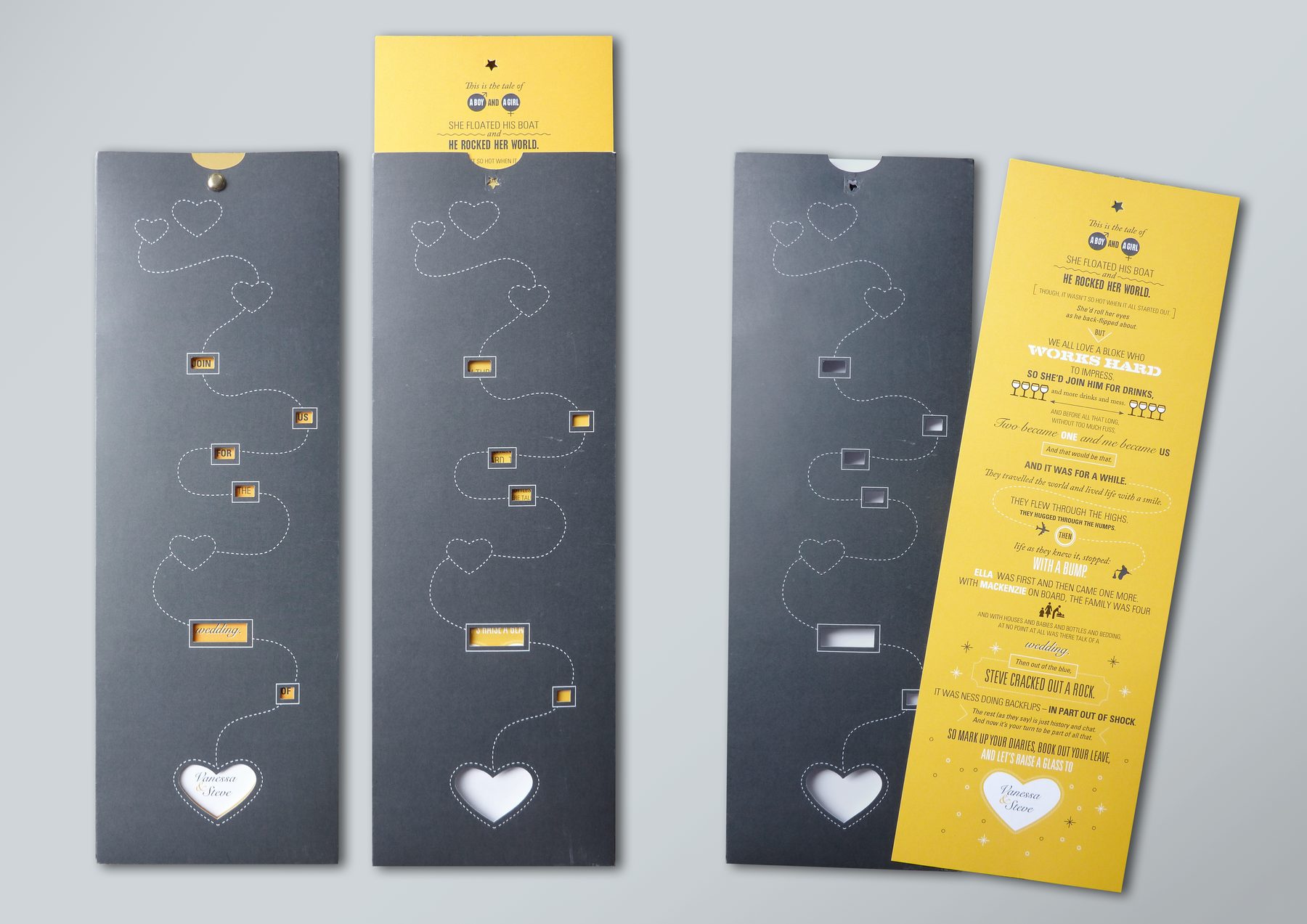
A die-cut invitation in dark grey board with a tall narrow format and die-cut windows revealing a yellow inner card telling the couple’s love story through witty, typographically-led copy. Multiple physical components including outer carrier, pull-out inner and response card. Concept was supplied by a copywriter friend and I ‘made it work’ – designed and illustrated the whole love story, then produced the final artwork, which had to be just right to show the content accurately.
MY ROLE
Design, finished art
AGENCY
Personal project
Beermat Design Competition
Heineken (Ireland)
Design + Layout
10/10
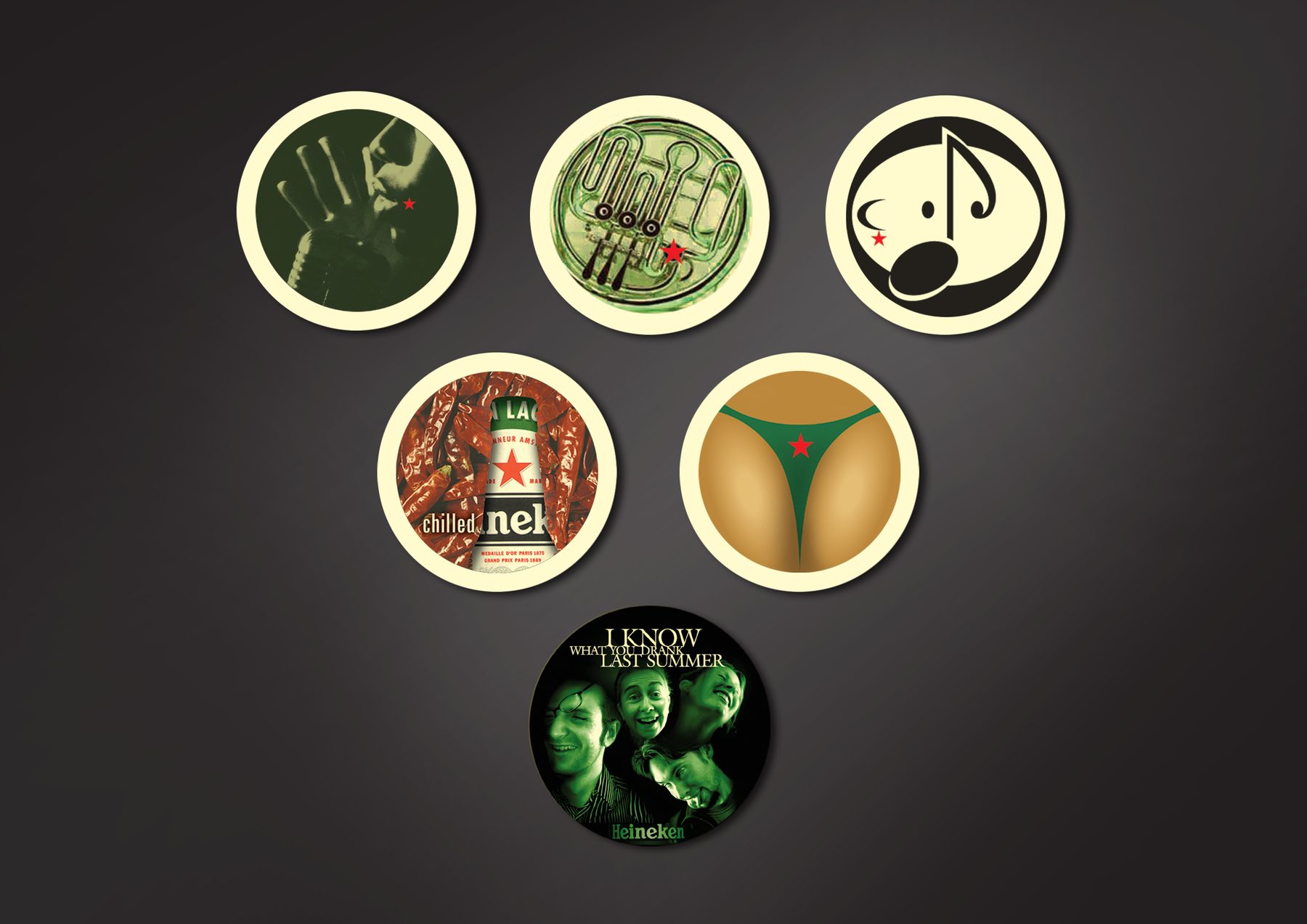
A series of beermat designs entered into Heineken’s monthly design competition. Two category wins from the same series – ‘Music’ and ‘Film’. The ‘Film’ winner was a parody of a well-known late-90s slasher film.
MY ROLE
Design
AGENCY
Personal project
One of the Winners, ‘Music’ category, Heineken Beermat Competition, 2002
One of the Winners, ‘Film’ category, Heineken Beermat Competition, 2002
Animal World
Logos + Related Design Work
1/13
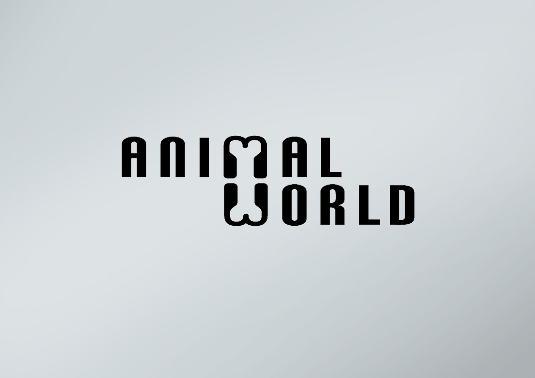
Speculative logo concept for a pet shop. The negative space between M and W reveals a dog bone – a clever, memorable typographic detail. Clean, bold and instantly recognisable.
AGENCY
Madinagoodway
Finance Now
Logos + Related Design Work
2/13
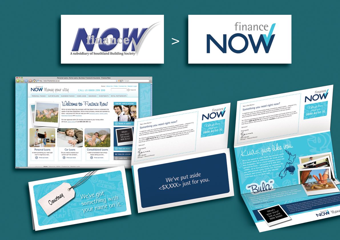
A comprehensive refresh of logo and comms style. Designed the new logo, selected and specified the typeface system for communications, art directed and commissioned custom illustrations, laid out the landing page, and built a DM template plus many DM pieces using it.
AGENCY
justONE, Auckland (Freelance)
Lawfields Orchards
Logos + Related Design Work
3/13
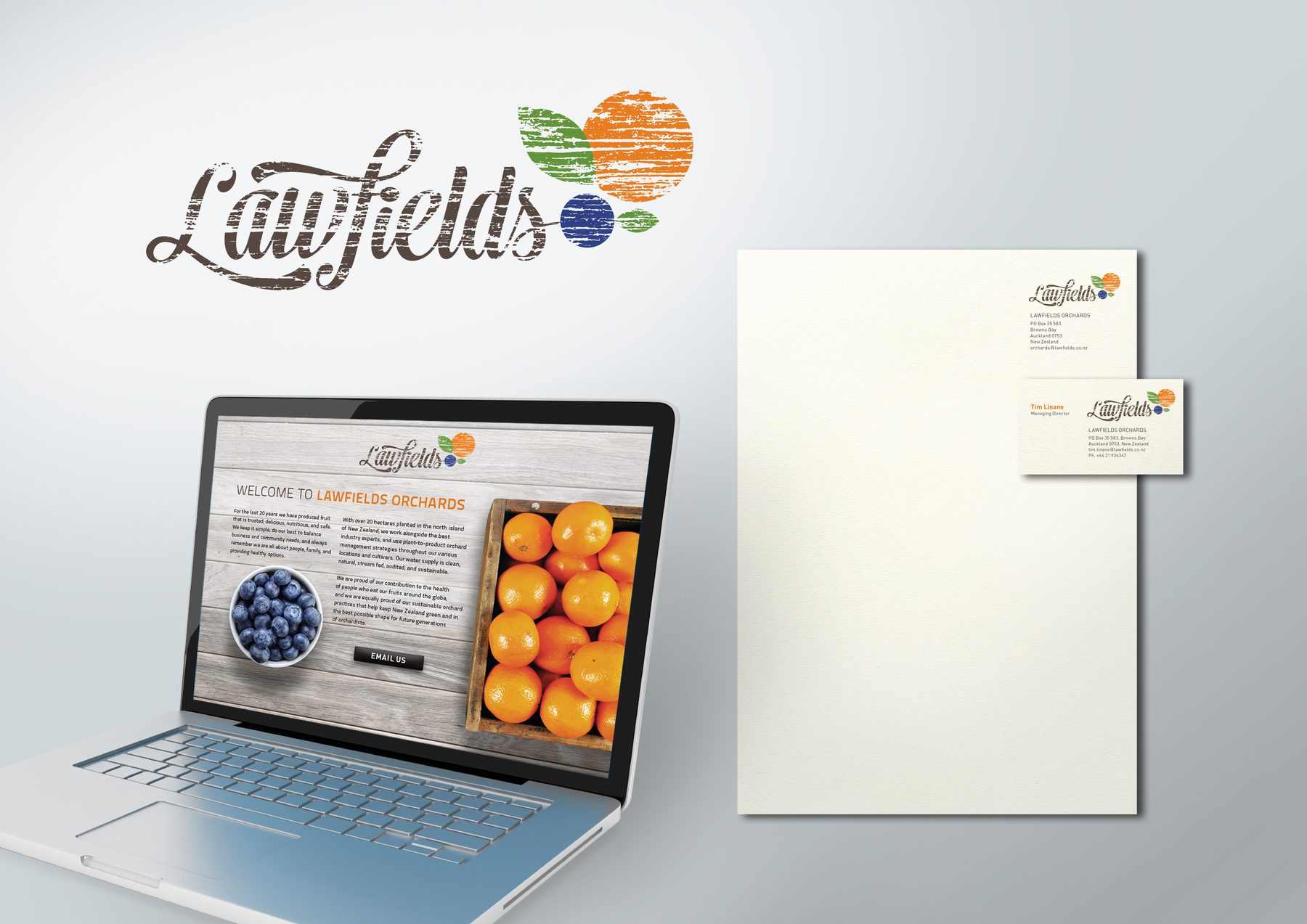
Logo, letterhead, business card and a static homepage mockup with a premium farm-to-table feel, for a North Island orchard business.
AGENCY
Madinagoodway
justONE
Logos + Related Design Work
4/13
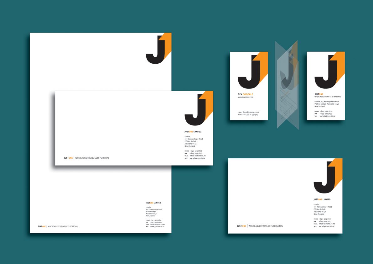
A bold wordmark pairing a geometric ‘J’ with an orange ‘1’ – the angled top stroke of the ‘1’ echoes the leading edge of a direct mail letter caught mid-fold at its first third, referencing the agency’s specialism in personal, one-to-one communication.
AGENCY
Madinagoodway
Fix
Logos + Related Design Work
5/13
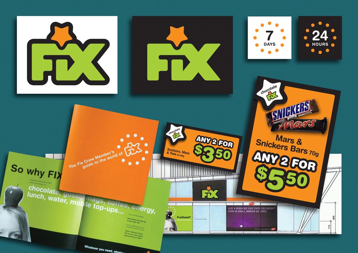
A confident, urban, 24/7 retail identity for Fix (formerly Star Mart). Bold lime green and orange wordmark with a star device as a nod to the Star Mart roots. The full launch suite included a trade brochure (‘The Fix Crew Member’s guide to the world of Fix’), window decals, signage and a range of POS templates from shelf-edge price tags to A0 promotional posters.
AGENCY
justONE, Auckland (Freelance)
Dance Yourself Happy
Logos + Related Design Work
6/13
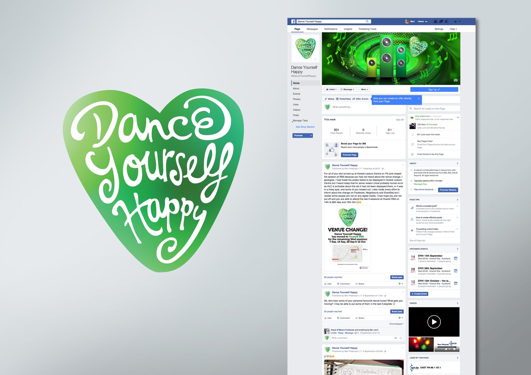
Logo and social media brand identity for a free community drop-in dance initiative, supported by local council funding. The hand-lettered script set inside a green heart is warm, inclusive and full of positive energy – just like the dance sessions I ran.
AGENCY
Personal project (pro bono)
Eden Park Session
Maclean
Logos + Related Design Work
7/13
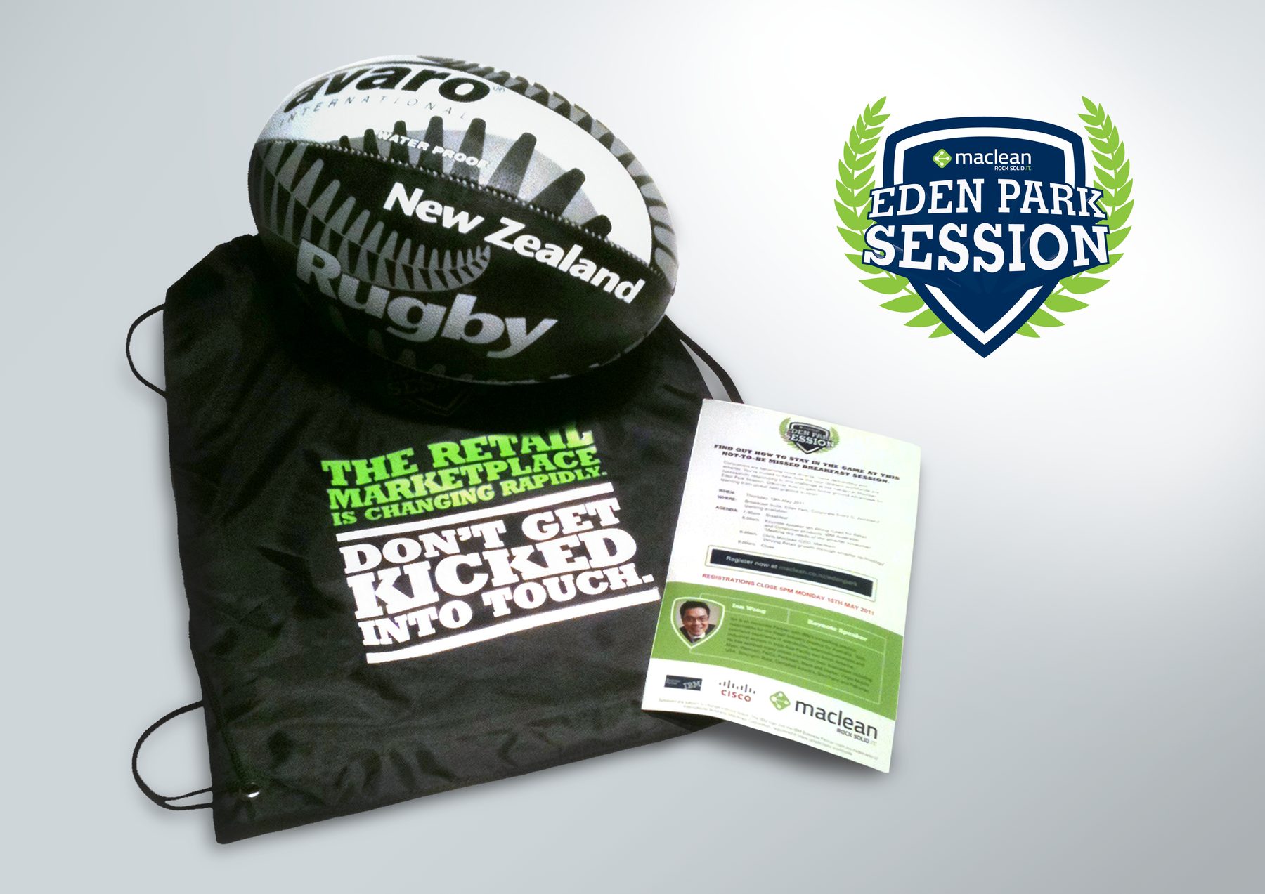
An IT company Maclean organised a B2B networking event, ‘Eden Park Session’, built around a rugby theme and served with breakfast. Designed the logo with a shield/crest device in navy and green with a laurel wreath, and created all the graphics for the event pack, including a printed drawstring bag and an invitation flyer.
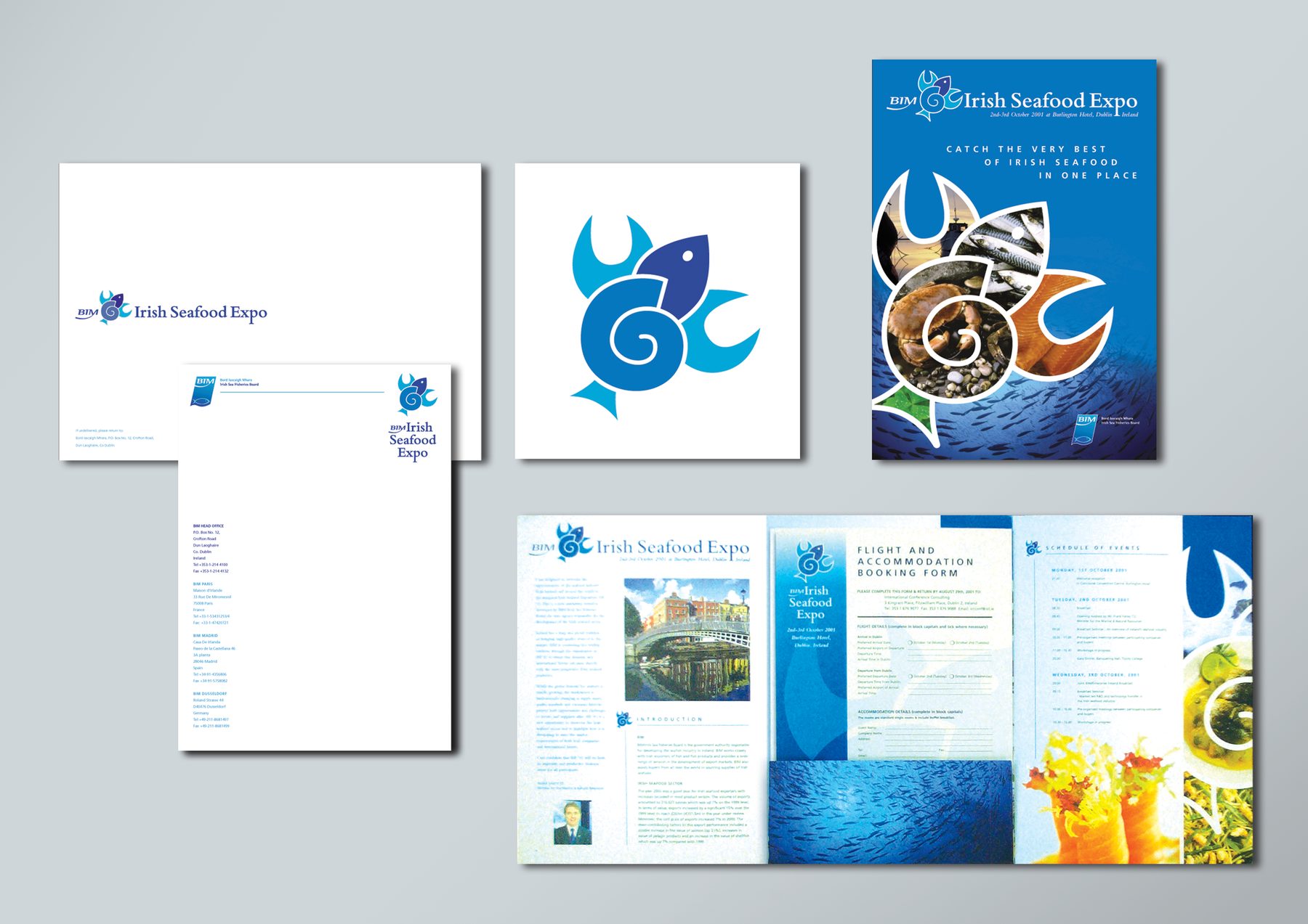
Logo and full visual identity for the Irish Seafood Expo 2001 materials, staged at the Burlington Hotel, Dublin. The icon is a stylised fish and shellfish mark in blue, combining movement and form into a single memorable device.
AGENCY
Dialogue Marketing Communications, Dublin
Be Bold
Bolt of Cloth
Logos + Related Design Work
9/13
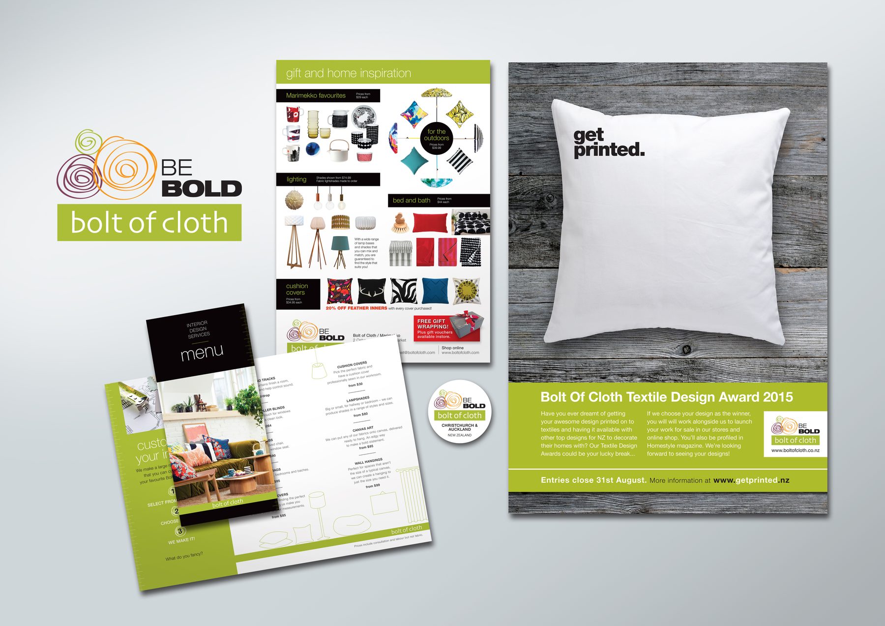
The brief was to beef up the existing wordmark with ‘Be Bold’ messaging. I designed a lockup where three circular hand-drawn elements represent colourful bolts of cloth. Also introduced a more modern typeface and played its weights to add visual boldness to match the messaging. Work included a branded packaging sticker, a flyer with an airy image-led layout, an interior design services brochure, and the Bolt of Cloth Textile Design Award 2015 promotional poster.
AGENCY
Madinagoodway
Safka
Logos + Related Design Work
10/13
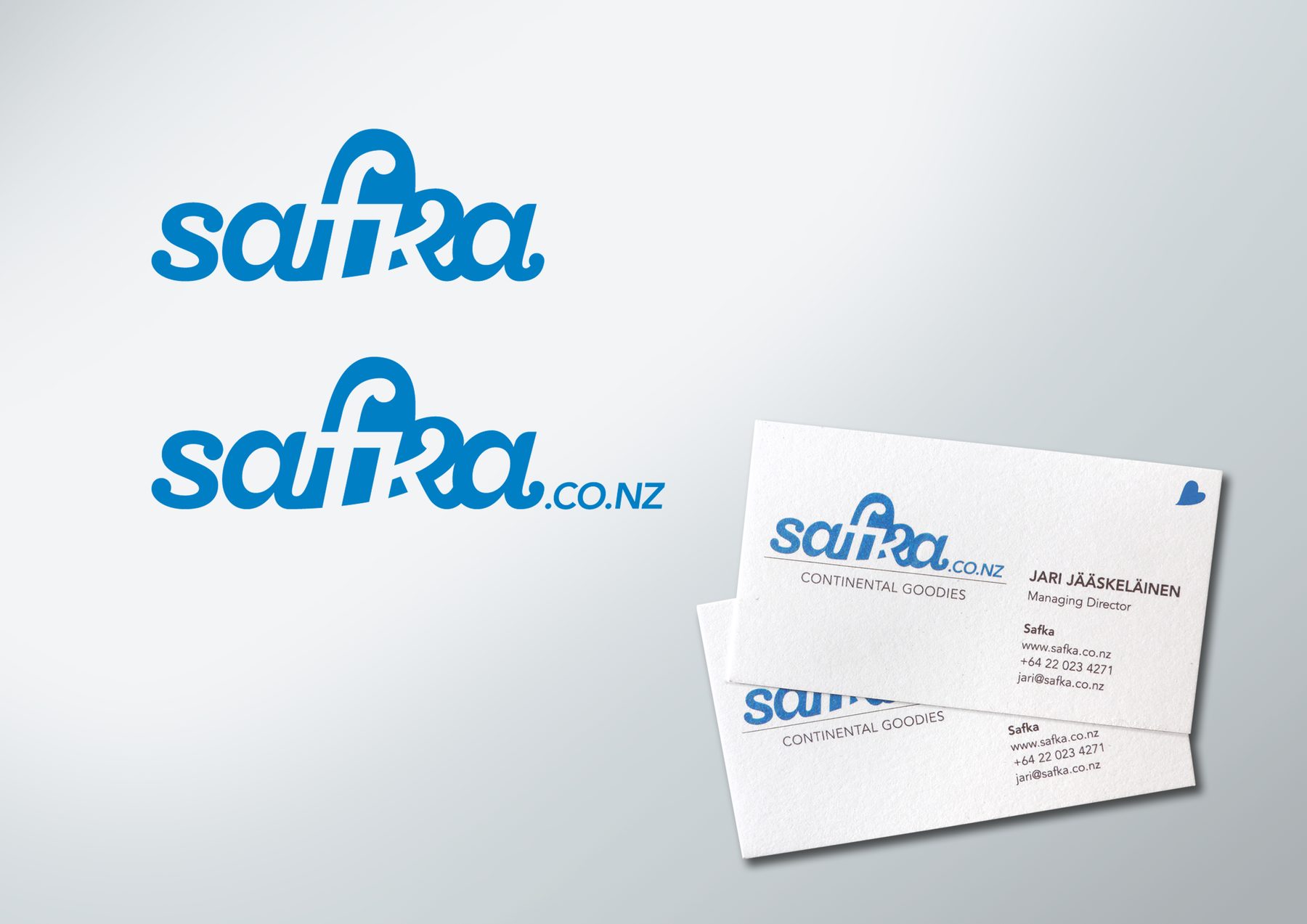
A NZ-based importer of continental European food items. The wordmark incorporates a distinctive f/k ligature flowing through a blue heart – a subtle reference to the owner’s Finnish roots. A small heart device was also designed for selective use in airy corners of communication, such as business cards.
AGENCY
Madinagoodway
Roof Roof
Logos + Related Design Work
11/13
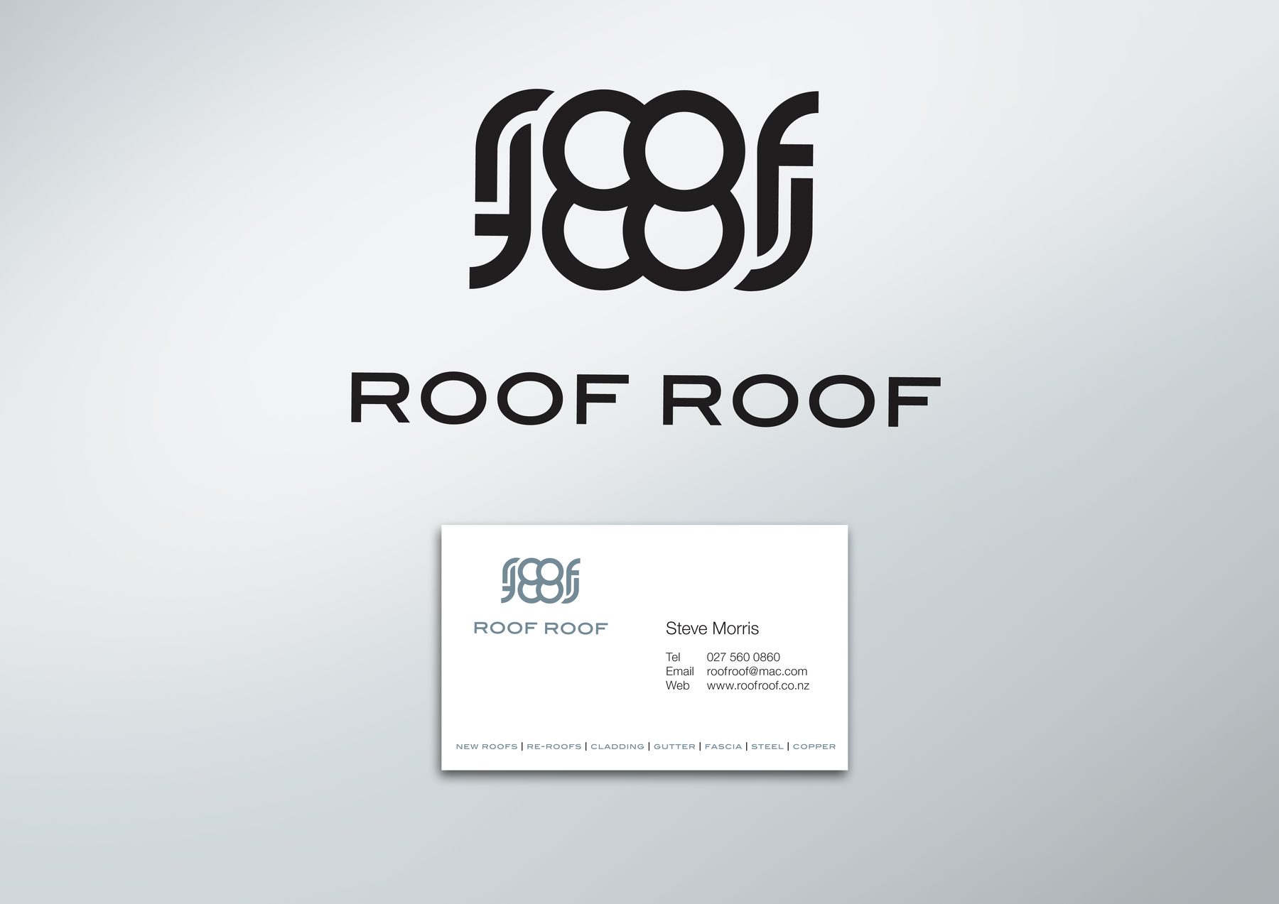
A bold typographic logo for an Auckland roofing company. The mark interlocks the letters of ‘Roof Roof’ into a hard-working wordmark that says more than just the company name.
AGENCY
Madinagoodway (pro bono)
Vanilla Cupcake
Logos + Related Design Work
12/13
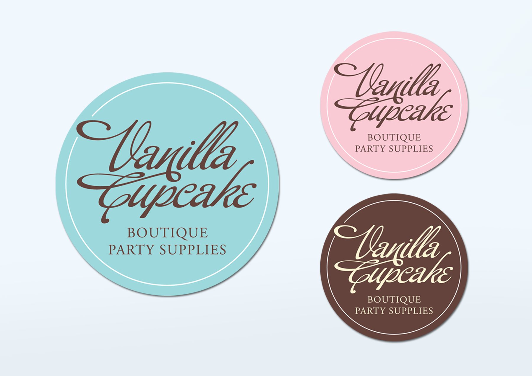
A circular badge logo for a boutique party supplies business. Script lettering sits inside a fine-rule circle, presented in three powdery colourways – teal, pink and chocolate brown – giving the client flexible options across packaging and print.
AGENCY
Madinagoodway
Tiksu
Tiksu Badminton Club
Logos + Related Design Work
13/13
A classic interlocked monogram for a Finnish badminton club I represented at one point in my life. The letters are woven together in a traditional crest style to form the silhouette of a shuttlecock – refined, timeless and well suited to club kit.
AGENCY
Personal project
Limited Edition Tyre Swing
Bridgestone
DM + CRM
1/15
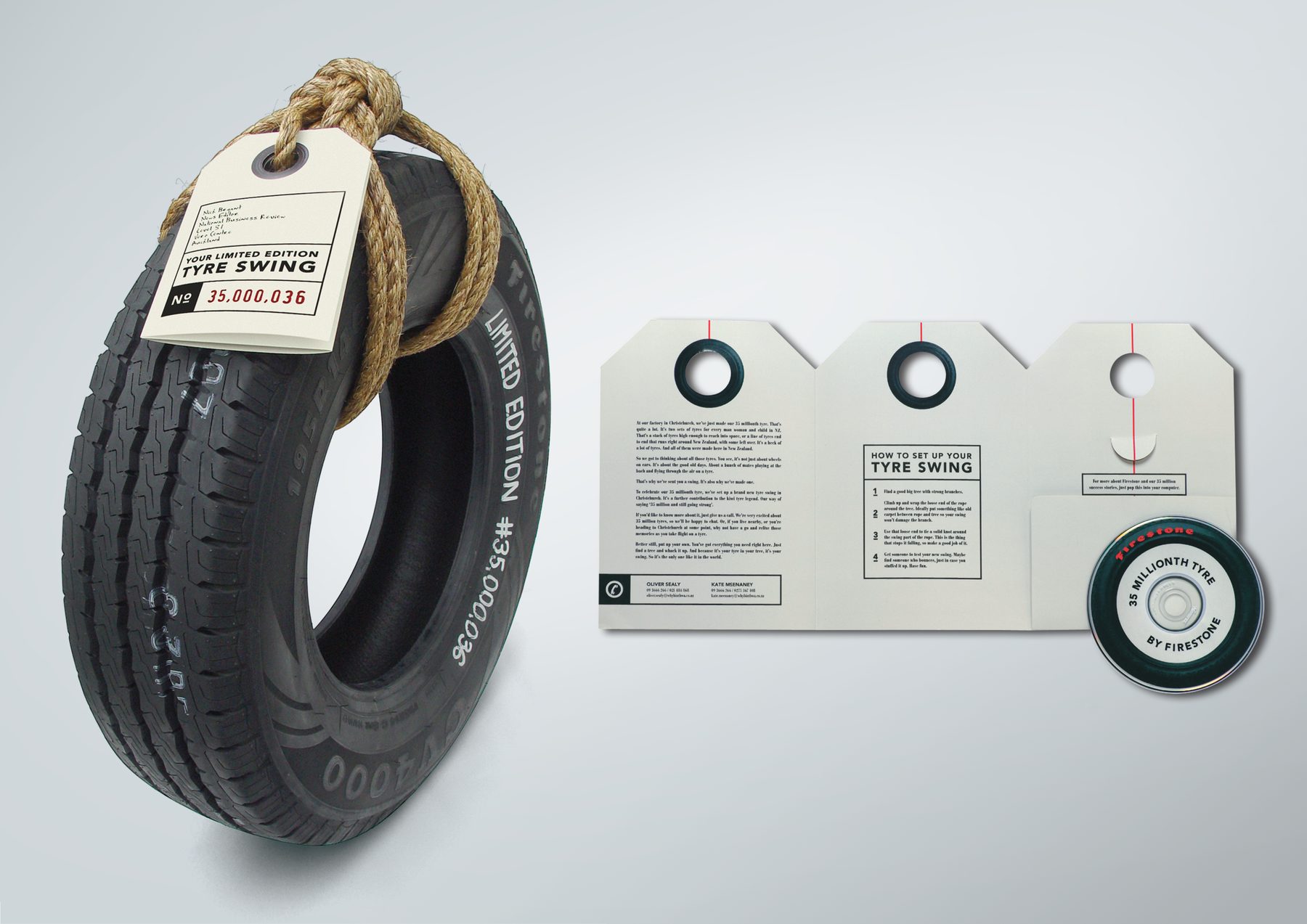
The PR team wanted to mark the 35-millionth tyre off the Bridgestone production line by sending a press release disguised as a tyre swing. Solution we came to together: rope neatly wrapped around the rim to form a handle, with a custom retro-feel tri-fold tag tied on. The press release was printed on the tag, with the last fold revealing a pocket containing a CD of all relevant digital media assets. A pseudo production-line number hand-written by me on each tyre completed the effect, making it a physical, tactile press gift that was impossible to ignore or throw away.
MY ROLE
Design, finished art
AGENCY
TEQUILA, Auckland
Finalist, Craft, RSVP Awards 2006
One Team
ASB
DM + CRM
2/15
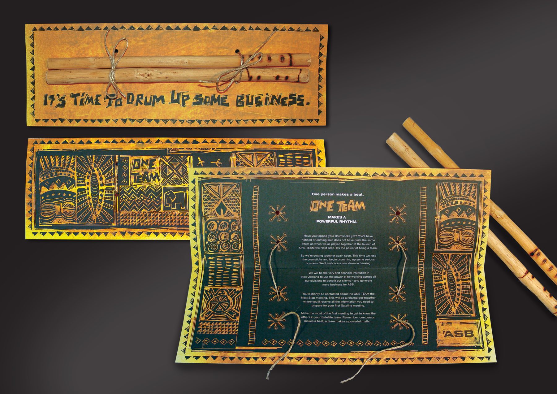
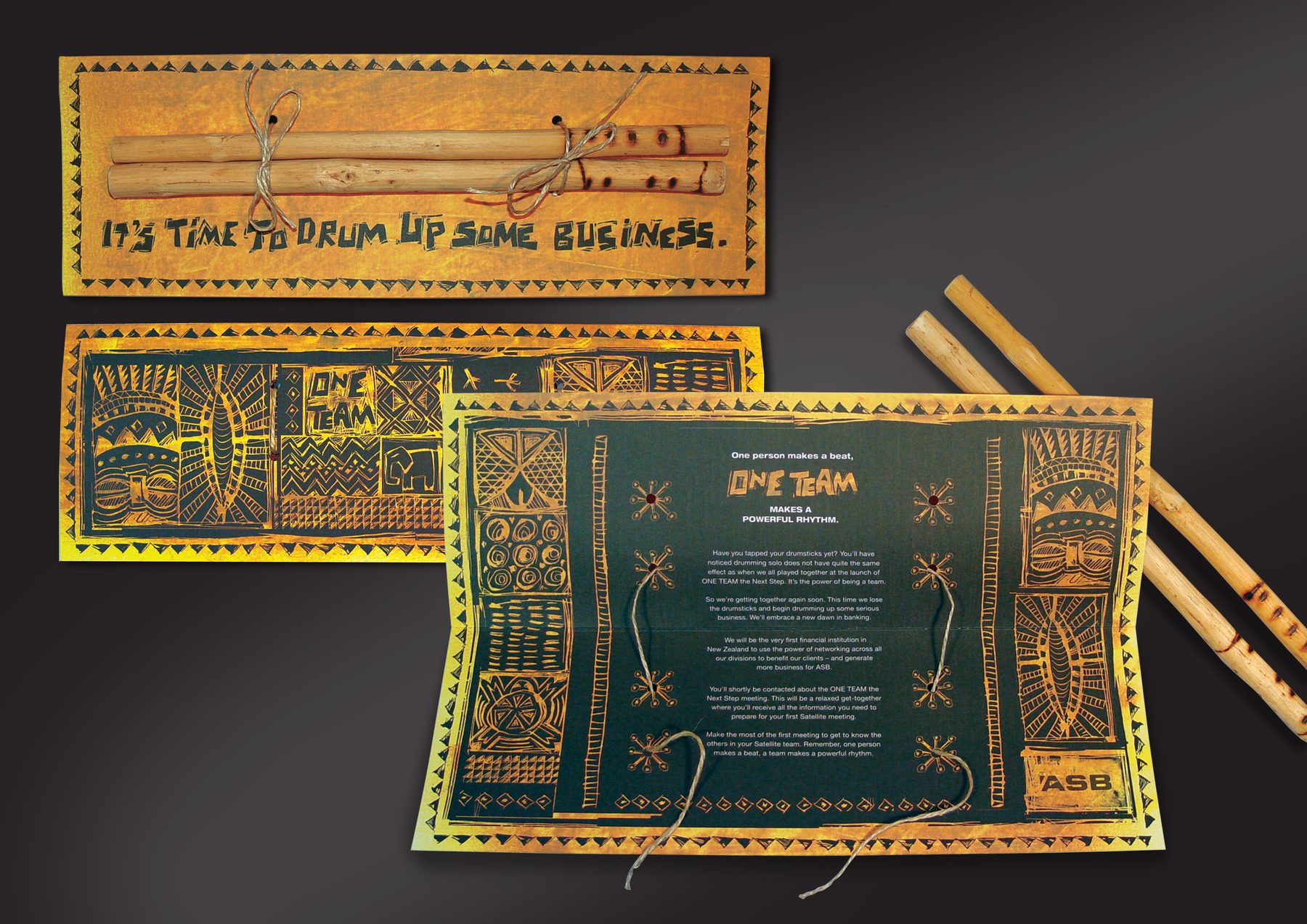
An invite for a BeatsWork-style group drumming team-building event for the company. I illustrated the visuals to reflect the tribal nature of the event and sourced drumsticks from Nigeria to be sent as part of the pack, and it all worked out for the best. The physical packs were assembled and tied by hand in the office by a diligent team, me included!
MY ROLE
Art direction, illustration, finished art
AGENCY
TEQUILA, Auckland
Cut Out the Big Guy
Woosh
DM + CRM
3/15
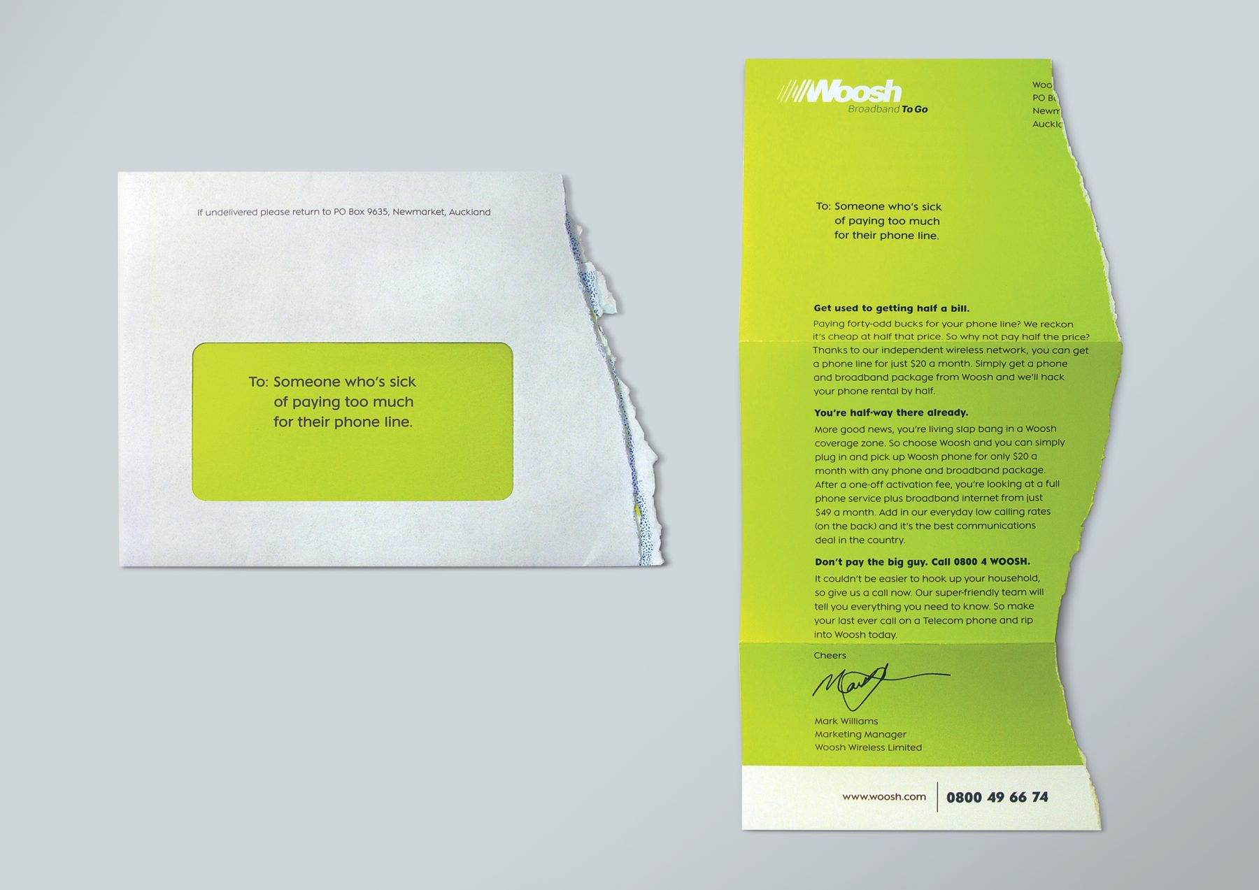
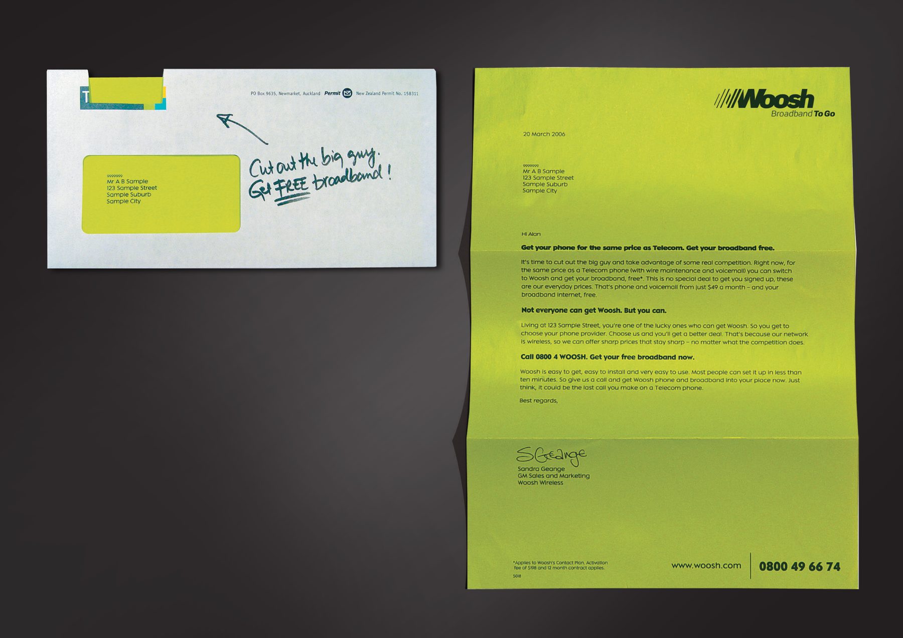
Straight-talking acquisition DM for Woosh’s independent wireless network, built entirely around their anti-Telecom challenger positioning. No hedging, no corporate softening – just a direct, confident case for switching. Concepted with a copywriter.
MY ROLE
Concept, art direction, design
AGENCY
TEQUILA, Auckland
Bronze, Art of the Envelope Awards 2006
Finalist, Craft, RSVP Awards 2006
Half a Bill
Woosh
DM + CRM
4/15
The proposition – halving your phone bill – demonstrated in the most direct way imaginable: the DM itself arrived as two halves. One of several ideas explored in the usual creative team process; this was the one that made it through. Concepted with a copywriter.
MY ROLE
Concept, art direction, design
AGENCY
TEQUILA, Auckland
Upsize Your Summer
GE Money
DM + CRM
5/15
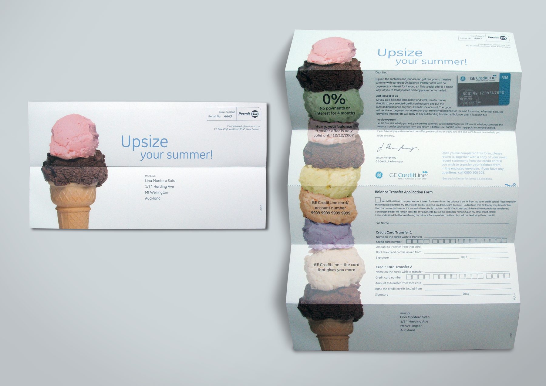
A melting hot balance transfer DM with a tease-and-reveal mechanic at its heart. When opened, it revealed the benefit in the sweetest of ways. Concepted with a copywriter.
MY ROLE
Concept, art direction, finished art
AGENCY
G2, Auckland
A Love Story
Ziera
DM + CRM
6/15
We received the theme and abundant campaign assets from the above-the-line agency. The DM and CRM components of this campaign were mine to originate – extending the look and feel consistently across all touchpoints from envelopes through to the brochure, and executing everything to finished art. The brochure for the same campaign appears separately under Design + Layout.
MY ROLE
Design, finished art
AGENCY
justONE, Auckland (Freelance)
Apology
TBWA\TEQUILA, Auckland
DM + CRM
7/15
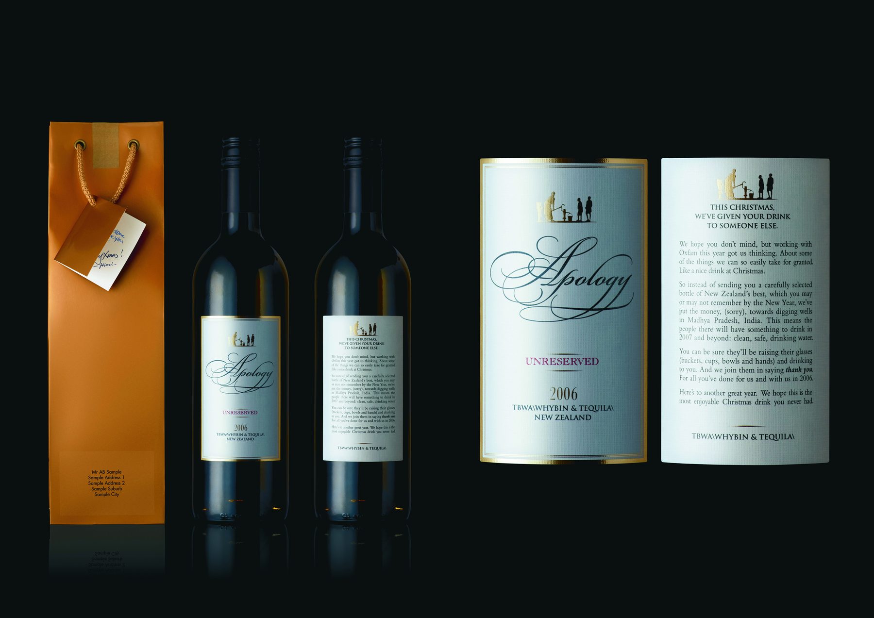
Instead of the usual agency Christmas bottle, the idea was to redirect that budget to fund clean water in a country that needed it – and make that the message. Developed with a copywriter and creative director pair; the concept evolved from a bottle of dirty water into something more refined: an empty wine bottle with a label that told the whole story.
MY ROLE
Ideation, art direction
AGENCY
TEQUILA, Auckland
Loyalty Current Account Welcome Pack
Permanent TSB
DM + CRM
8/15
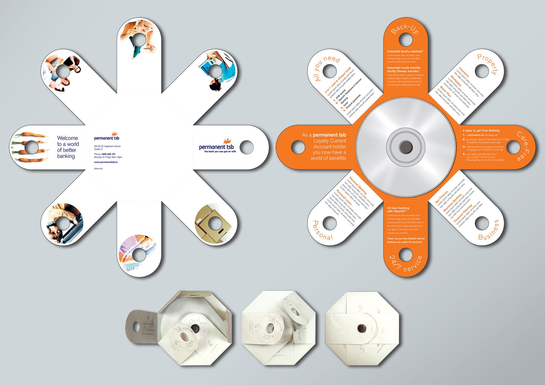
I engineered an innovative self-mailer for a pack that had everything the customer needed to get started. The unfolding flaps revealed key information in digestible chunks – a considered alternative to a bulky welcome envelope.
MY ROLE
Design, finished art
AGENCY
Dialogue Marketing Communications, Dublin
There’s no place like home
Permanent TSB | Save2Buy
DM + CRM
9/15
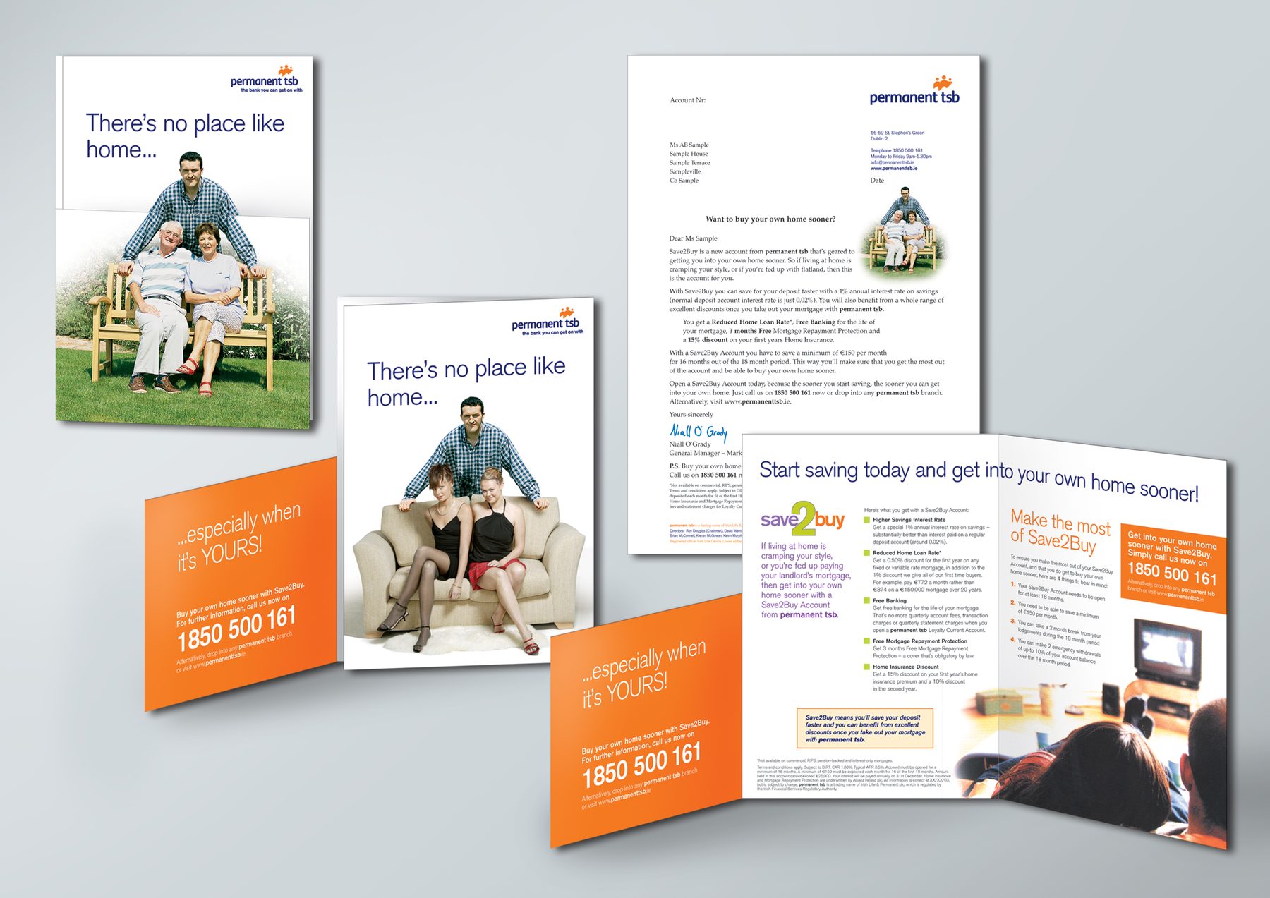
A tease-and-reveal fold aimed at first-home buyers, highlighting one of the benefits of home ownership in a demographic-appropriate, identifiable way. I originated the concept, supervised the photoshoot, selected the final images from a wide range of options, and retouched them to work seamlessly across both tease and reveal states.
MY ROLE
Concept, art direction, finished art
AGENCY
Dialogue Marketing Communications, Dublin
6-Pack
Fitland (Fictious)
DM + CRM
10/15
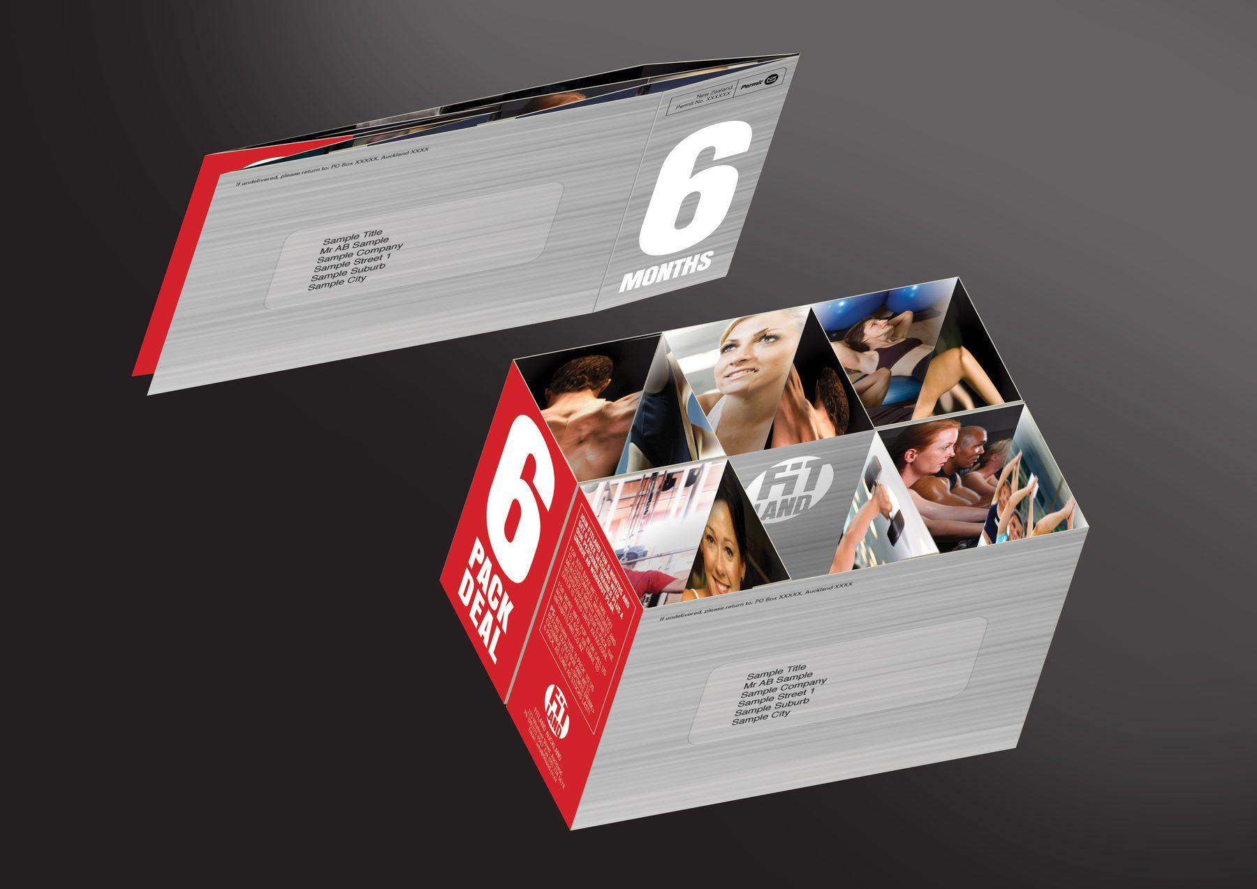
A self-initiated competition entry for a hypothetical fitness brand. The concept borrowed a deployable structure from drinks packaging: the mailer was folded flat to MaxPop size for efficient delivery, then expanded by the recipient to a 6-pack reveal – six individual pockets with aspirational gym imagery inside each. The reward mechanic completed the idea: bring your mailer into the gym on joining and get it filled with six energy drinks to take home.
MY ROLE
Concept, design, finished art
AGENCY
Madinagoodway
Category Winner, Art of the Envelope Awards
Empty
Depression Helpline
DM + CRM
11/15
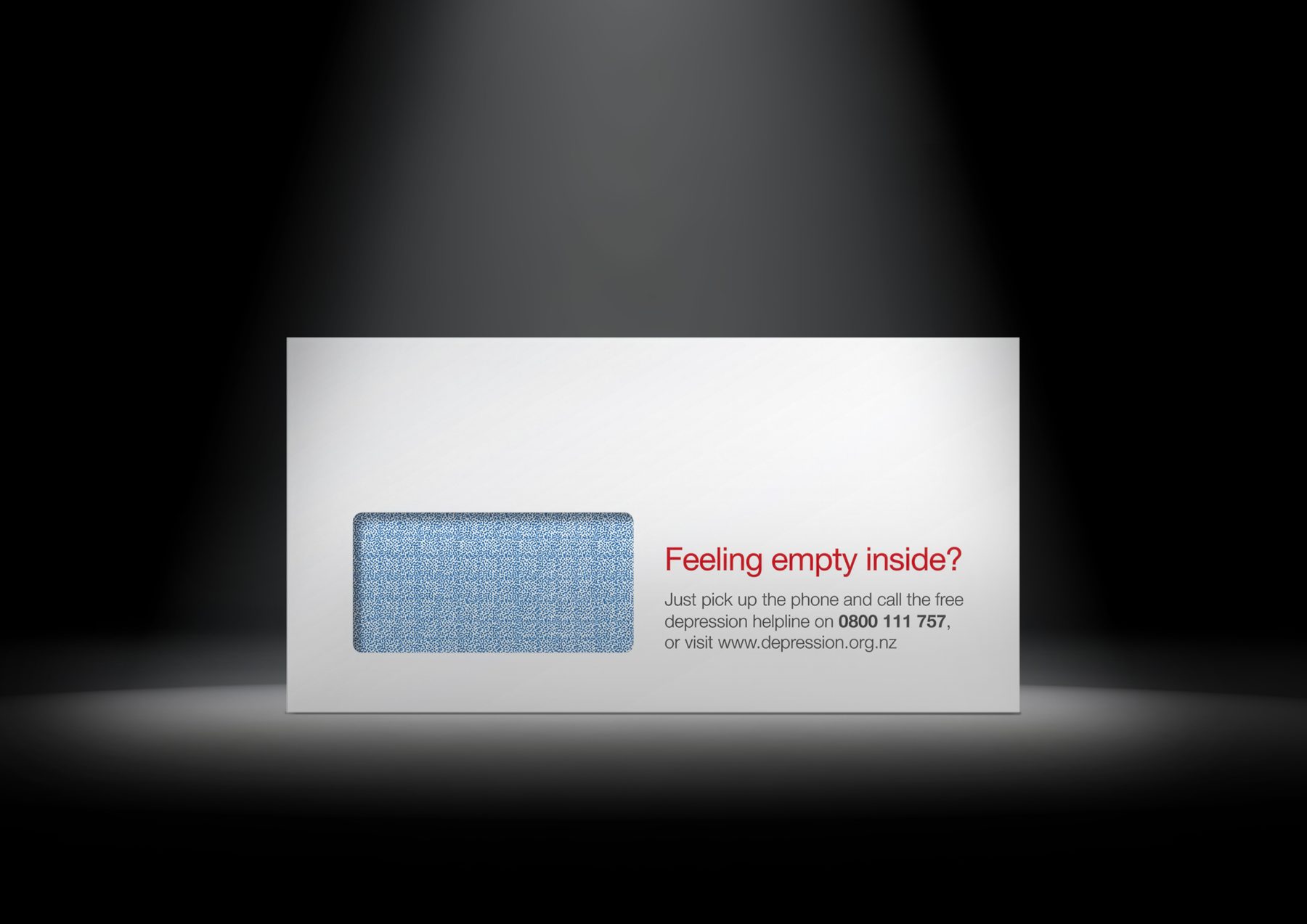
A self-initiated speculative competition entry. The envelope was the concept: ‘Feeling empty inside?’ printed on the outside, with a real depression helpline number. Nothing else needed. A simple, empathetic idea that used the medium as the message.
MY ROLE
Concept, design, finished art
AGENCY
Madinagoodway
Transformer
The Film Squad (Fictious)
DM + CRM
12/15
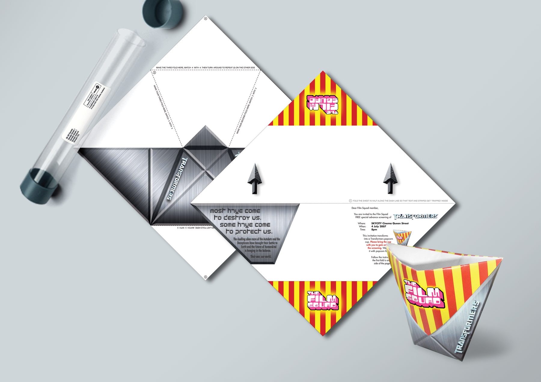
A self-initiated competition entry. The speculative DM would arrive in a transparent, futuristic tube – and challenge the recipient to fold the contents into a popcorn holder, which doubles as a redemption device for a free serving at the cinema.
MY ROLE
Concept, design, finished art
AGENCY
Madinagoodway
Switch for Free Spotify Premium
Telecom (pre-Spark)
DM + CRM
13/15
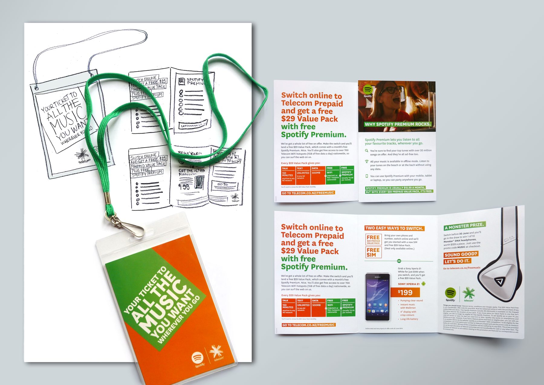
An unaddressed letterbox piece promoting free Spotify Premium as a switching incentive. Presented as a VIP pass – lanyard pouch included – making the offer feel like access to something exclusive rather than a standard acquisition push. Concepted with a copywriter.
MY ROLE
Concept, art direction
AGENCY
RAPP (Freelance)
WinWin
Lotto NZ
DM + CRM
14/15
‘WinWin’.
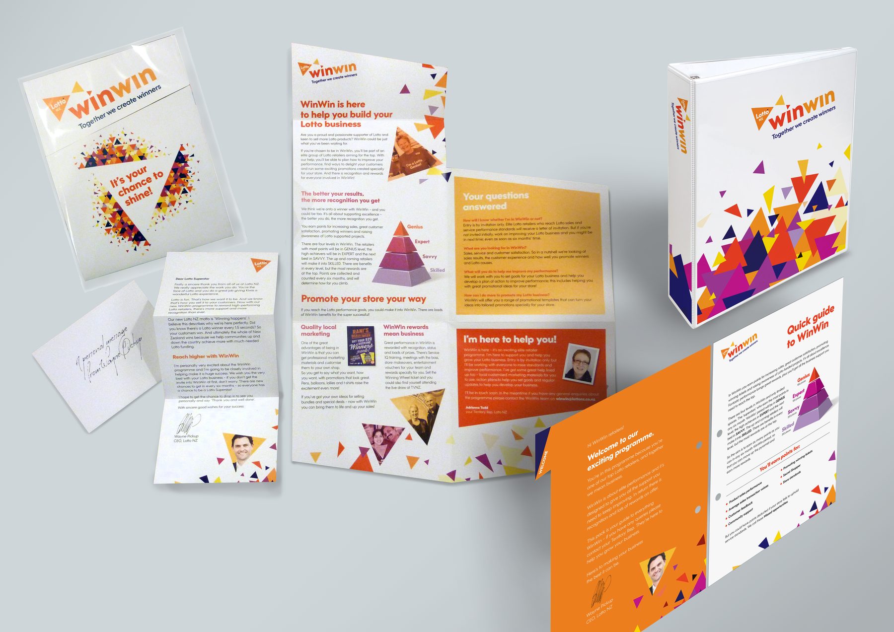
WinWin is (or was) an elite retailer partnership programme designed to give Lotto NZ’s top 600 retailers the support they need to improve as a business. As part of the initial activities, I engineered this innovative multi-fold self-mailer from an SRA3 sheet and worked with a copywriter to tailor copy for each panel once the reveal order was clear. Designed using supplied brand assets, complemented with a custom 3D pyramid tier graph and other appropriate imagery. I also designed the WinWin guide with comprehensive tabbed sections containing everything about the programme itself.
MY ROLE
Format, design, layout, finished art
AGENCY
Chemistry Interaction (Freelance)
Where2next
BMW
DM + CRM
15/15
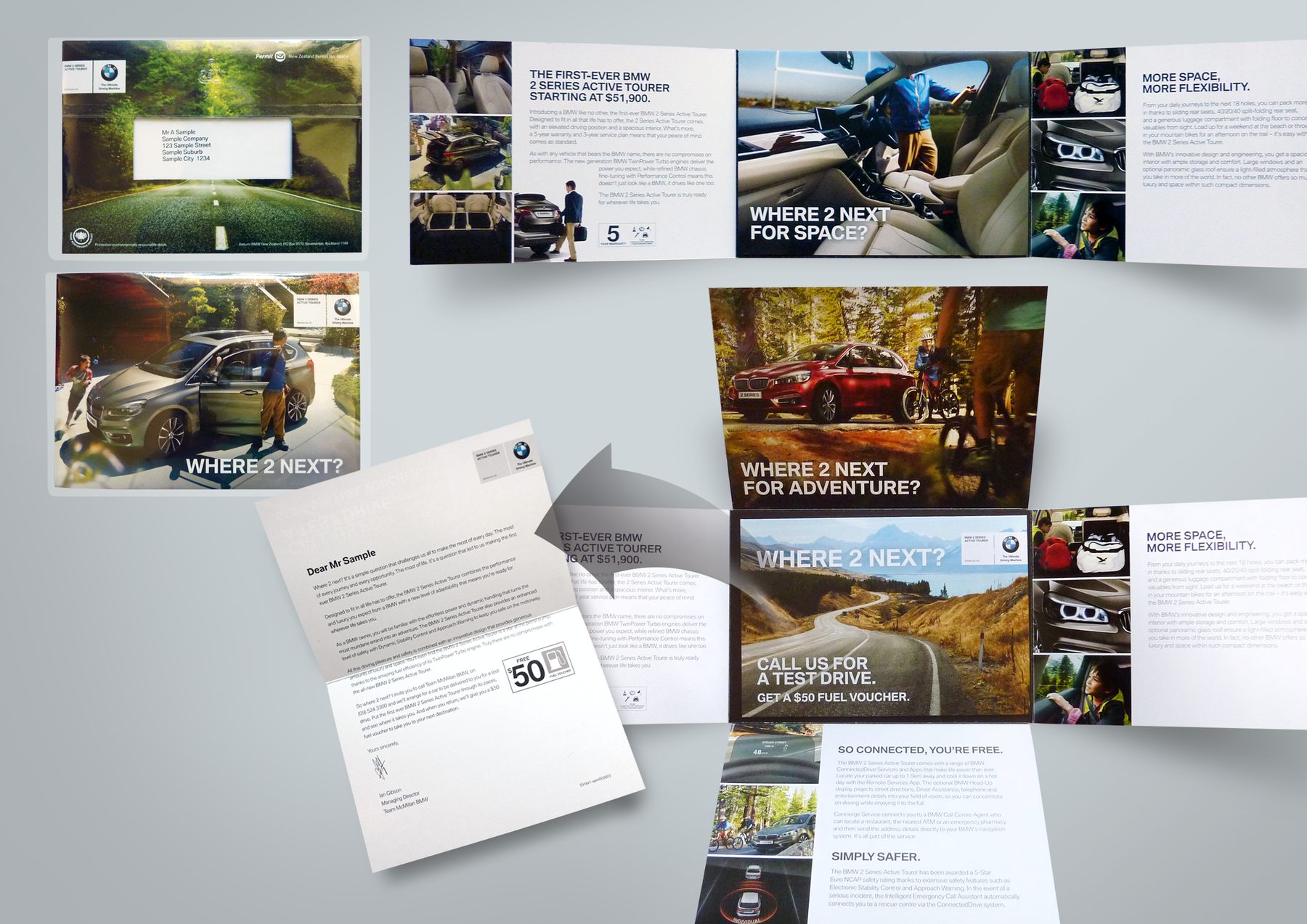
As with most global mega brands, BMW had a TVC for a new car that needed test-driving. I came up with a quad cross-fold DM with a personalised mini letter that doubled as the address carrier through a window when nested inside. European imagery was supplied but reworked and art directed to feel relevant to the local market.
MY ROLE
Format, art direction
AGENCY
RAPP (Freelance)
Don’t Buy Crap This Christmas
Oxfam
Digital + OOH + Motion
1/12
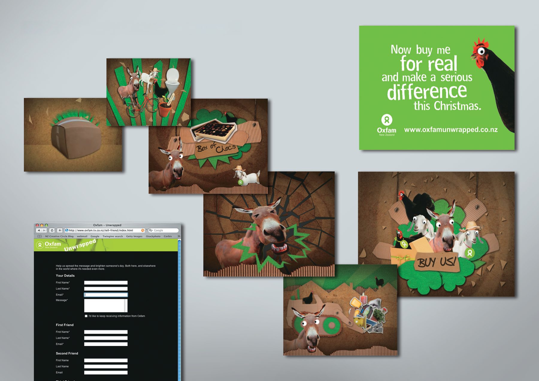
‘Oxfam Unwrapped’ is a project offering charity gift cards that do good. Each card represents a donation helping to transform the lives of people living in poverty. For example, a Chicken gift card helps families living in poverty to become chicken farmers.
Christmas was approaching fast and Oxfam wanted a campaign that would go viral and get people talking. Together with copywriter Michael Goldthorpe we came up with an idea of the giftable animals becoming the spokespersons for the campaign as stars in a fun music video, singing ‘Buy me!’
I drew the moodboard as a storyboard for the production company. Our above-the-line team, who happened to be semi-pro musicians, wrote and performed the original music, and a legendary VO artist was recruited for the video narrator role. Together with the production crew, Goldthorpe and I gave our voices to the animals. A true shoestring budget group effort.
During the first review, I suggested a content edit that became one of the many memorable moments in the spot: the donkey singing ‘Buy me’ so high it breaks the screen! Check it out here.
MY ROLE
Concept, storyboard, production direction, voiceover
Top 10 NZ campaigns across all media, The Big Won 2008
Design a Gift Card
Subway
Digital + OOH + Motion
2/12
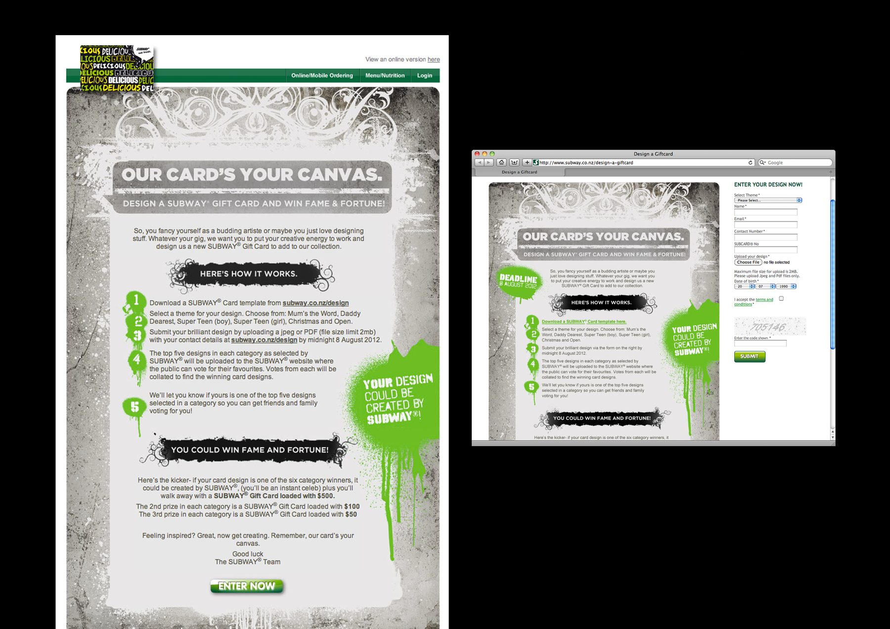
Front-end art direction and design for an eDM promotion. Received the concept and copy, produced mockup designs using stock shots, and selected a secondary font for campaign callouts. Handed over to a digital developer to build.
MY ROLE
Design, art direction
AGENCY
justONE, Auckland (Freelance)
Various digital work
Subway
Digital + OOH + Motion
3/12
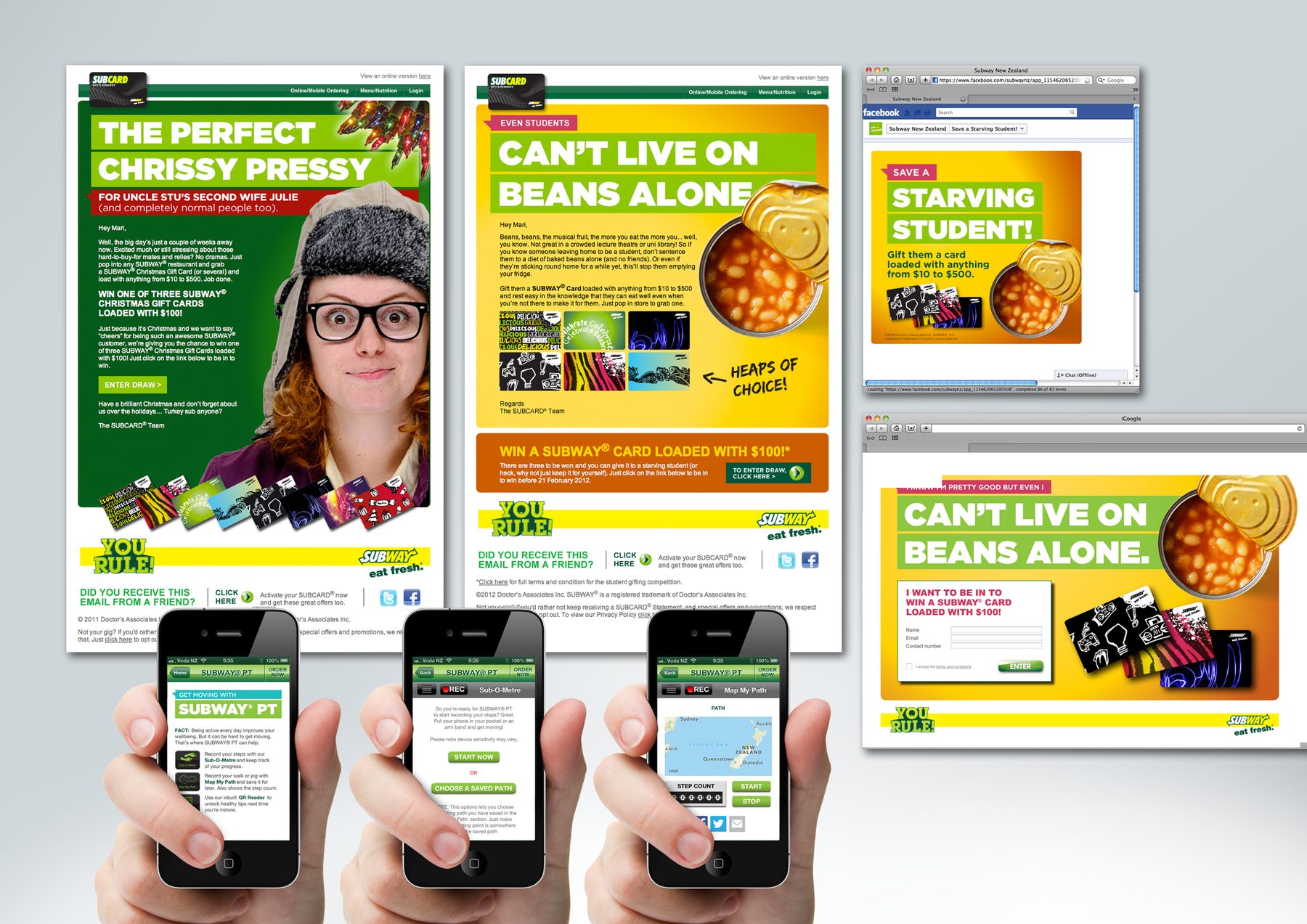
Front-end art direction and design across a range of digital communications: eDMs, landing pages, and a Personal Trainer app. For the eDMs and landing pages, copy was supplied and I art directed and produced mockup designs using stock shots. For the Personal Trainer app, I art directed and created all designs and icons from scratch. All pieces handed over to a digital developer to build.
MY ROLE
Design, art direction
AGENCY
justONE, Auckland (Freelance)
Pink Caravan
NZ Breast Cancer Foundation
Digital + OOH + Motion
4/12
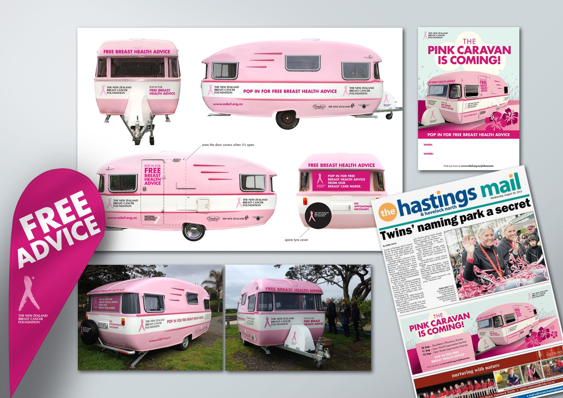
The client had purchased a caravan to serve as a mobile breast health clinic. Working from supplied photos and technical drawings, I designed the full exterior wrap for all sides. Deliverables also included regional newspaper ads (one version per city/region), a poster template, and posters and flyers for inside the caravan.
MY ROLE
Design, vehicle wrap art direction, finished art
AGENCY
Madinagoodway
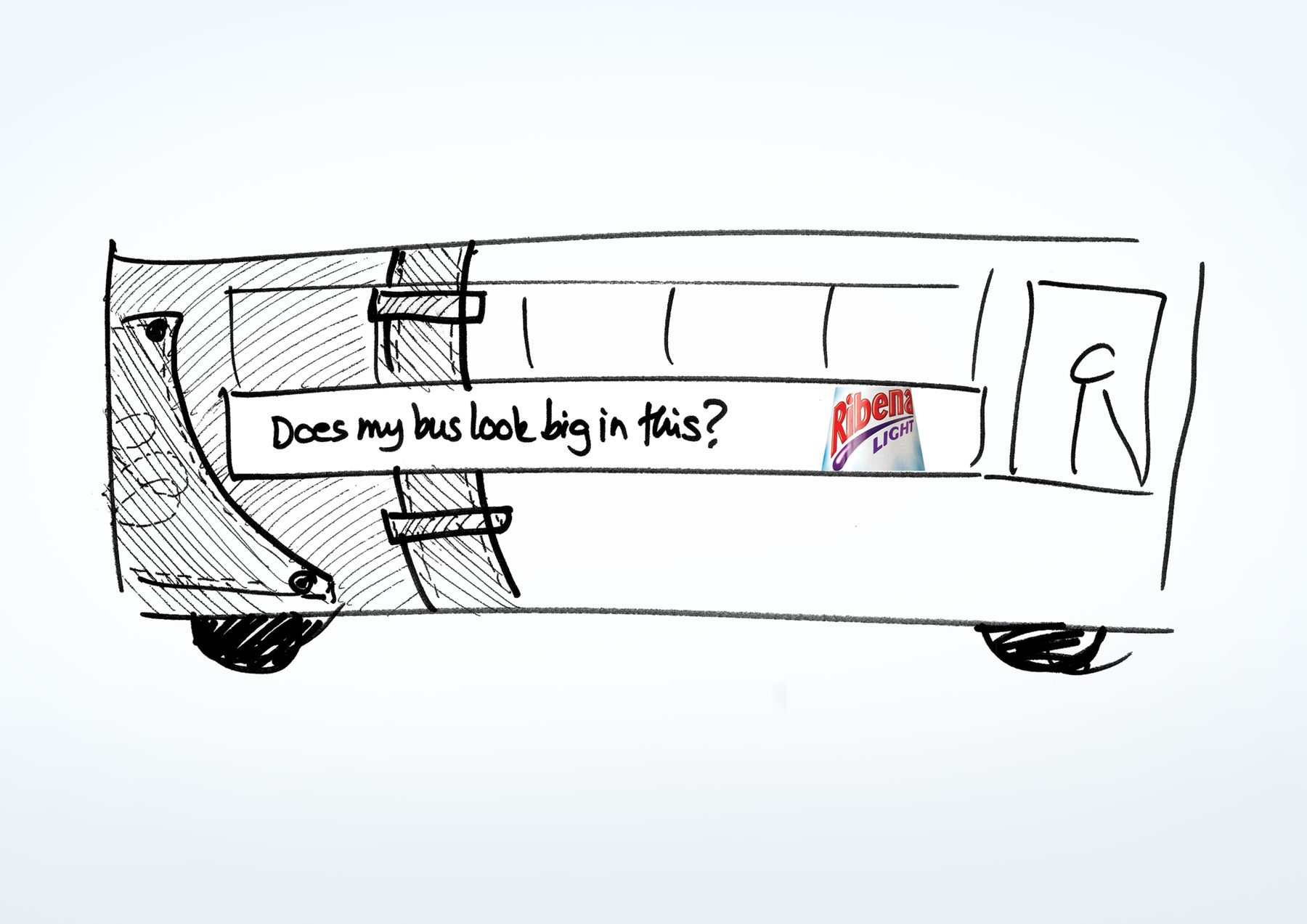
Does my bus look big in this?
GSK | Ribena Light
Digital + OOH + Motion
5/12
A bus back oozing cheeky body-confidence for a light drink, vehicle wrap that turns heads for all the right reasons. Not confirmed whether this was ever presented to the client.
MY ROLE
Concept, copy
AGENCY
G2, Auckland
Wedding Expo stand
Les Mills
Digital + OOH + Motion
6/12
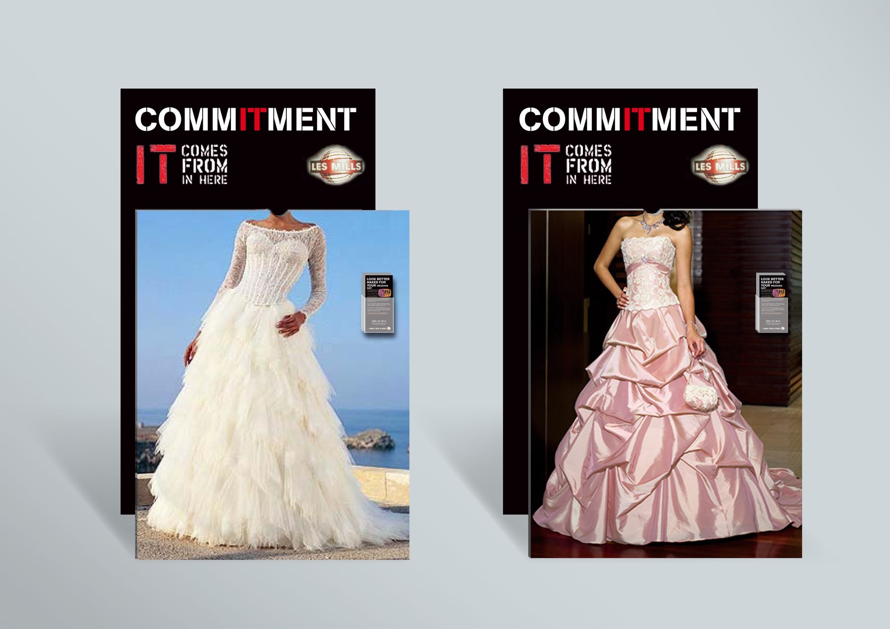
A blue-sky concept for an expo stand where visitors can take photographs in the perfect wedding dress with the perfect figure. A discreet pocket houses flyers promoting fitness classes – no staff required. Not confirmed whether this was ever presented to the client.
MY ROLE
Concept, design
AGENCY
G2, Auckland
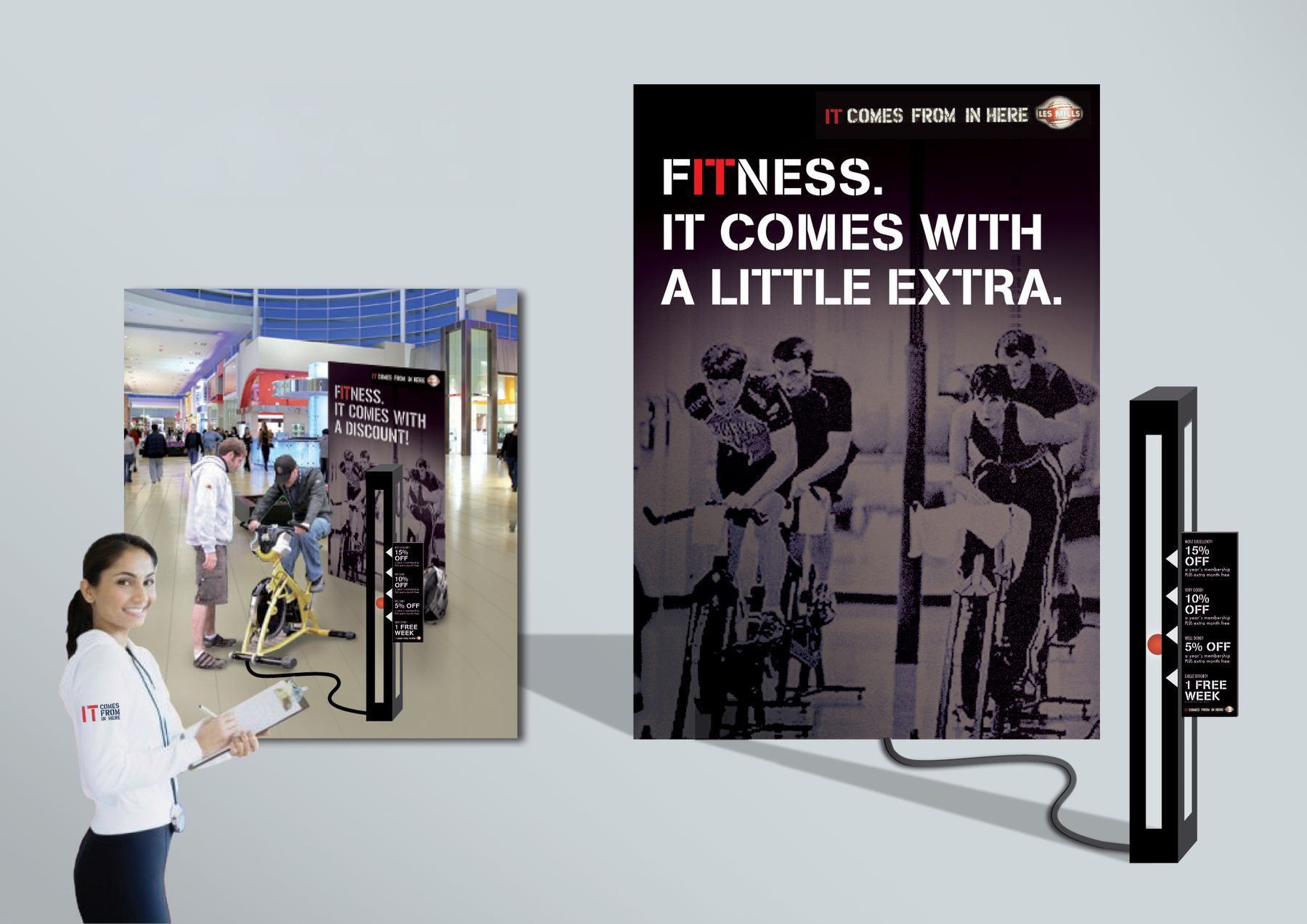
Pedal for Discount
Les Mills
Digital + OOH + Motion
7/12
Stationary bikes placed in shopping centre environments, with membership discount rewards scaling to pedalling speed. The product becomes the activation. Not confirmed whether this was ever presented to the client.
MY ROLE
Concept, design
AGENCY
G2, Auckland
Travelling with three stripes
Adidas
Digital + OOH + Motion
8/12
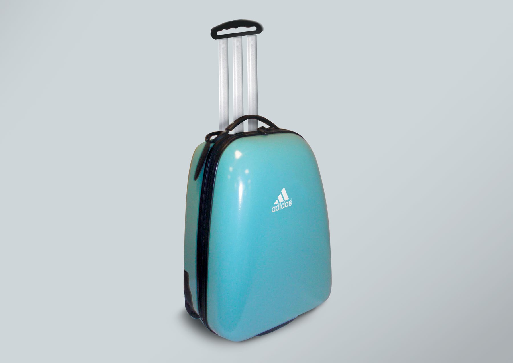
A self-initiated speculative concept exploring branded luggage for Adidas, who was a client at the time. Not confirmed whether this was ever presented to the client.
MY ROLE
Concept, design
AGENCY
TBWA\TEQUILA
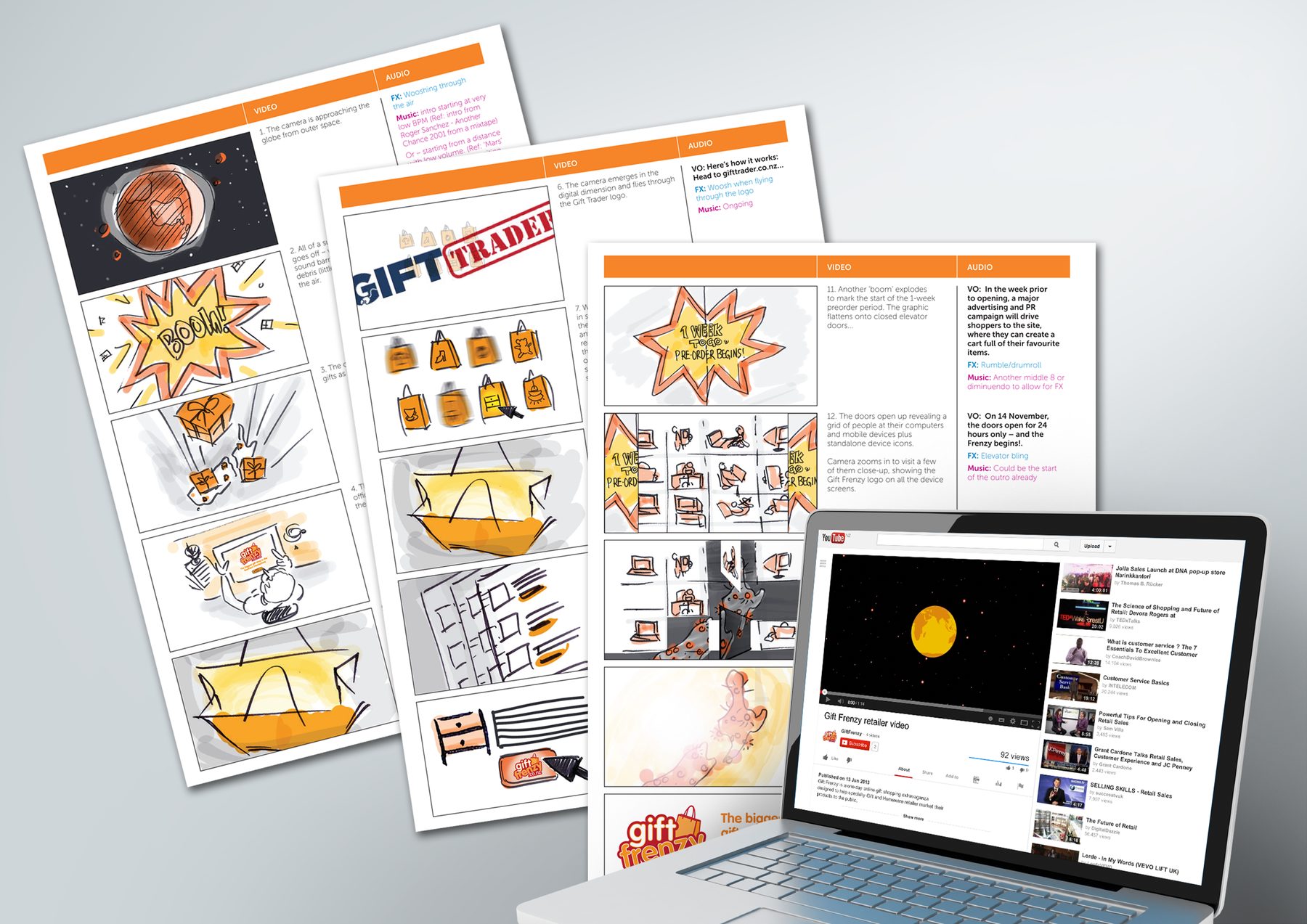
Gift Frenzy retailer video
XPO
Digital + OOH + Motion
9/12
Gift Frenzy was an online gifting platform. This launch video was aimed at trade – retailers and brands being invited to list on the site. I developed the storyboard, worked with the copywriter on messaging, commissioned the soundtrack, and supervised its production end to end.
MY ROLE
Concept, art direction, sound procurement & direction
AGENCY
Chemistry Interaction (Freelance)
Data disaster gamble
IBM
Digital + OOH + Motion
10/12
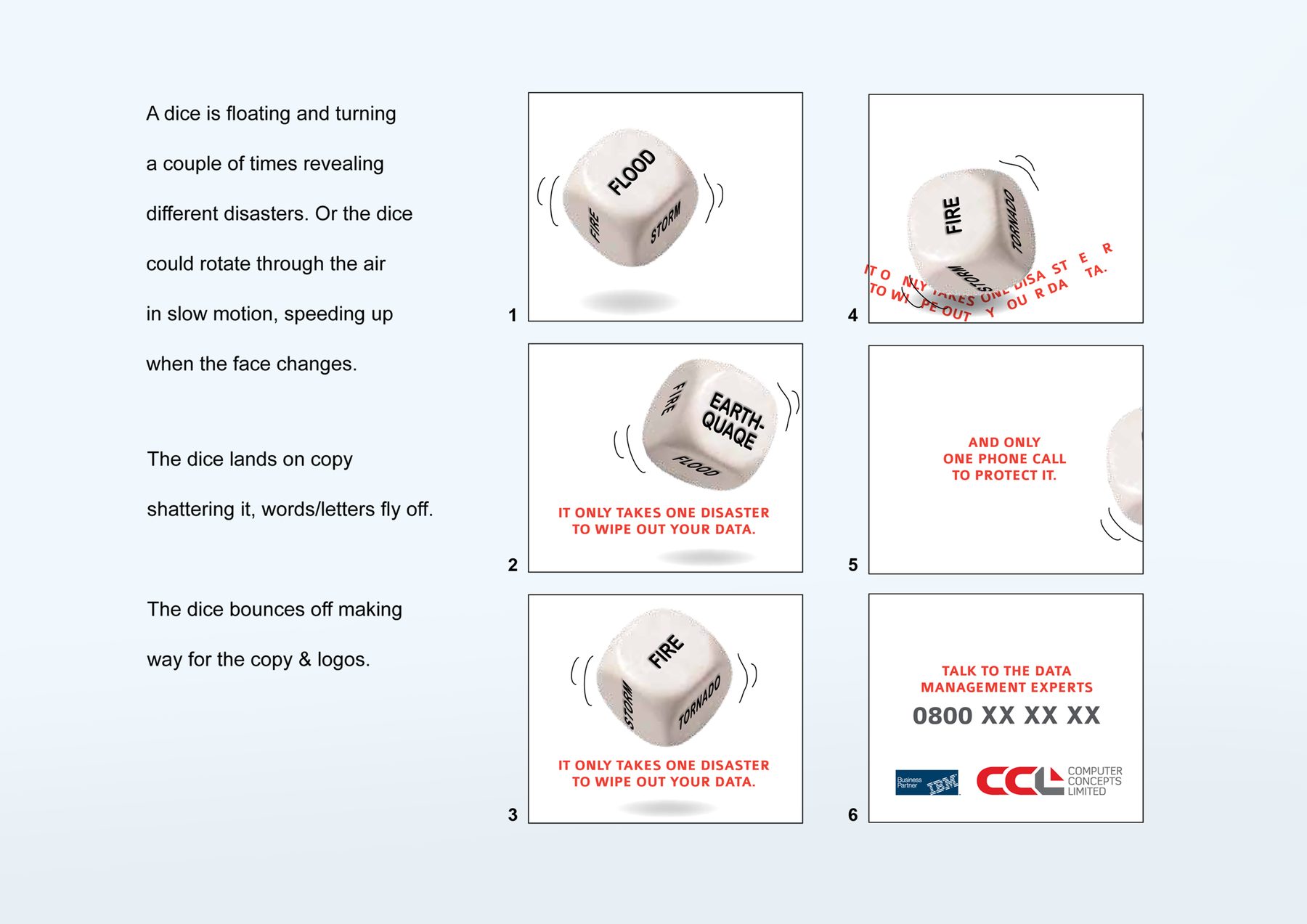
An animated banner ad concept. The brief was clear: ‘It only takes one disaster to wipe out your data.’ Working from that, I developed the idea of a rotating die revealing disaster scenarios – flood, fire, earthquake – landing on that line. Simple and punchy, well suited to the banner format.
MY ROLE
Concept development, storyboard
AGENCY
justONE, Auckland (Freelance)
Thank you for not printing this
DLB Magazine
Digital + OOH + Motion
11/12
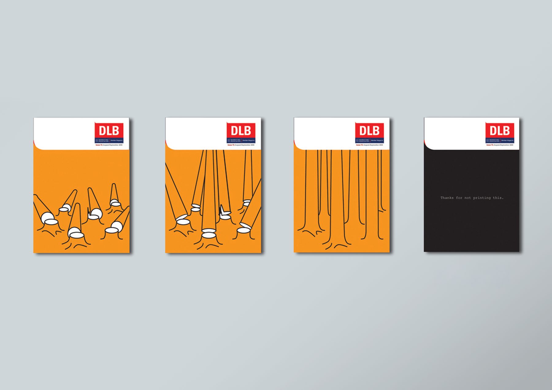
The DLB Sustainability e-issue, produced by the Marketing Association of New Zealand, needed a cover. The copy line was supplied; the rest was open. I thought of a ‘reverse tree-felling’ animation where felled trees rise back up by themselves. I created a static forest illustration in Adobe Illustrator and handed it to a digital developer to animate.
MY ROLE
Concept, design, art direction
AGENCY
justONE, Auckland (Freelance)
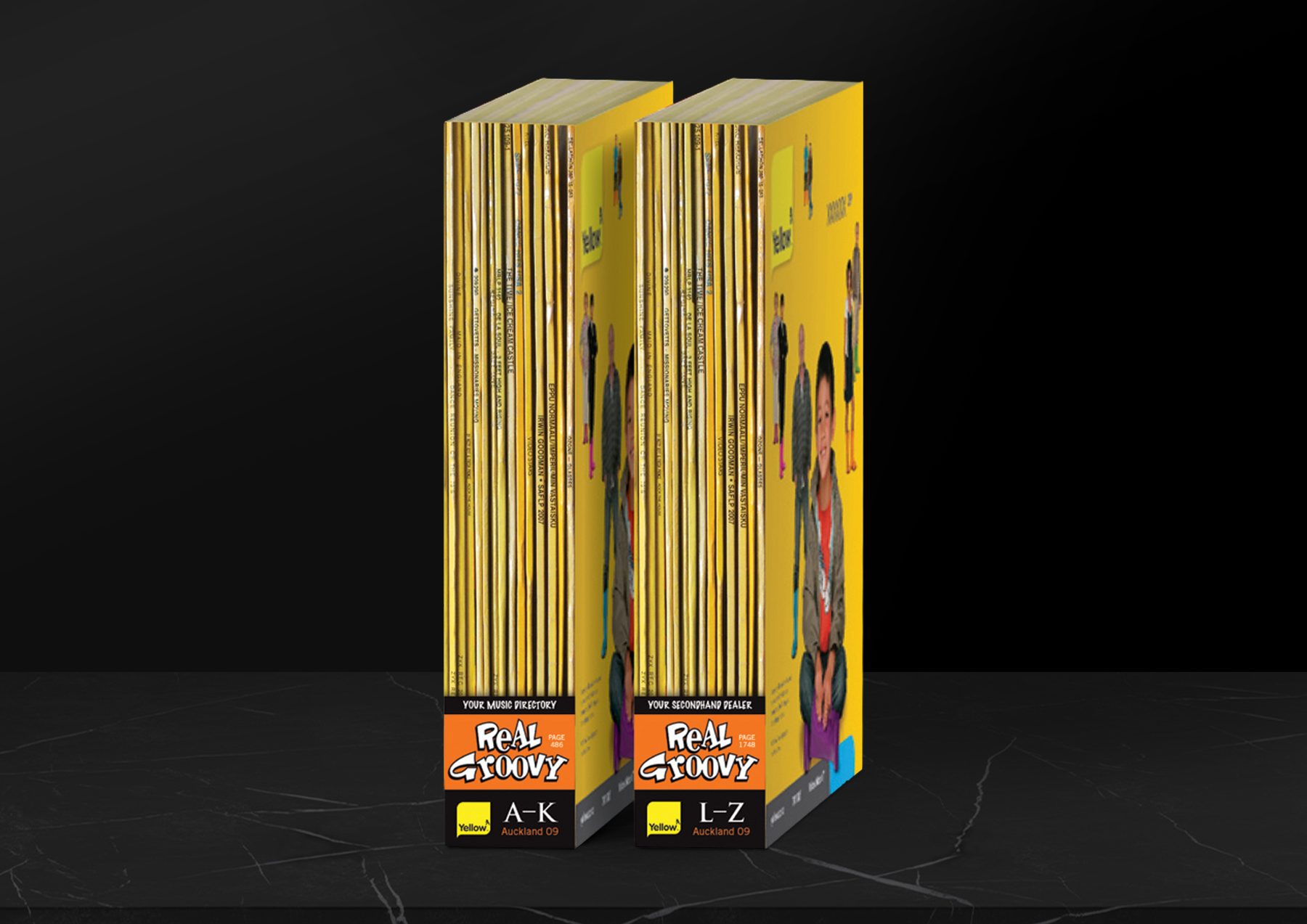
Real Groovy directory
Yellow Pages
Digital + OOH + Motion
12/12
A speculative competition entry. An inventive ad placement for Real Groovy Records split vinyl sleeves A–K and L–Z across two phone book spines. The sleeve ends echoed yellow and light tones, the brand colour of the medium.
MY ROLE
Concept, design
AGENCY
Madinagoodway
Tablet in-store promotion & magic roadshow
Bio Luvil | Unilever (Finland)
POS + Packaging + Experiential
1/10
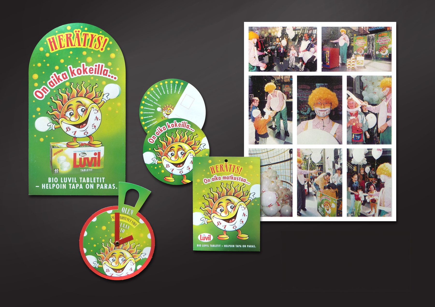
Bio Luvil detergent in Finland has always been the brand for families with kids, and the in-store promotions we did always delivered fun. The promotion theme ‘Suuri hukkajahti’ is a play on the Finnish word ‘hukka’ – meaning both ‘wolf’ and ‘waste’ – and ‘jahti’ meaning ‘hunt’, loosely translating to ‘The Great Wastebusters’. Consumers were challenged to save every detergent crumb from the jaws of the wasteful wolf.
Traffic signs and mobiles guided shoppers to ‘no waste’ zones where the container-packaged product could be found. The trade brochure surprised the reader with a popup mouth that had gobbled up the campaign message. Concepted with a copywriter.
MY ROLE
Concept, illustration procurement, art direction, some finished art
AGENCY
Ammirati Puris Lintas, Helsinki
Finalist, AME Advertising Awards, New York Festivals, in-store promotion, 1998
Finalist, Best of Finnish International Advertising, 1998
Subcard Mashup
Subway NZ
POS + Packaging + Experiential
2/10
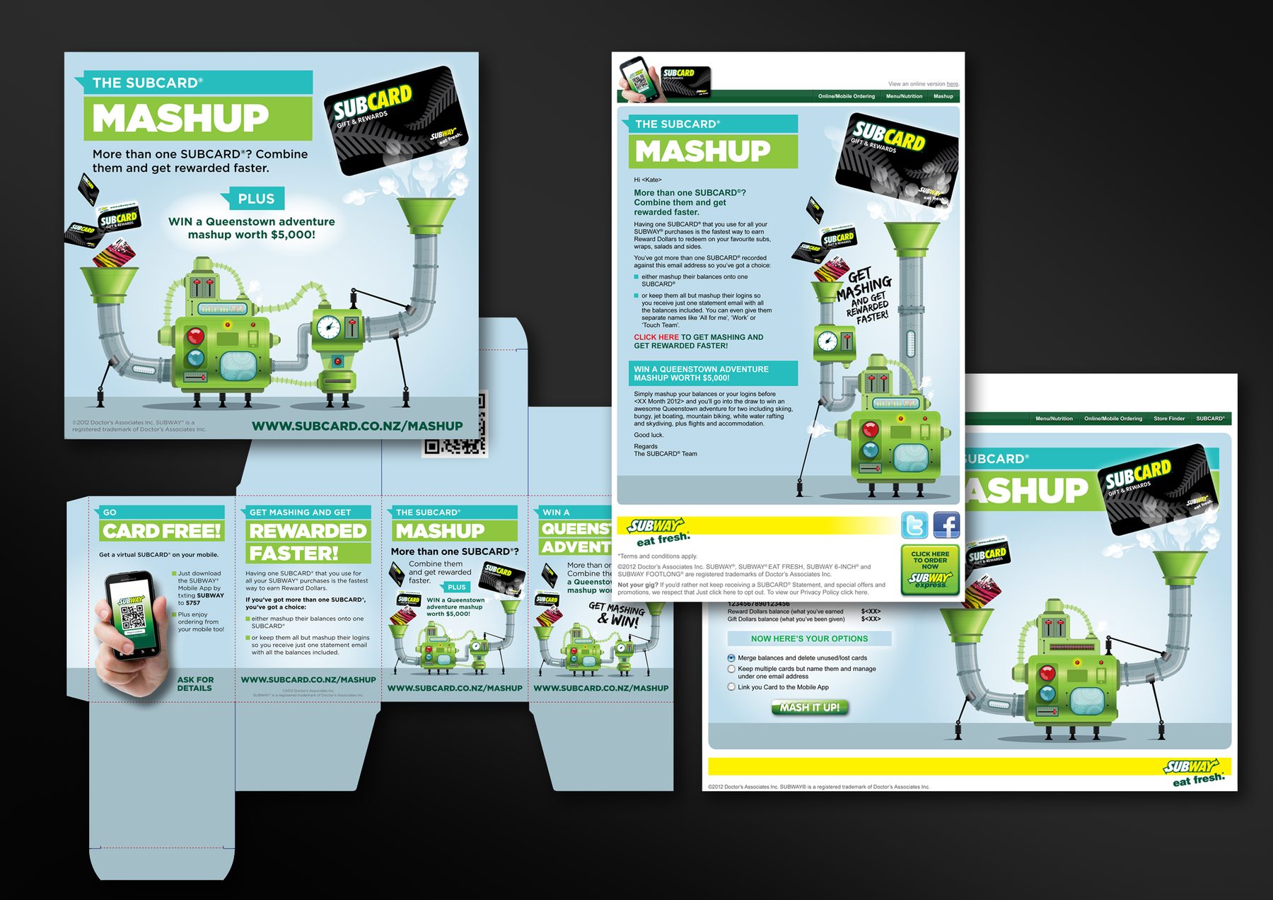
POS and digital materials for Subway’s Subcard loyalty card relaunch, encouraging customers to combine multiple Subcards for faster rewards. I briefed the illustrator to develop a flexible ‘mashup machine’ concept with additional building blocks, allowing the illustration to be adapted to fit different shapes and formats, such as the cubic table-talker I engineered.
MY ROLE
Visual concept, art direction, finished art
AGENCY
justONE, Auckland (Freelance)
Limited Edition Extra Stout
Diageo | Guinness
POS + Packaging + Experiential
3/10
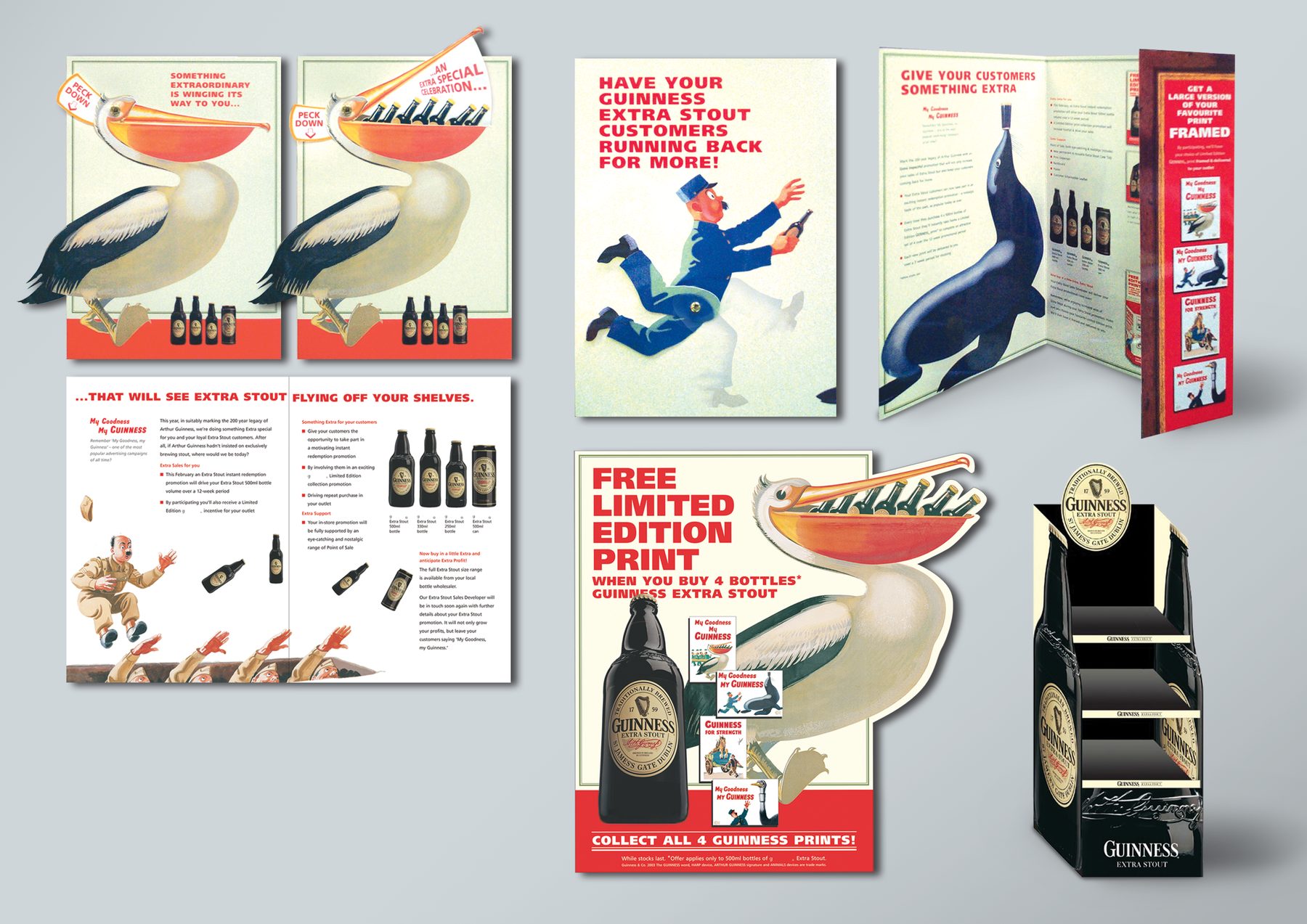
Off-licence promotion built around the iconic Guinness limited edition posters. The central visual idea was to ‘mechanise’ each character to serve the campaign messaging: the Toucan’s beak opened as a teaser reveal for the promotional announcement; the Zookeeper’s legs spun for eye-catching movement in the trade sell-in pieces, which I engineered from the ground up. A retail display stand heroed the beautiful retro bottle. A campaign that respected the brand’s visual heritage while giving it genuine in-store energy. Concepted with a copywriter.
MY ROLE
Formats, design, image retouching, finished art
AGENCY
Target Interactive Marketing, Dublin
Macleans Shark Trail
GSK | Macleans
POS + Packaging + Experiential
4/10
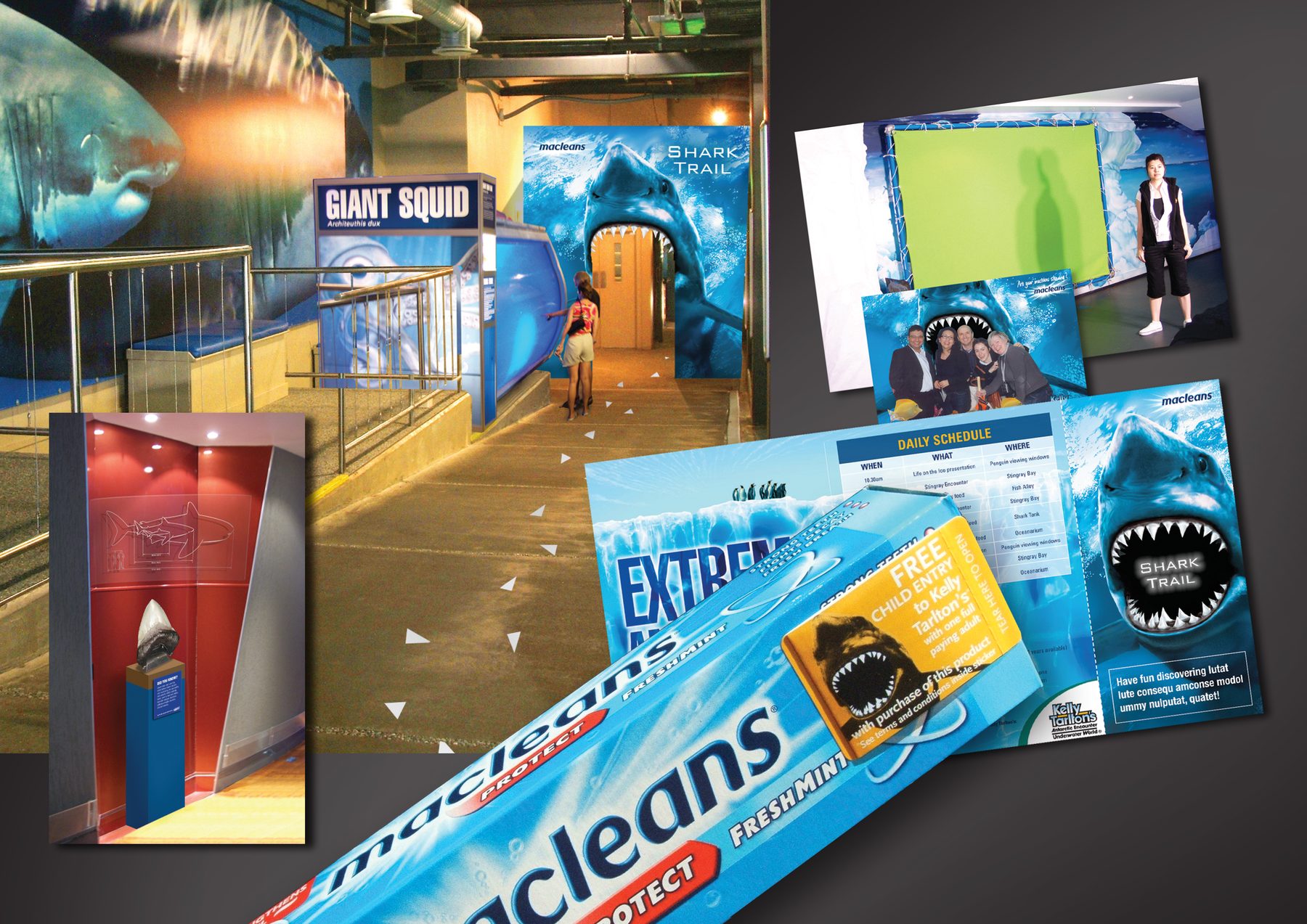
Macleans had a TVC running built around a brilliant fact: sharks grow their teeth back, we can’t, so brushing matters. The brief was to take that idea off-screen and into real life during school holidays, when families needed somewhere to go. The answer was obvious: Kelly Tarlton’s Underwater World – Auckland’s home of sharks. We took over the entrance and created a ‘Did You Know?’ exhibit that turned the venue into an extension of the campaign. The hero piece was an authentic Otodus megalodon tooth – a jaw-dropping specimen that stopped kids and parents alike. An on-pack sticker leaflet drove purchase in-store, with a free child entry ticket redeemable at Kelly Tarlton’s bundled with every pack. I also concepted and art directed a short shark animation that was overlaid on the supplied TVC, and created a promo tail for the ad.
MY ROLE
Experience concept, art direction, production across all touchpoints
AGENCY
G2, Auckland
Multi-pack
HB
POS + Packaging + Experiential
5/10
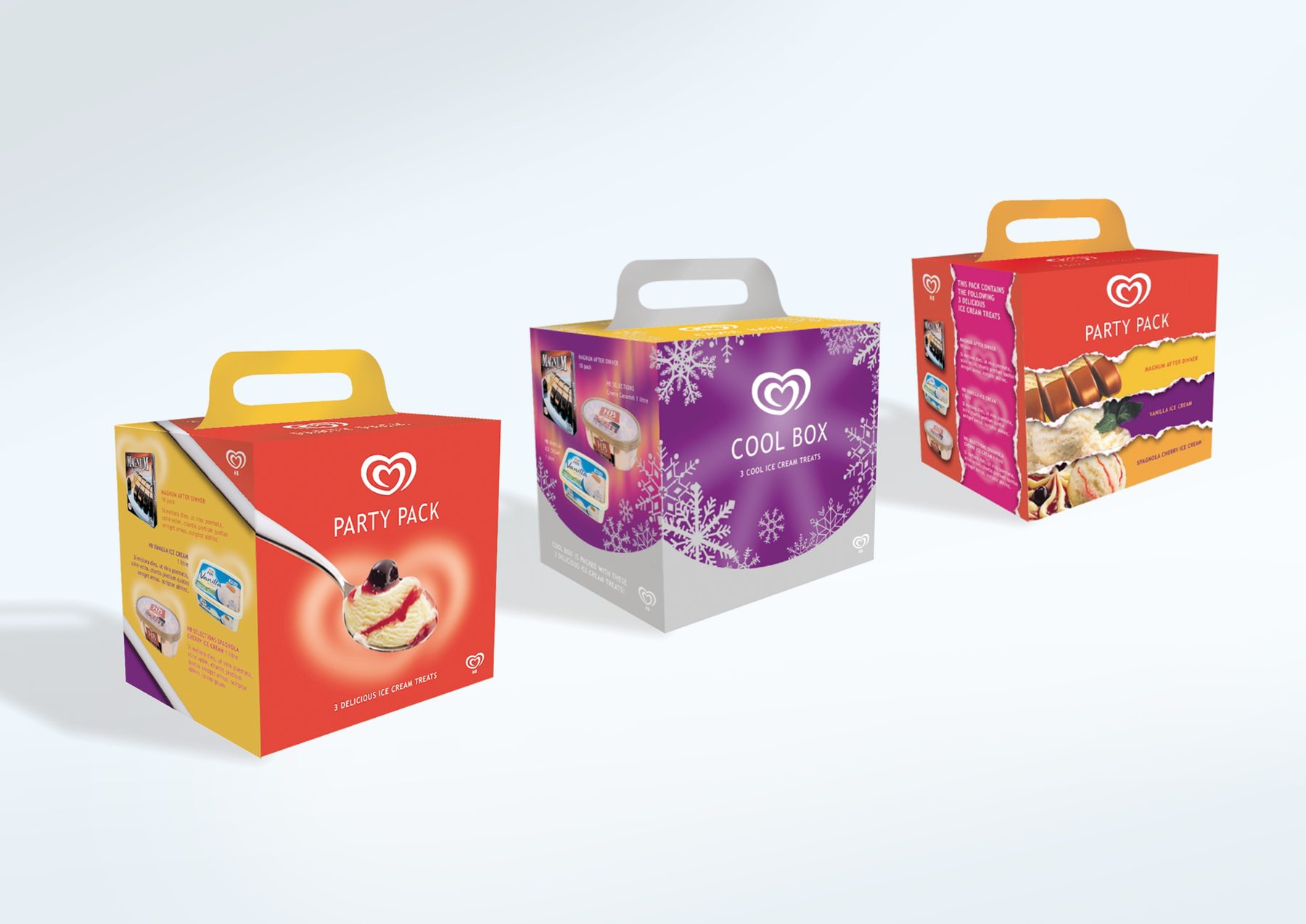
Concept designs for multi-pack retail packaging for HB – the Irish name for the Unilever Heartbrand range, known elsewhere as Streets, Wall’s, and GB Glace.
MY ROLE
Ideation, design
AGENCY
Kingram Communications Group (K2 Creative), Dublin
Dump bins
Mars | Starburst and Skittles
POS + Packaging + Experiential
6/10
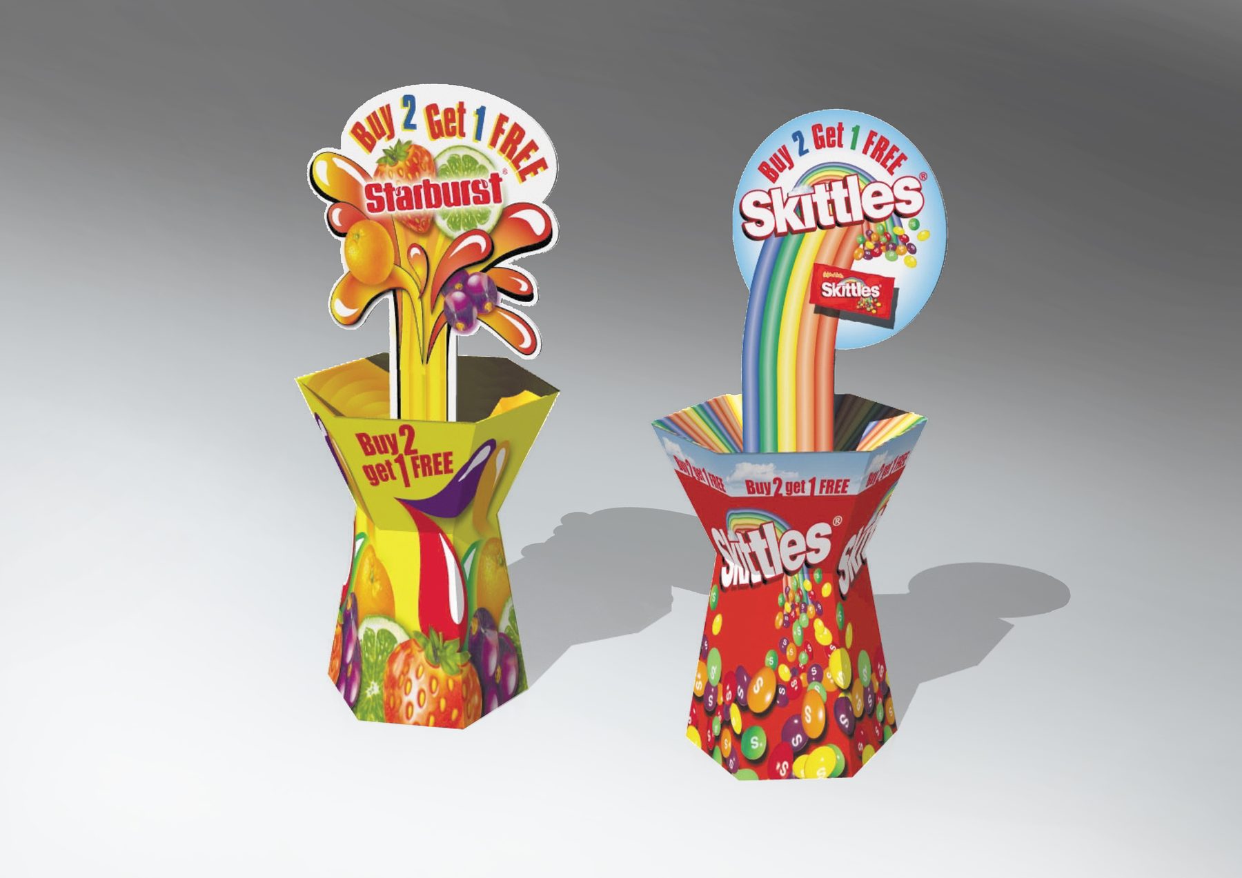
Retail dump bin designs for Starburst and Skittles, produced from supplied brand assets. Eye-catching solutions with a deliberately small footprint maximise shelf impact without demanding floor space. A 3D illustrator at the agency rendered the flat designs into presentation visuals.
MY ROLE
Format, design
AGENCY
Kingram Communications Group (K2 Creative), Dublin
Whip Around & Win
Farmlands
POS + Packaging + Experiential
7/10
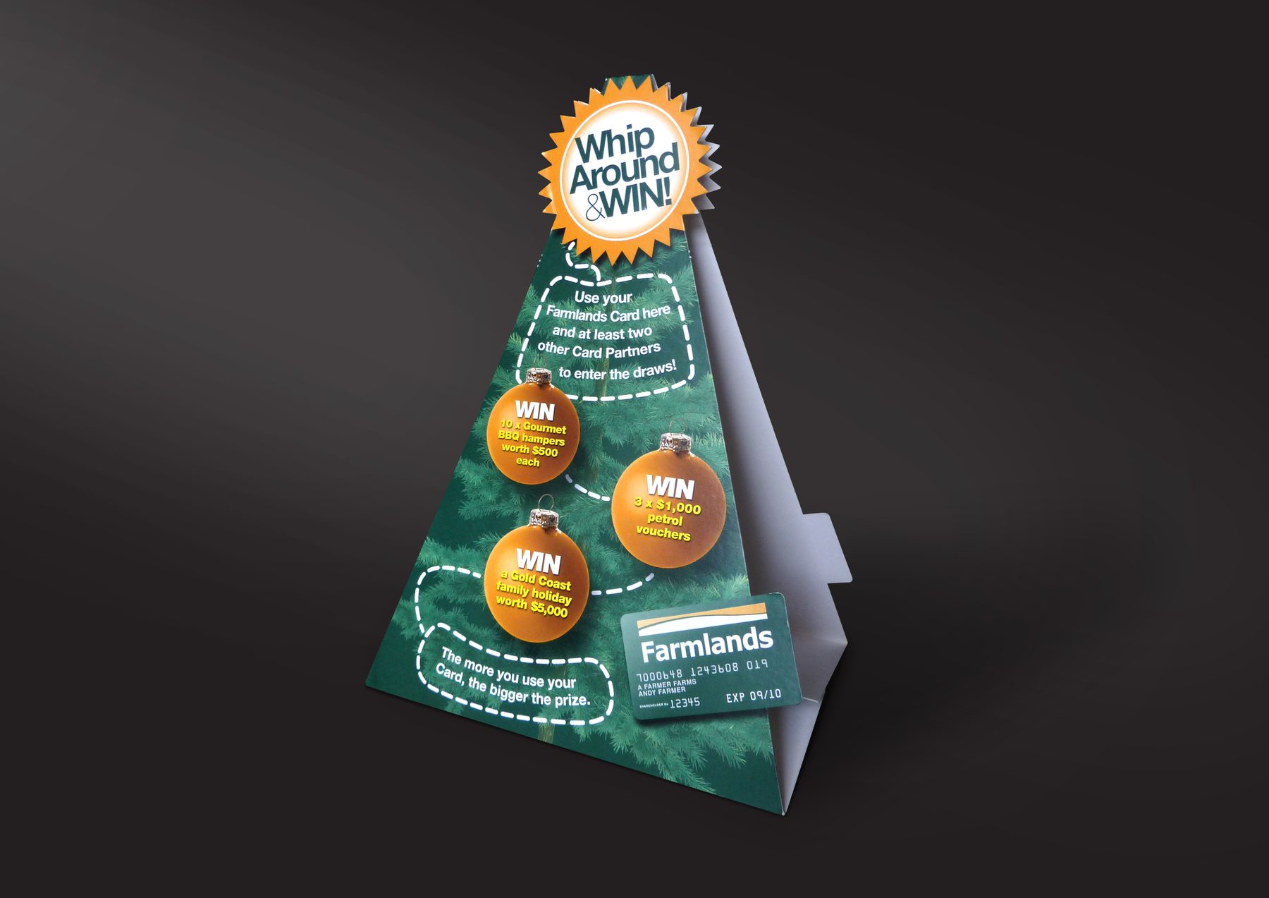
Farmlands was running a Christmas promotion encouraging card holders to use their card across multiple partner retailers for a chance to win gourmet hampers, petrol vouchers, and a Gold Coast family holiday. They needed a festive tent card for the checkout counter. Concept copy was supplied; I engineered the format, designed and finished it.
MY ROLE
Format, design, finished art
AGENCY
justONE, Auckland (Freelance)
Tent cards for insurance products
ASB Bank
POS + Packaging + Experiential
8/10
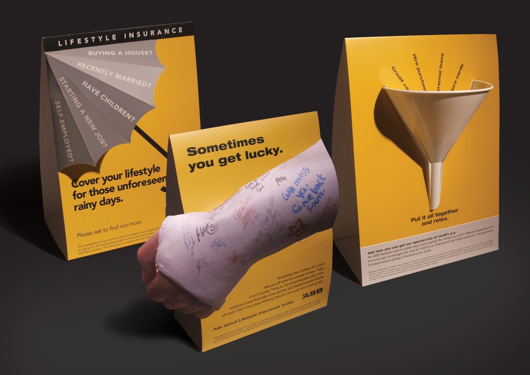
A series of tent cards for various ASB campaigns, designed to grab customers’ attention while they queue. Bold 3D concepts made the wait worth a second look. I wrote the headline for the ‘cast’ concept and supervised its photography.
MY ROLE
Concept, design, art direction, some copy
AGENCY
TEQUILA, Auckland
Milk packaging concept
Speculative
POS + Packaging + Experiential
9/10
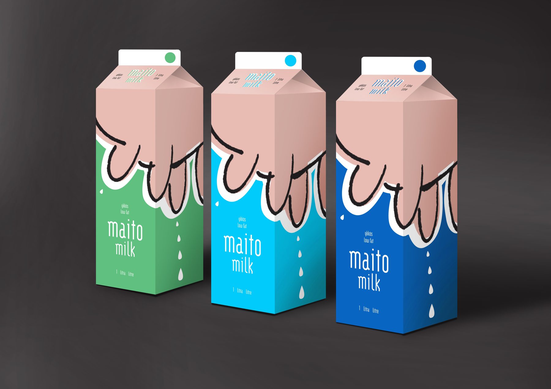
A fun tetra pak concept, just for the fun of it. It was a bit too ‘out there’ at the time for Finnish market.
MY ROLE
Idea, design
AGENCY
Personal project
Packaging range for pies and pastries
Atria (Finland)
POS + Packaging + Experiential
10/10
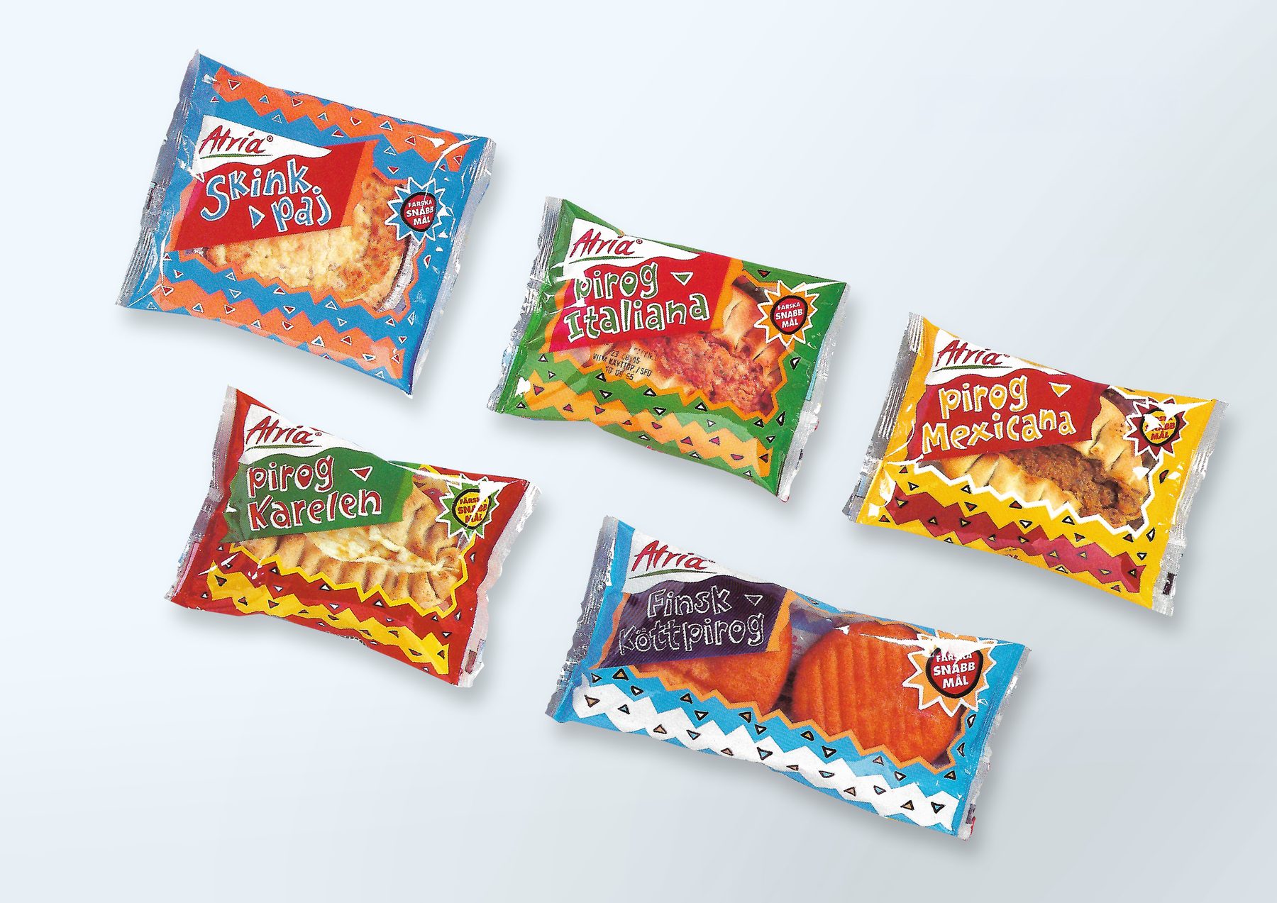
Atria is one of Finland’s largest food companies, making this a substantial national-level brand packaging project from my early career in Helsinki. I originated the design solution myself and produced all the way to finished art.
MY ROLE
Design, finished art
AGENCY
Bates Saatchi & Saatchi, Helsinki
Corrections in Disguise
Department of Corrections
Press + Print Ads
1/6
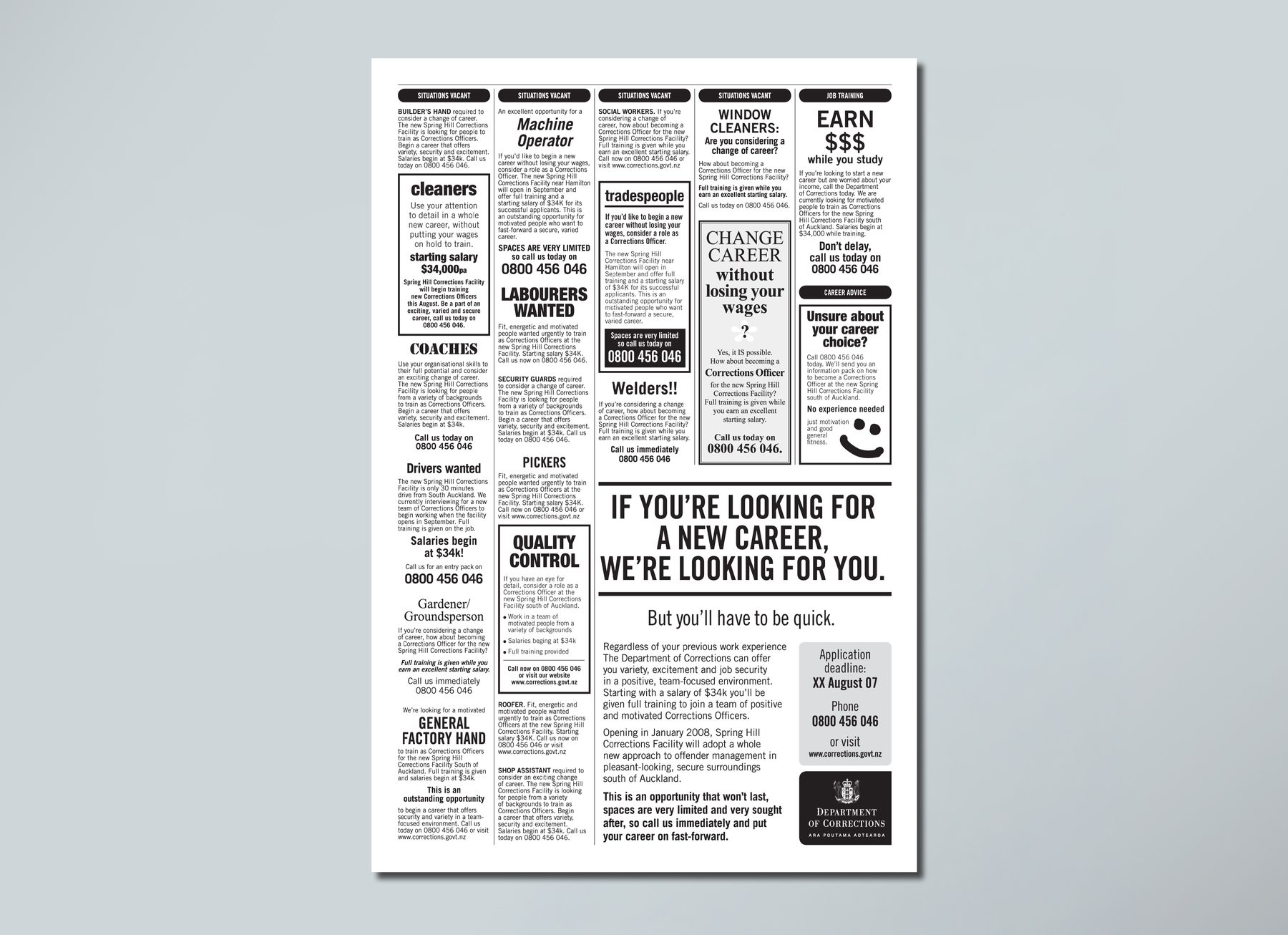
A full-page press ad disguised as a genuine classifieds section. Each small line ad subtly transforms into a Department of Corrections recruitment message, highlighting key benefits – salary from $34k, full training, job security – before resolving to the DoC call-to-action. A larger ad at the bottom of the page completes the series and delivers the fuller picture. Produced ahead of the planned opening of Spring Hill Corrections Facility in January 2008. It is unclear whether this execution went into production.
MY ROLE
Concept, design, layout
AGENCY
G2, Auckland
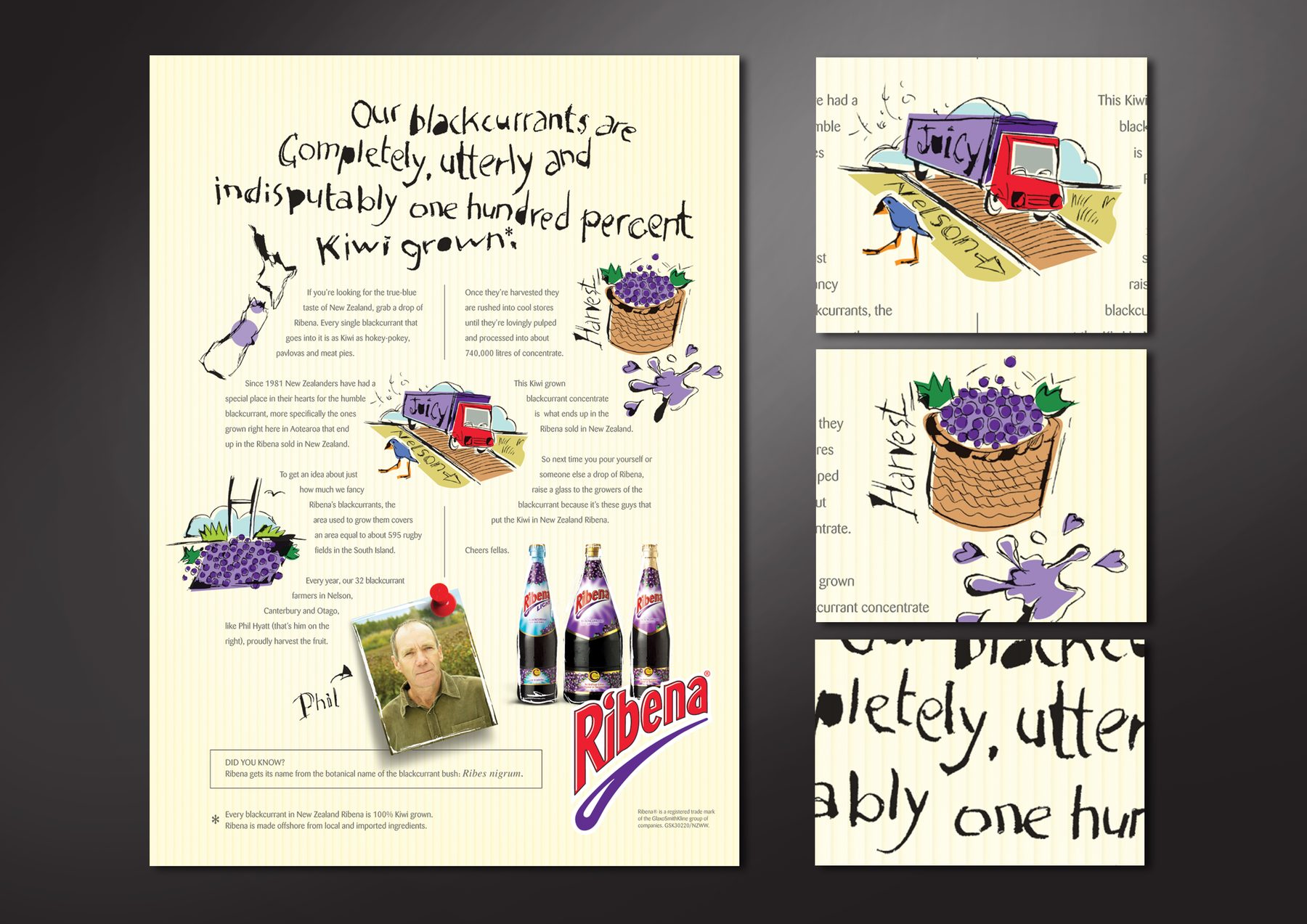
100% Kiwi Grown
GSK | Ribena
Press + Print Ads
2/6
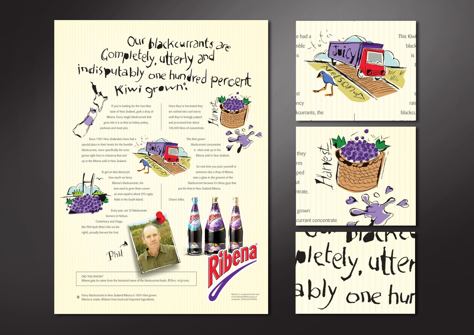
An illustration-led editorial press ad celebrating Ribena’s New Zealand-grown blackcurrants, charting their journey from Nelson and Canterbury farms to the Ribena bottle. A confident departure from standard FMCG advertising after a vitamin C scandal that almost ruined the brand. Concepted with a copywriter. Illustration was originated and produced by me.
MY ROLE
Concept, illustration, layout, finished art
AGENCY
G2, Auckland
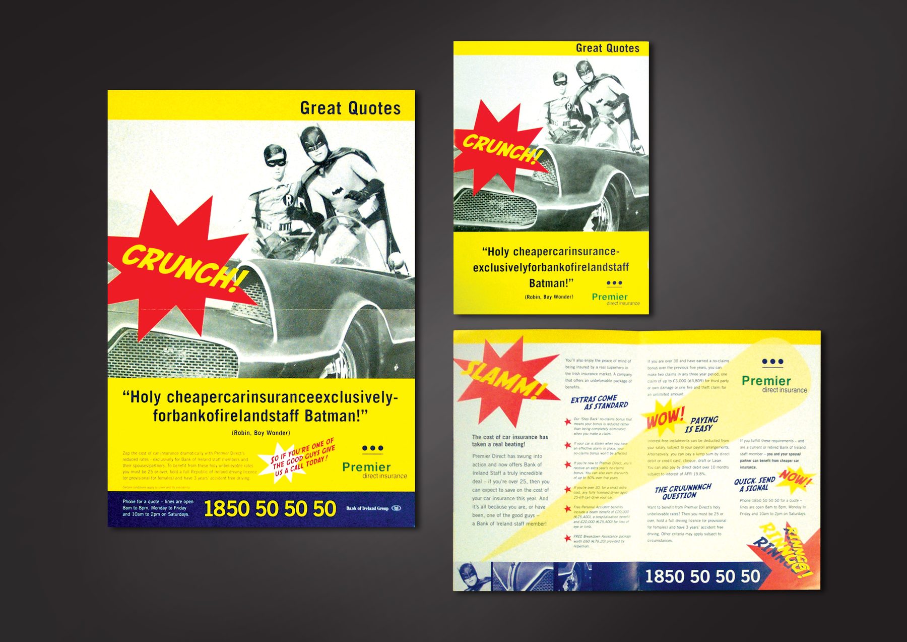
Great Quotes
Bank of Ireland | Premier Direct Insurance
Press + Print Ads
3/6
The above-the-line campaign was built around ‘Great Quotes’, such as Muhammad Ali’s ‘I am the greatest’. Briefed to bring the upcoming campaign to the top of mind for Bank of Ireland staff before launch, I developed a fun internal concept using Batman and Robin’s famous ‘Holy…’ theme. Deliverables were a deskdrop flyer and a staffroom poster, strictly for internal consumption.
MY ROLE
Concept adaptation, design, finished art
AGENCY
Dialogue Marketing Communications, Dublin
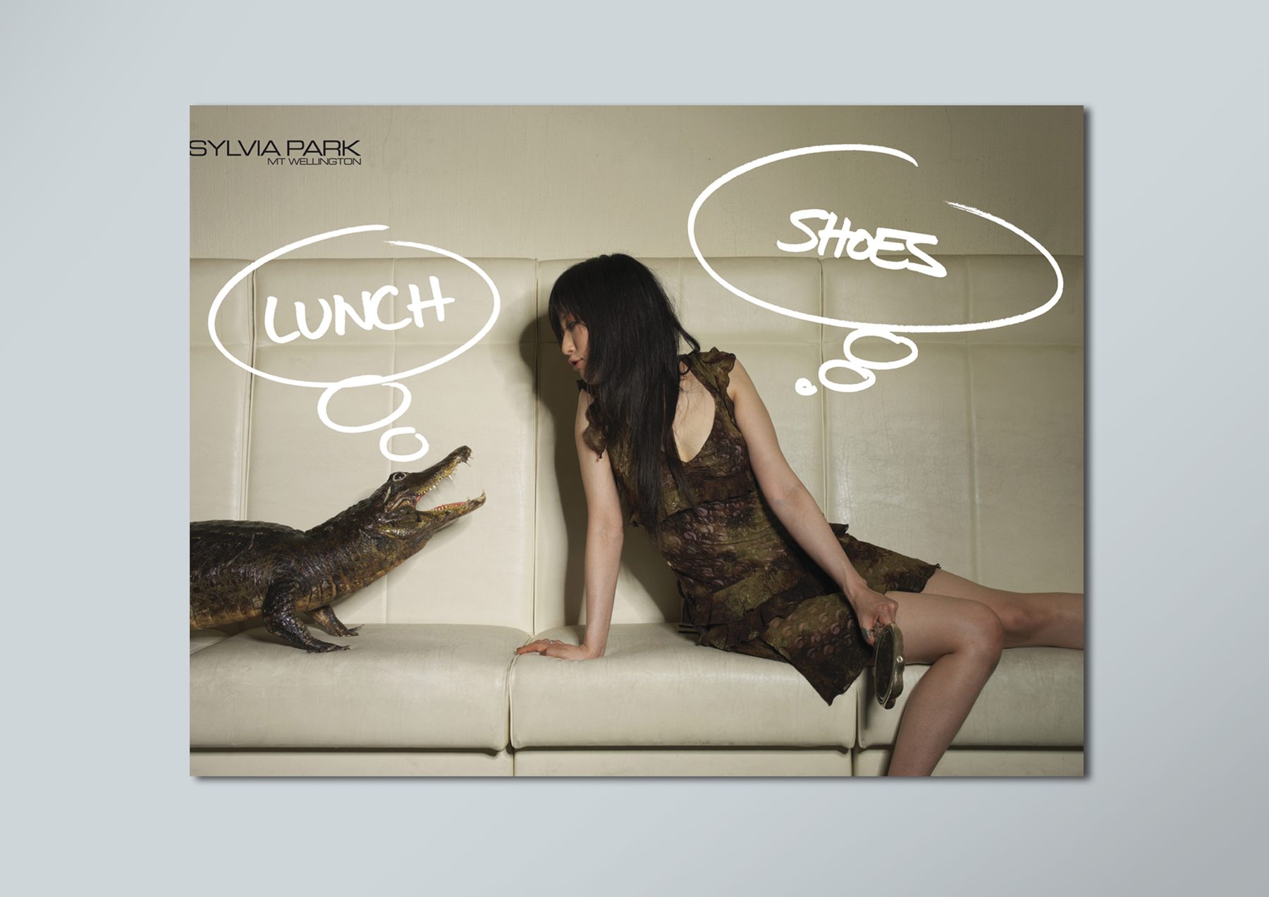
Lunch! Shoes!
AdMedia
Press + Print Ads
4/6
AdMedia ran a series of ‘Create an ad from a stock photo’ competitions in the late 2000s. This ad won in 2007. It takes an absurd photo and turns it into a clever play between two of the many competing desires in Sylvia Park shopping centre. I entered this competition across three consecutive years, placing each time.
MY ROLE
Idea, design
AGENCY
Personal
Winner, AdMedia ‘Create an Ad from a Stock Photo’ competition, 2007
Save the Shark
Shark Energy Drink
Press + Print Ads
5/6
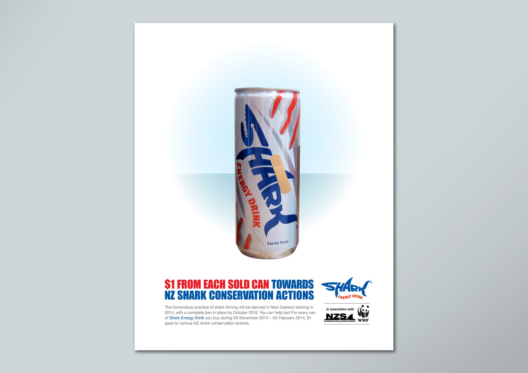
A speculative promotional ad built around the phased ban on shark finning coming into effect in NZ from 2014. The idea proposes that $1 from every can sold goes towards NZ shark conservation. Never presented.
MY ROLE
Idea, design
AGENCY
Personal
Pink Caravan
NZ Breast Cancer Foundation
Press + Print Ads
6/6
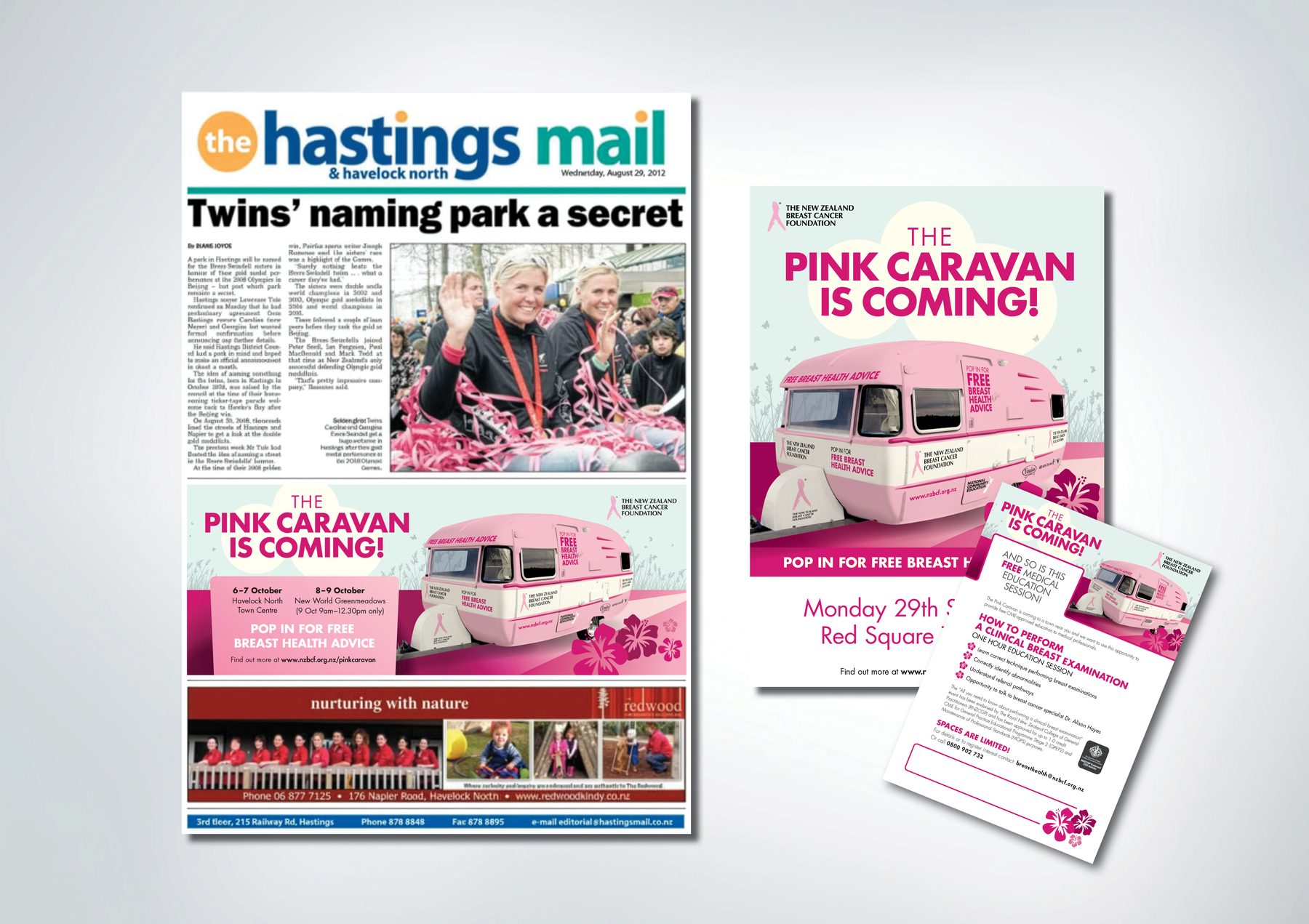
The client had purchased a caravan to serve as a mobile breast health clinic. My job was to create everything for the Pink Caravan campaign, from vehicle wrap to printed and digital assets. Working only from supplied photos and technical drawings, with the decorated caravan itself not yet available to shoot, it quickly became evident the challenge was to create a visual style that let the caravan mockup shine. I chose a minimalist illustration style with a combination of powdery pastel and stronger fuchsia colours to create a sense of space and let the pink caravan pop in the landscape.
Printed deliverables included regional newspaper ads (one version per city/region), posters, and poster templates where exact location and time could be handwritten or overprinted. There were also several info posters and flyers for inside the caravan.
MY ROLE
Design, finished art
AGENCY
Madinagoodway
UI iconography
Fisher & Paykel Appliances
Technical Design + Systems
1/6
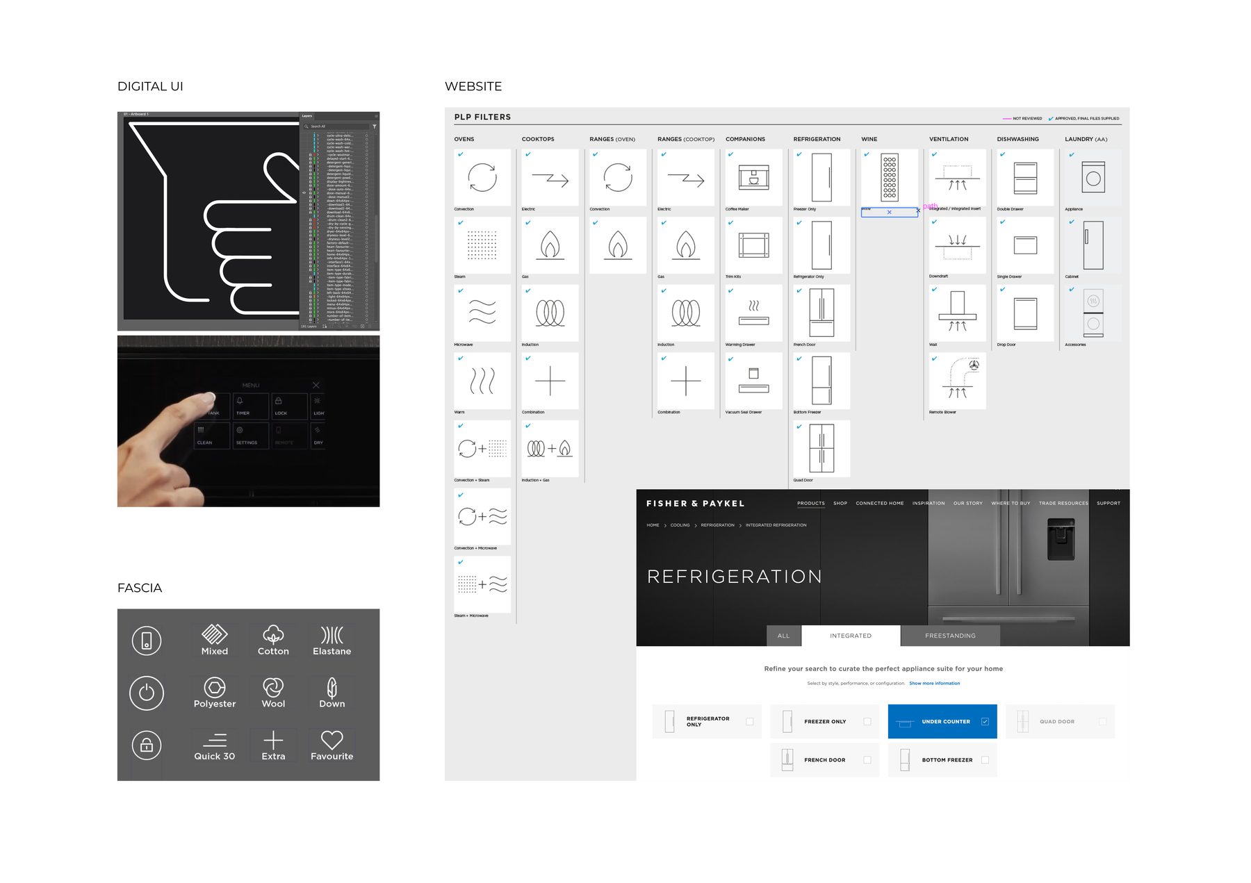
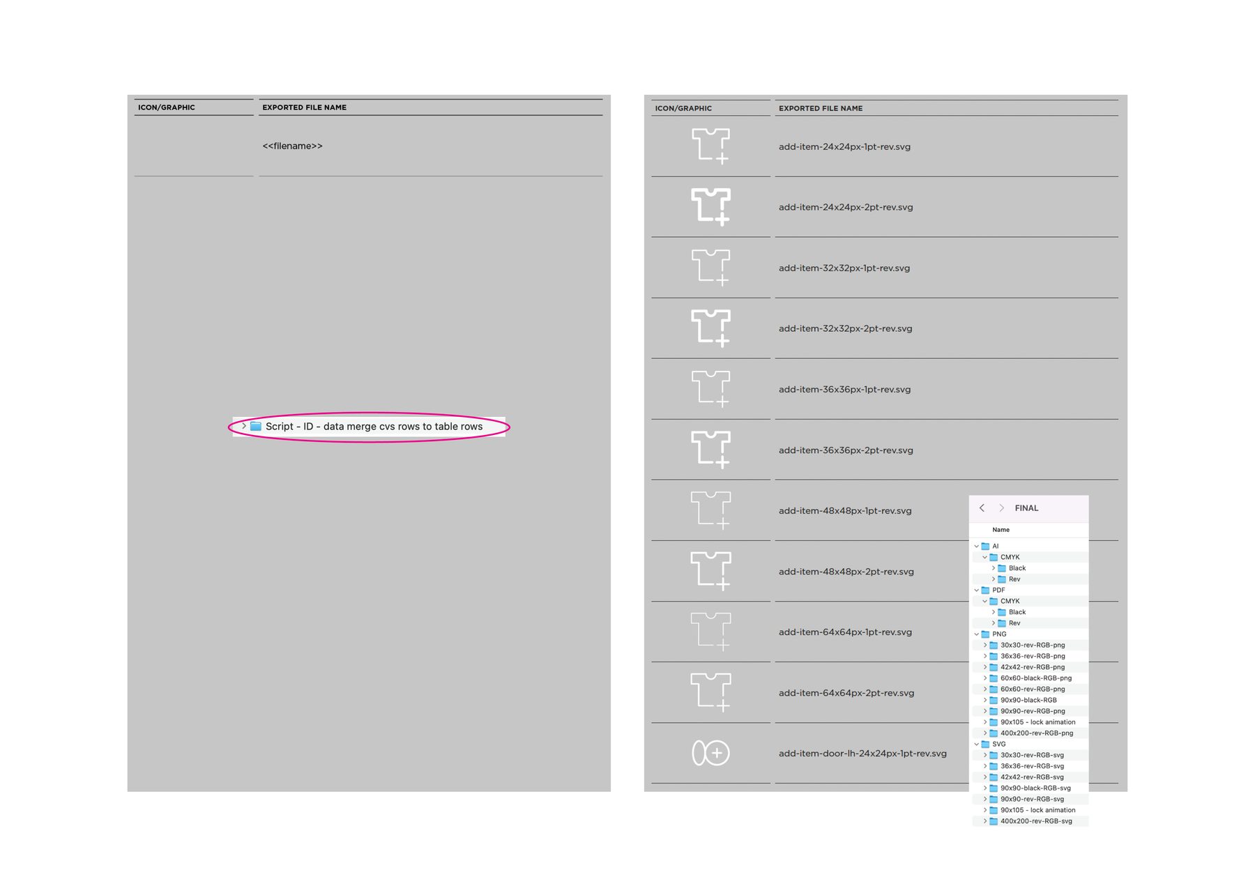
Designed and produced a large-scale icon library covering hundreds of appliance functions, across three distinct output contexts: touchscreen displays (TFT), product fascia panels and the Fisher & Paykel website. Each icon was engineered to meet the specific size, contrast and technical requirements of its context, while staying visually consistent across all three.
Icon design system
Fisher & Paykel Appliances
Technical Design + Systems
2/6
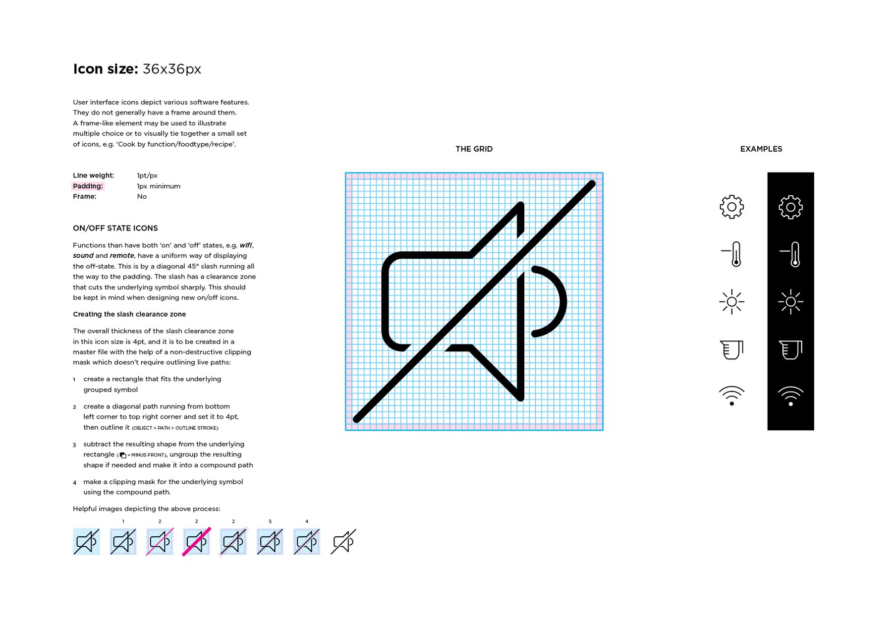
Created the style guide and grid rules governing how all icons are built – defining canvas sizes, line weights and minimum padding, and establishing a standardised method for on/off state icons. This gave the wider team a clear, reusable framework for any new icons to sit consistently within the existing system.
Compliance workflow guides
Fisher & Paykel Appliances
Technical Design + Systems
3/6
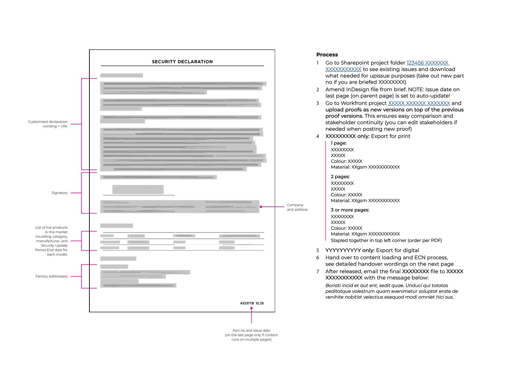
Documented complex compliance workflows – including the Declaration of Conformity process – in clear, visual formats the team could follow without specialist knowledge. Created standardised artwork templates alongside these to ensure visual consistency across all categories.
Logistical cartons
Fisher & Paykel Appliances
Technical Design + Systems
4/6
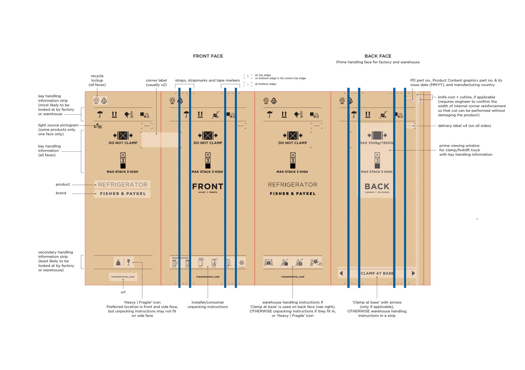
Joined the company during a strategic carton redesign phase and contributed to evolving the handling iconography to align with the broader Fisher & Paykel icon style in development at the time. Helped document the complete carton approach for global warehouse stakeholders – covering icon placement, safety pictograms, stacking limits, delivery labels, recycling lockups and unpacking instructions across carton faces. Over time, took ownership of producing all carton artworks across every product category globally.
InDesign template suites
Fisher & Paykel Appliances
Technical Design + Systems
5/6
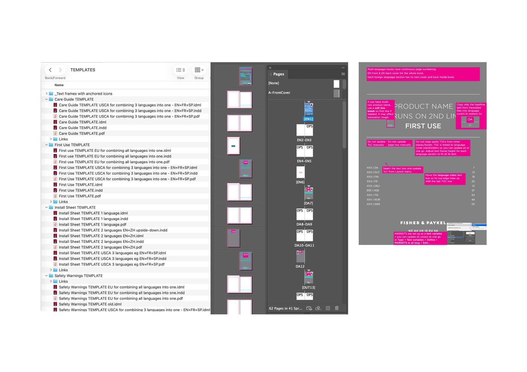
Built a library of InDesign master templates for product documentation across global markets, covering User Guides, Install Guides, Safety & Warnings and more. The templates handle complex multi-language outputs – including EU, US/Canada and China, combining up to nine languages in a single document – with continuous pagination and automated tables of contents. Significantly reduced errors and production time across a high-volume, multi-product workload.
Workflow automations
Fisher & Paykel Appliances
Technical Design + Systems
6/6
Championed automation and early AI adoption within the Product Content team. Developed and documented a suite of InDesign and Illustrator scripts for repetitive production tasks – including batch file renaming, style name find and replace, data merge from CSV to table rows, and Unicode character insertion. Built a file naming tool to help the team comply with a complex naming convention, and introduced AI-assisted workflows to reduce time on admin and data-heavy tasks.
Grrrr and Purrr
SPCA Auckland
Apparel + Merch
1/5
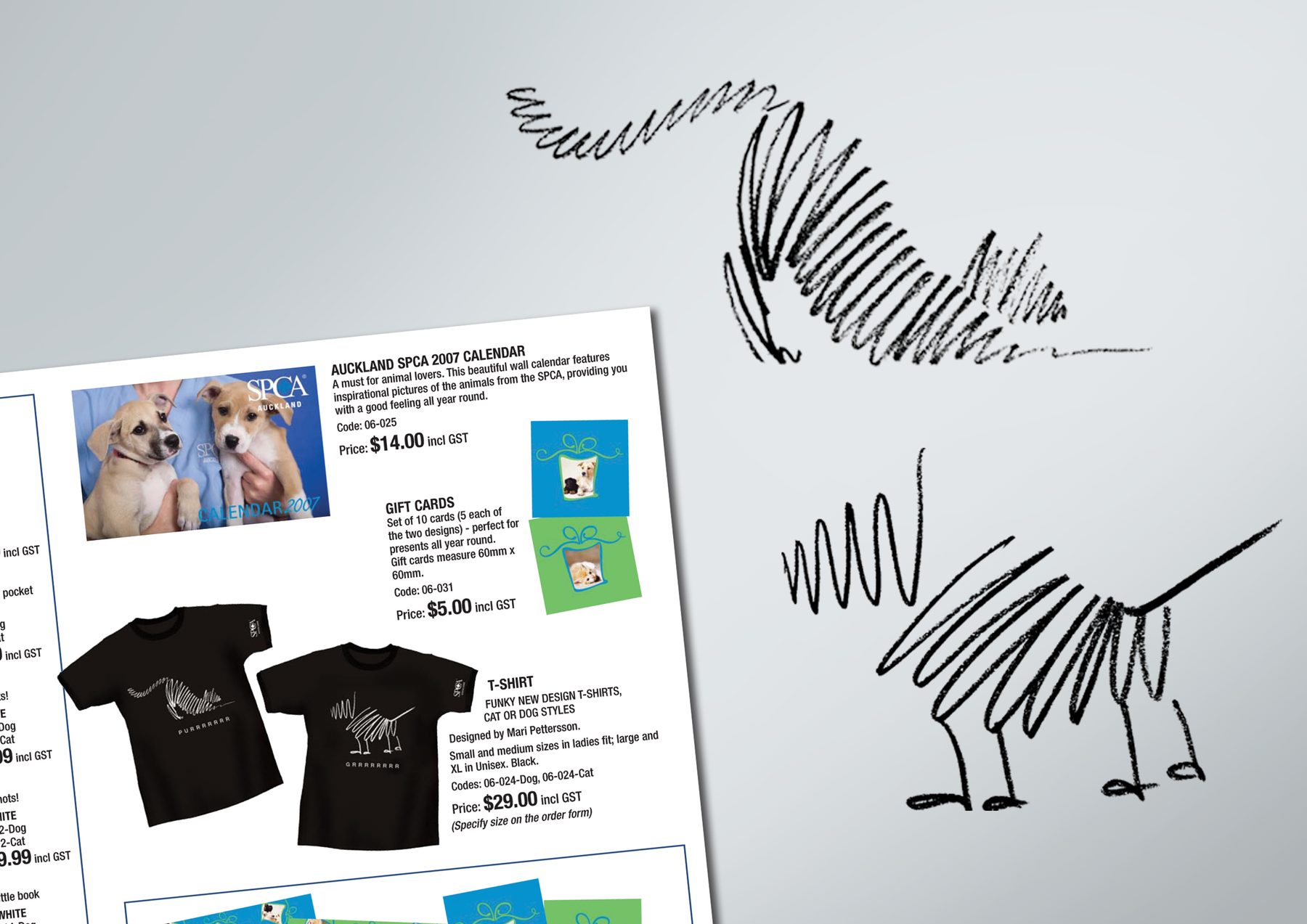
Two original illustrations (cat and dog) applied across a range of products. The designs proved so popular that SPCA Victoria in Australia wanted to use them too, extending the range of fundraising merchandise to include umbrellas and can coolers, to name a few.
MY ROLE
Design
AGENCY
Personal project
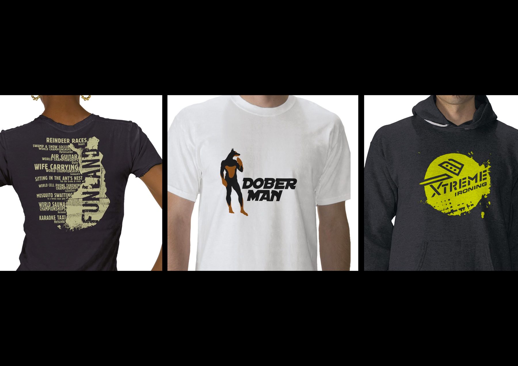
Funland | Dober Man | Xtreme Ironing
Madinagoodway (own Zazzle shopfront)
Apparel + Merch
2/5
Demonstrates range and humour. Funland celebrates all the quirky Finnish world championship events, Dober Man is the superhero underdog, and Xtreme Ironing taps into the niche ‘sport’ of ironing in the most ridiculous places.
MY ROLE
Design
AGENCY
Personal project
Project GIVE
Mental Health Foundation of New Zealand
Apparel + Merch
3/5
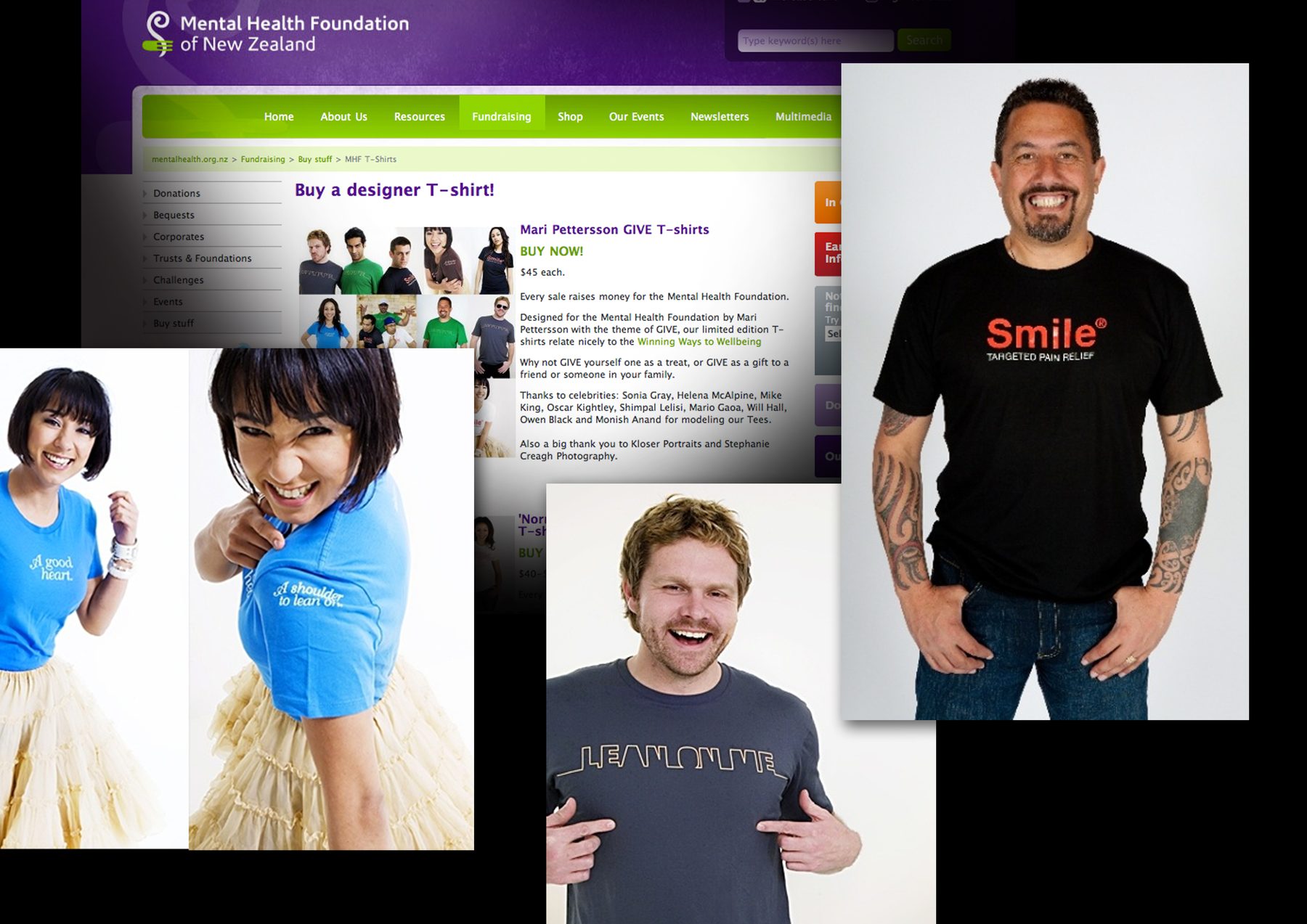
Competition entries that all won and went into production. A limited edition fundraising t-shirt range, all proceeds to the MHF. Modelled by NZ celebrities including Oscar Kightley, Mike King and Mario Gaoa. Featured on the MHF website, tied to the Winning Ways to Wellbeing platform.
MY ROLE
Design
AGENCY
Personal project
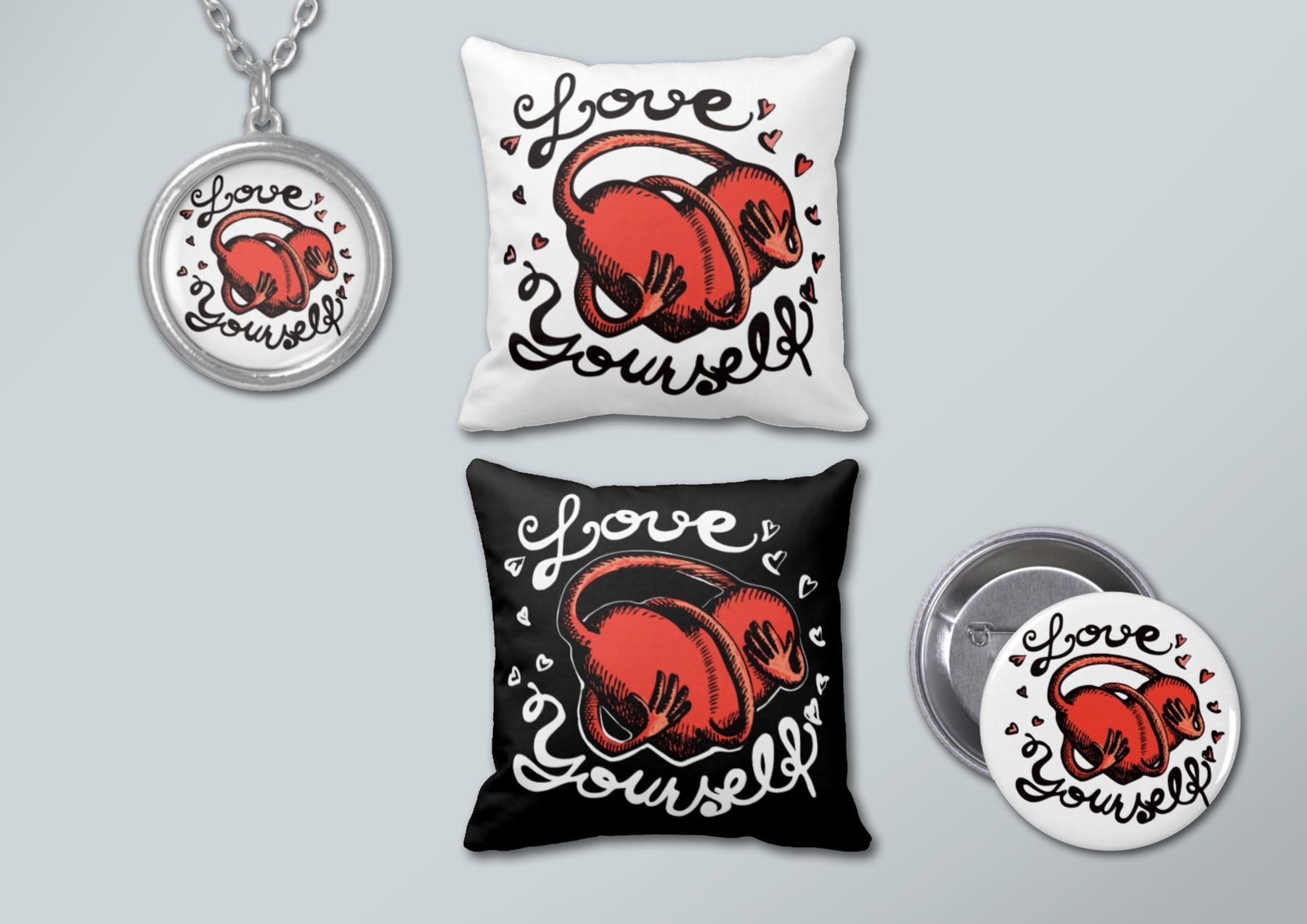
Love Yourself
Freestylist (own Zazzle shopfront)
Apparel + Merch
4/5
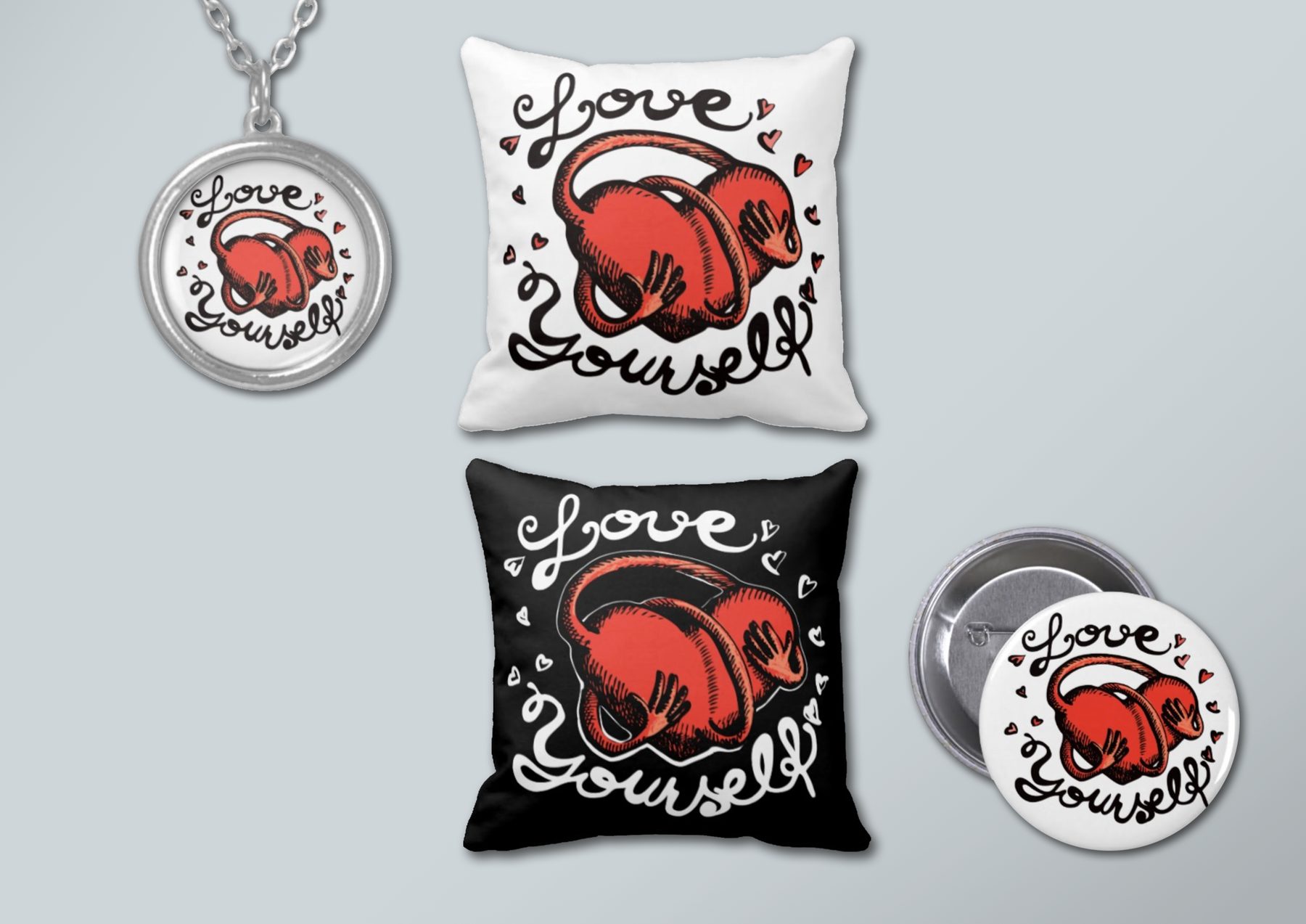
A self-loving, self-hugging design with hand-drawn typography, reminding us to be kind to ourselves.
MY ROLE
Design
AGENCY
Personal project
Antarctica | Lake Vostok Tour ’82
Madinagoodway (own Zazzle shopfront)
Apparel + Merch
5/5
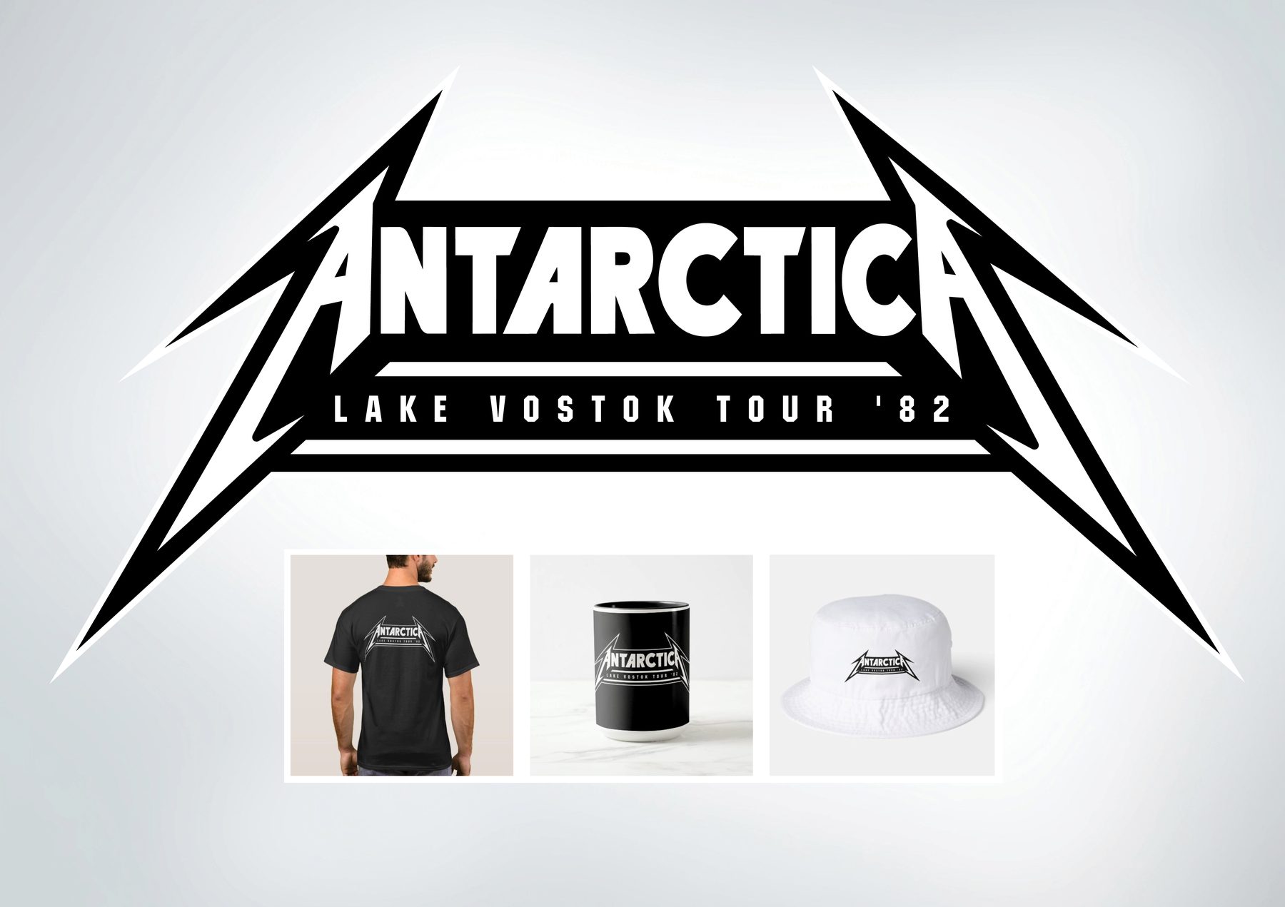
A parody of the Metallica wordmark harnessed for UAP ‘insider’ design. Strong conceptual wit – demonstrates personality and range.
MY ROLE
Design
AGENCY
Personal project
One Team
ASB
Illustration
1/10
Illustration for a dimensional DM piece built around a BeatsWork-style group drumming concept. I created a tribal patterning and paired it with intense colours that complemented ASB’s brand colour, yellow.
MEDIUM
Black scraperboard and pastels
AGENCY
TEQUILA, Auckland
Clever Mouse
Ernst & Young | Knowledge Portal
Illustration
2/10
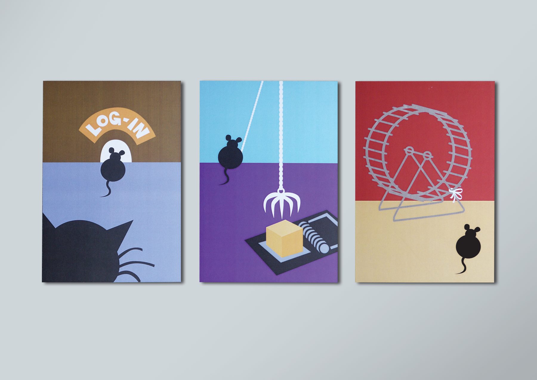
Three bold, minimalist illustrations to promote E&Y’s pioneering digital Knowledge Portal, which gave young entrepreneurs a special advantage by connecting them with the wider tech-startup community.
MEDIUM
Adobe Illustrator
AGENCY
Dialogue Marketing Communications, Dublin
Authentically Hammered
Hunch
Illustration
3/10
Detailed illustrations for Hunch’s client gift booklet, How to Get Authentically Hammered in France. Copy was supplied and I had free hands to create the drawings while laying out the booklet itself too.
MEDIUM
Fine rapido pen on paper
AGENCY
Madinagoodway
Crafted Juice
GSK | Ribena
Illustration
4/10
A full-page editorial press ad with hand-crafted illustrations throughout. The imperfect illustration style and purple-led earthy palette give the ad a distinctly local, honest flavour.
MEDIUM
Black scraperboard and Photoshop
AGENCY
G2, Auckland
Love Yourself
Freestylist (own Zazzle shopfront)
Illustration
5/10
A self-loving, self-hugging design with hand-drawn typography, reminding us to be kind to ourselves.
MEDIUM
Fine liner pen and ink on paper, colour applied digitally in Photoshop
AGENCY
Madinagoodway
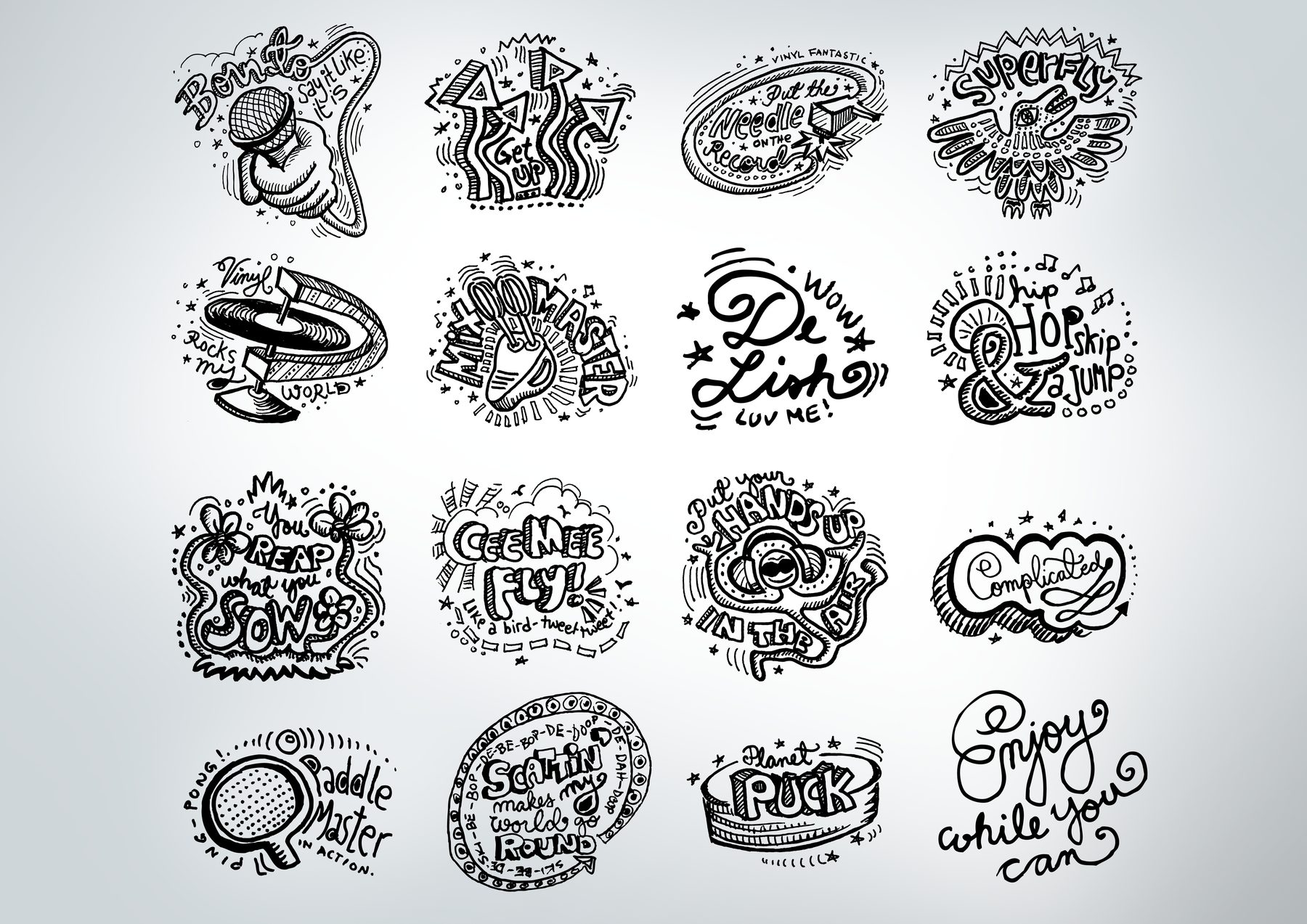
Freestyle Rhymes
Freestylist (own Zazzle shopfront)
Illustration
6/10
A cohesive suite of hand-lettered, illustration-driven graphic designs with a music and pop culture skew. Demonstrates illustration range and a consistent personal style.
MEDIUM
Fine liner pen and ink on paper
AGENCY
Personal project
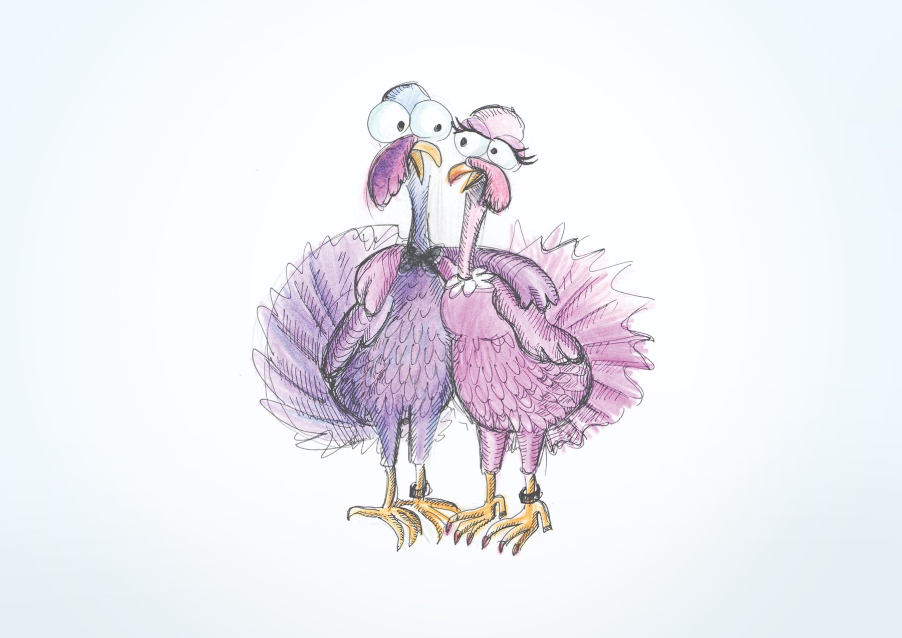
Plucky Perfect
For a friend
Illustration
7/10
A hand-drawn, hand-coloured greeting card illustration for a friend’s wedding. Charming, warm, and gently comedic. A good example of a different, more playful register.
MEDIUM
Pencil on paper, with watercolour pencils
AGENCY
Personal project
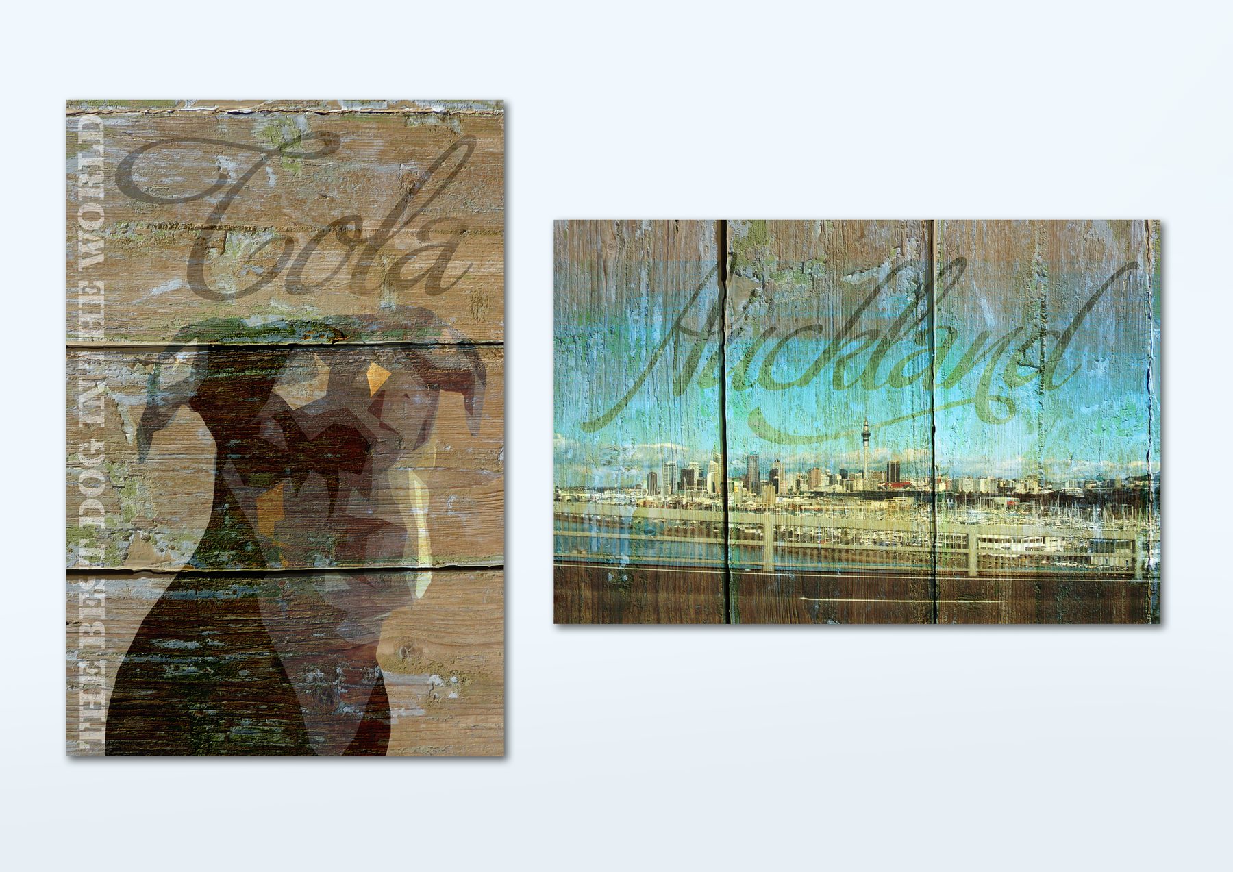
Weathered Treasures
Personal project
Illustration
8/10
Decorative artworks produced as canvas prints. Both feature highly stylised imagery and typography layered over a weathered timber texture.
MEDIUM
Photography, Photoshop
AGENCY
N/A
Winter’s Tale
Personal project
Illustration
9/10
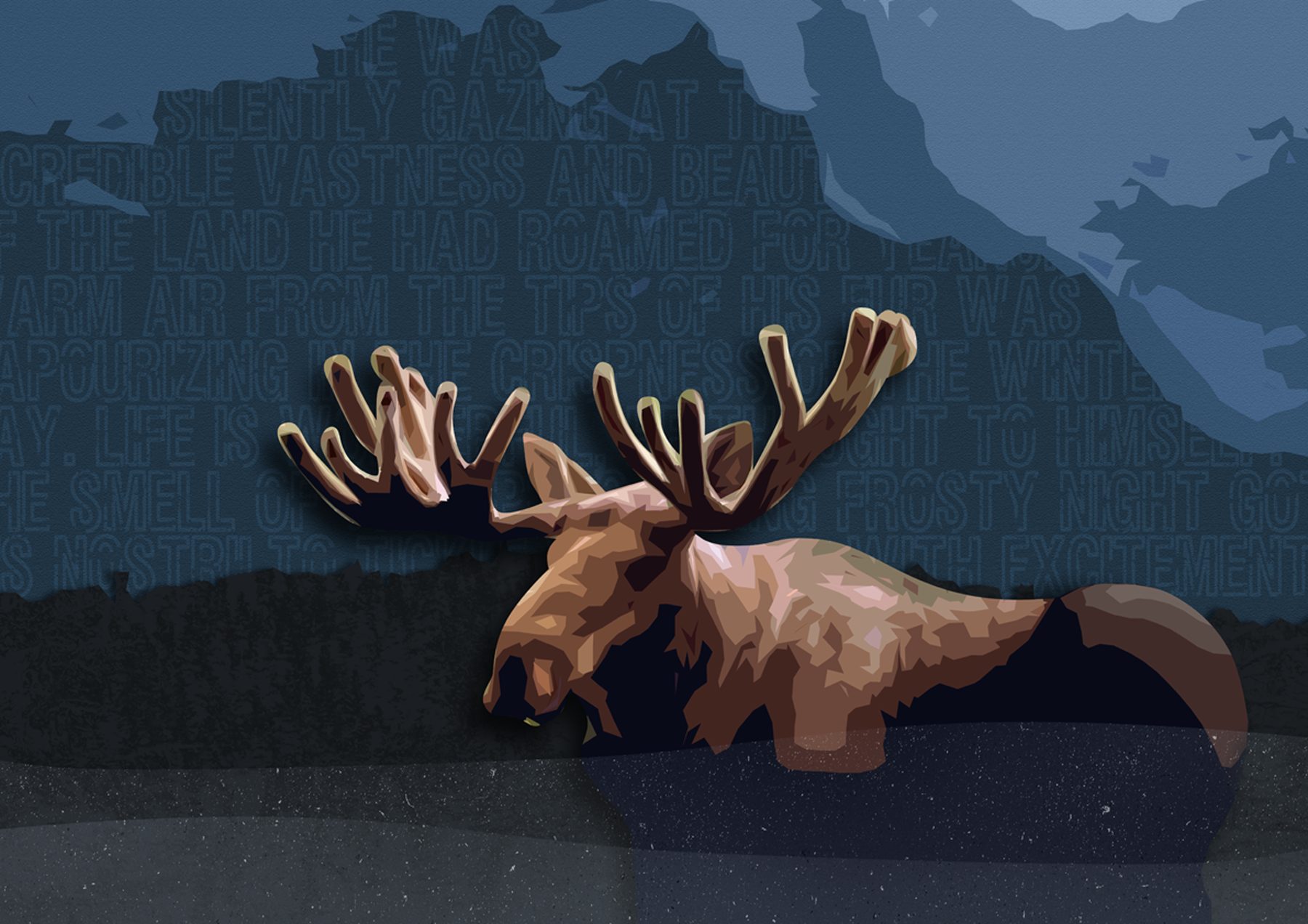
A bull moose in a layered winter landscape, with a poetic prose passage embedded in the background texture. Atmospheric, detailed, and evocative – the kind of personal work that demonstrates range well beyond commercial output. Strong Scandinavian sensibility.
MEDIUM
Illustrator & Photoshop
AGENCY
N/A
Tactile Studies
Personal project
Illustration
10/10
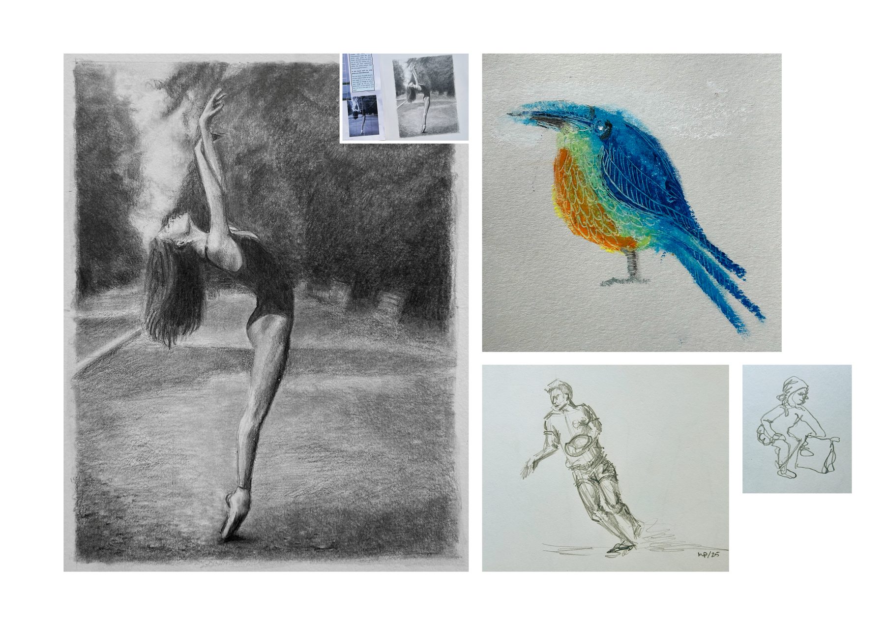
A set of miscellaneous studies showcasing range across media. Oil pastels let me work impressionistically and get my fingers messy; pencil and charcoal let me concentrate on light, shade and texture.
MEDIUM
Pencil, charcoal and oil pastels
AGENCY
N/A
Audio
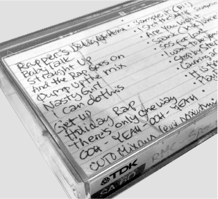
Long before design, there were cassette mixtapes, a family stereo dragged to class parties, and hand-made disco posters (art was my favourite class in school). By my early teens I was regularly DJing school discos and our local youth centre in Kerava.
In my late teens, I wrote a short rap praising Finnish language at a time when rap wasn’t mainstream, and it definitely wasn’t cool to use Finnish in rap. A few years later I borrowed the first two bars of it for a jingle for my fortnightly radio show, Real Beat, on local radio station Etelän Ääni 88,7 MHz. Suno allowed me to finally bring the full lyrics to life. Time to learn Finnish? 😜
Real Beat intro jingle
1988 | 01:15
Suomenkielinen
June 2026 | 03:25
After high school, the DJ sessions turned professional. Resident sets, agency bookings, gigs across the Helsinki area and beyond, even when art school had well and truly taken over. For a few months, I was still gigging and doing two radio shows, but I soon realised (after a written warning from the principal!) if I wanted to graduate I had to concentrate on art studies, and the rest is history.
Music has always stayed a big part of me. In 2016 I founded Dance Yourself Happy (DYH) – a free, weekly community dance hour in my neighbourhood in East Auckland. Venue hire was covered by community grants; everything else was just love. I built every mix in GarageBand, played them in the sessions, and ran the whole thing until 2022. DYH is on indefinite hiatus, but the mixes live on. Here’s one to keep you company while you browse 💚
Tracks will play on this page.
Dance Yourself Happy #50
5 August 2021 | 59:03
If you want to test your ‘visual’ music knowledge, check out the fun visual riddle collages I created as social media teasers for some of the dance sessions: